
CASE STUDY 01
Cendrillon
Project Overview:
This project was a client-led brief for the Royal Irish Academy of Music to design a poster and promotional campaign, alongside an opera programme, for their production of Cendrillon. The goal was to create a bold, modern visual identity that reinterpreted a classic opera in a way that would appeal to contemporary audiences.
Working within a three-week timeline, I developed a cohesive branding system across posters, print programmes, and tickets. Through research, rapid iteration, and client feedback, the final outcome balanced theatrical storytelling with strong typographic hierarchy and a distinctive visual motif, demonstrating my ability to respond to a real client brief under tight deadlines while maintaining consistency across multiple touchpoints.
01 / Setting the scene
Task
Design and create a poster and promotion campaign with a Opera program for RIAMs production of the Opera Cendrillon.
Background
The Royal Irish Academy of Music is Ireland’s oldest conservatoire, ranked in the top 50 institutions in the world for the performing arts. They train gifted musicians from all over the world for careers in music performance, composition and pedagogy. There graduates are innovative and reflective, with skills that enable them to take on the challenge of a life in the creative arts with confidence and zest.
Timeline
From the initial briefing with the client, to a midway client critique and feedback to final designs within a three week timeline.
02 / Research & Brainstorming
Research & Planning
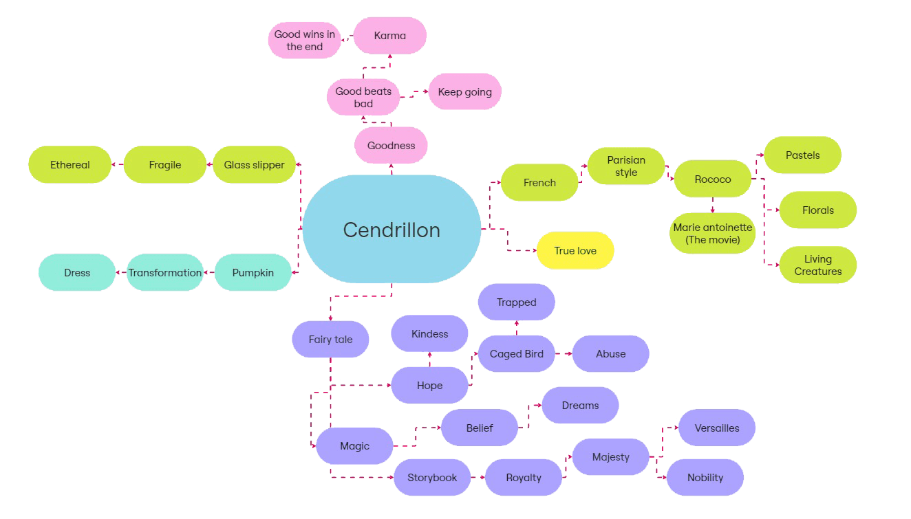
I researched the story of the Cendrillon Opera via script analysis and identifying key themes and motifs. Conducted market research to identify existing current and past productions of the Cendillon Opera.
Brainstorming
I researched the story of the Cendrillon Opera via script analysis and identifying key themes and motifs. Conducted market research to identify existing current and past productions of the Cendrillon Opera.

03 / Ideation
Secondary Research
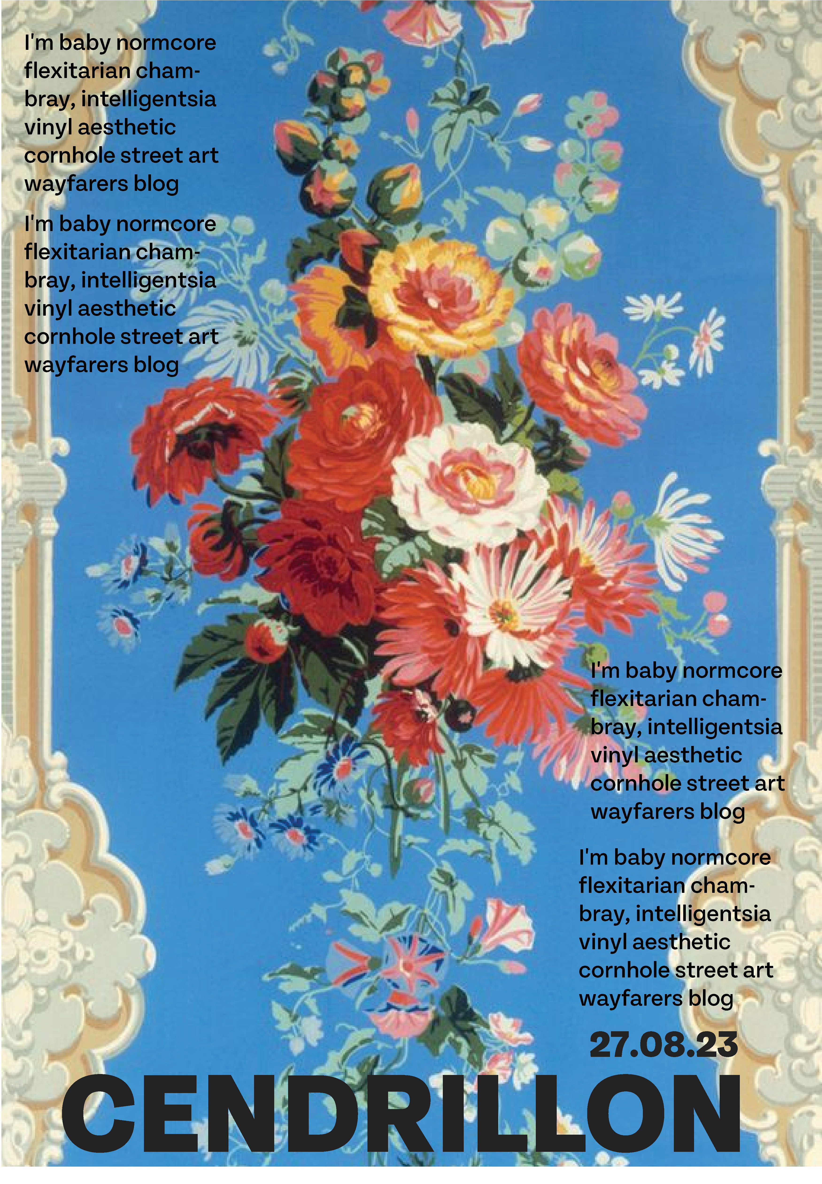
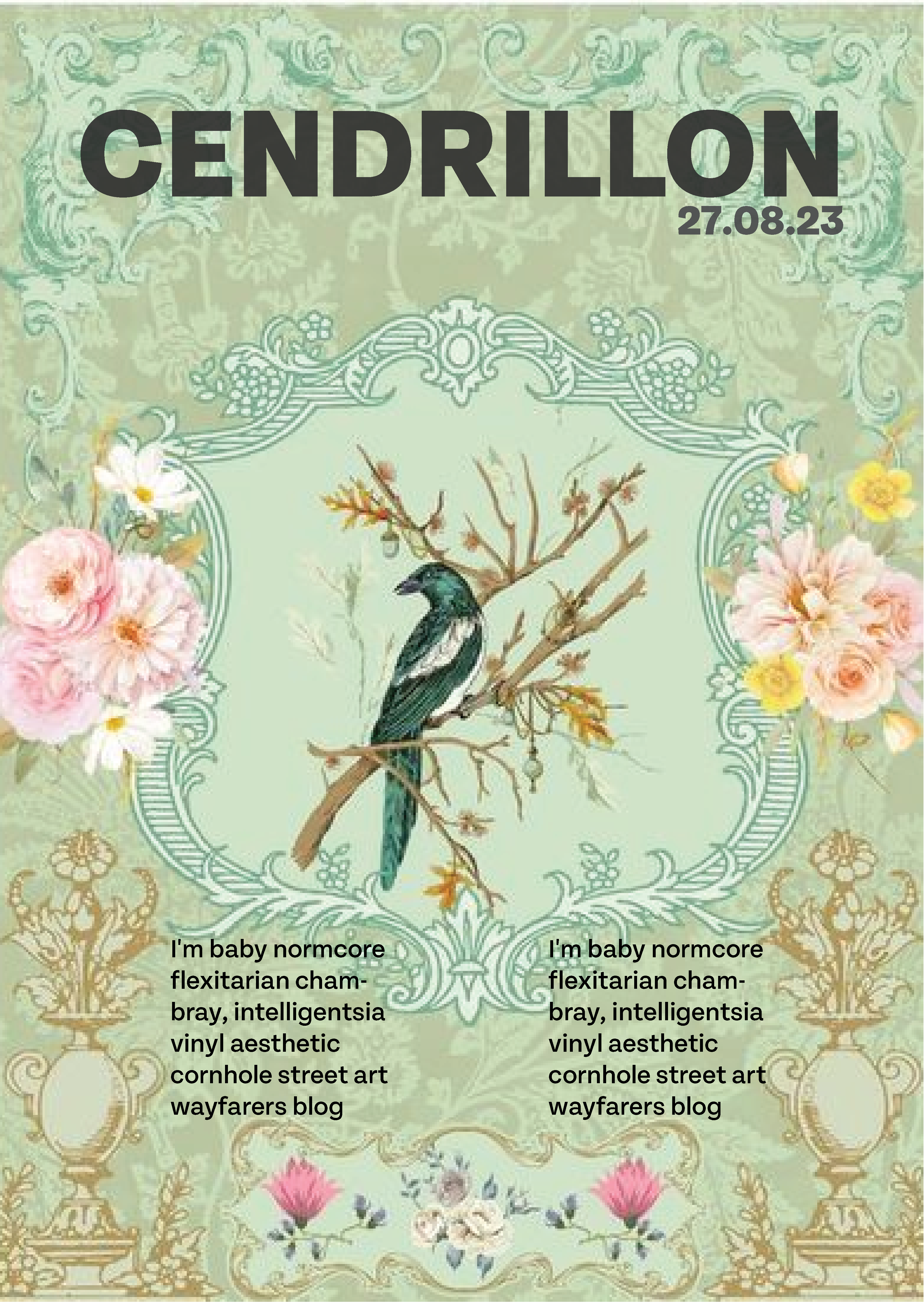
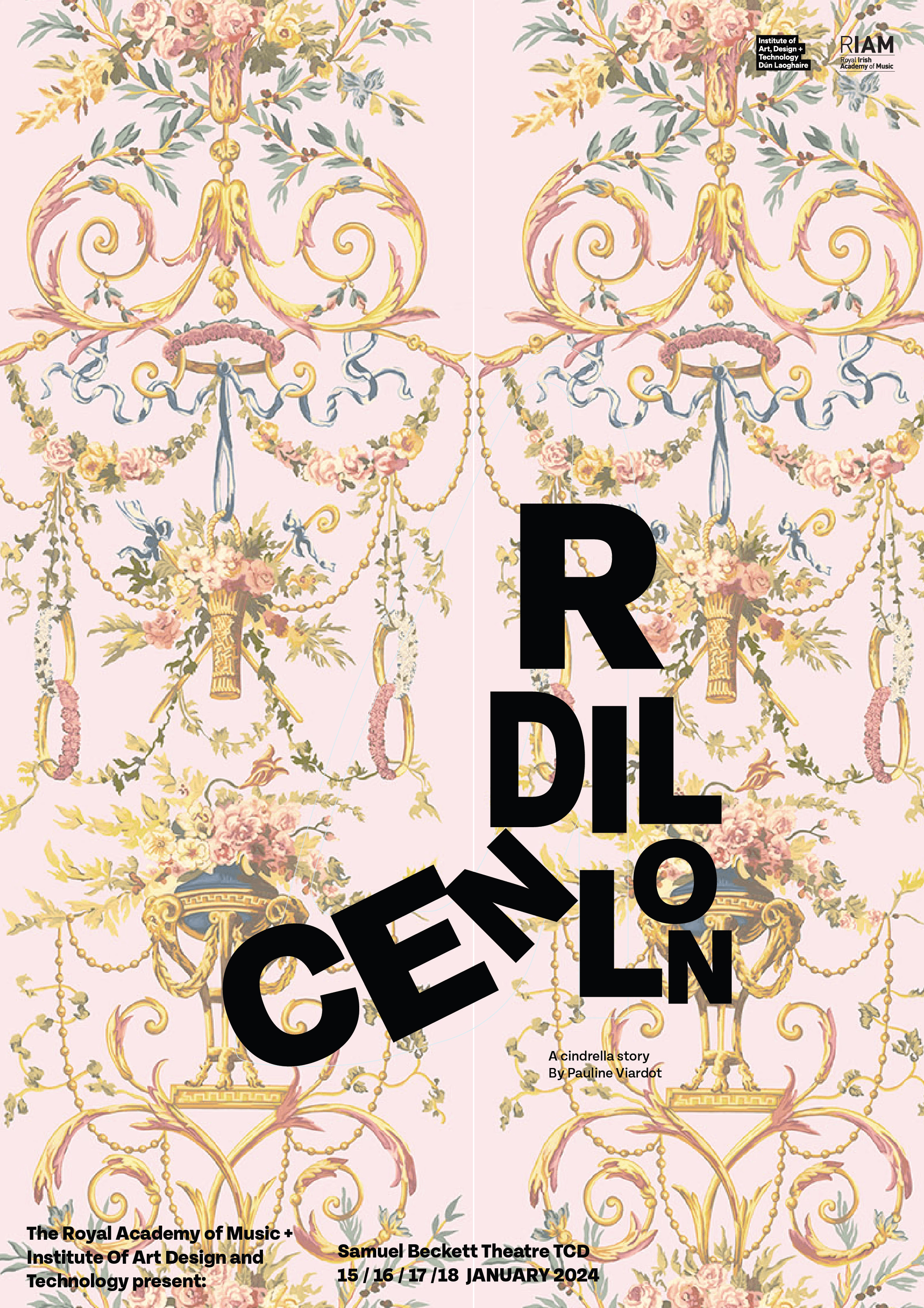
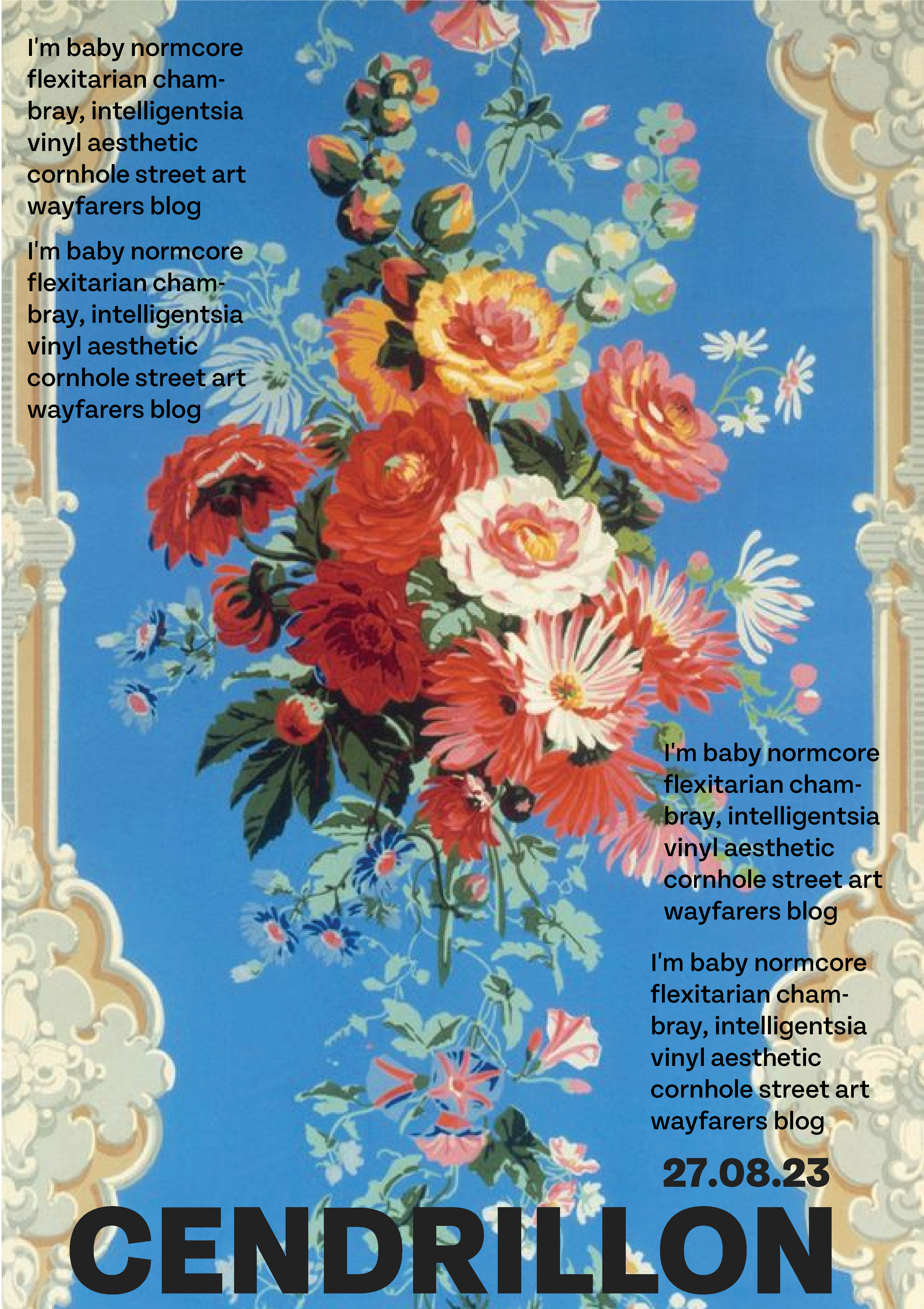
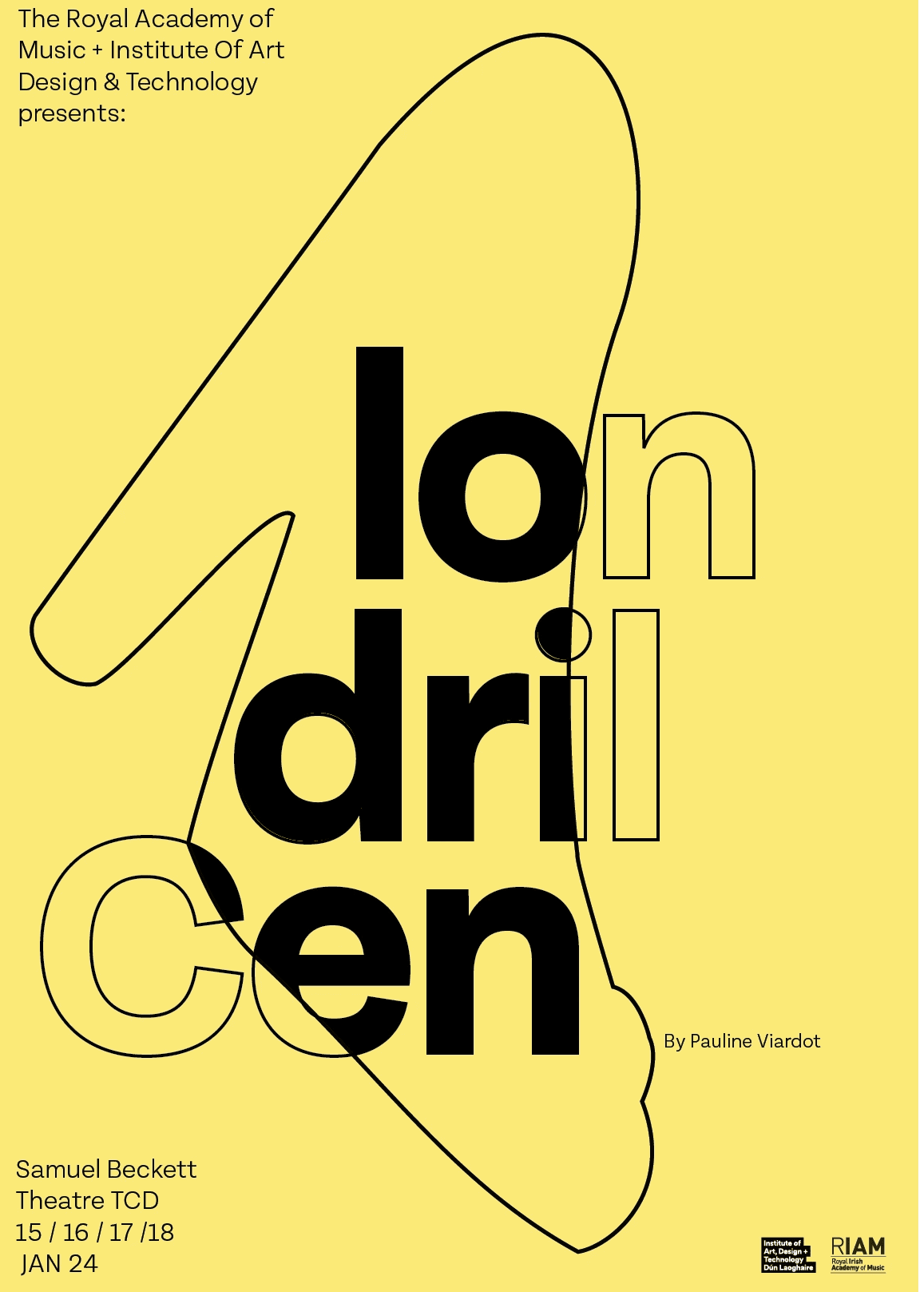
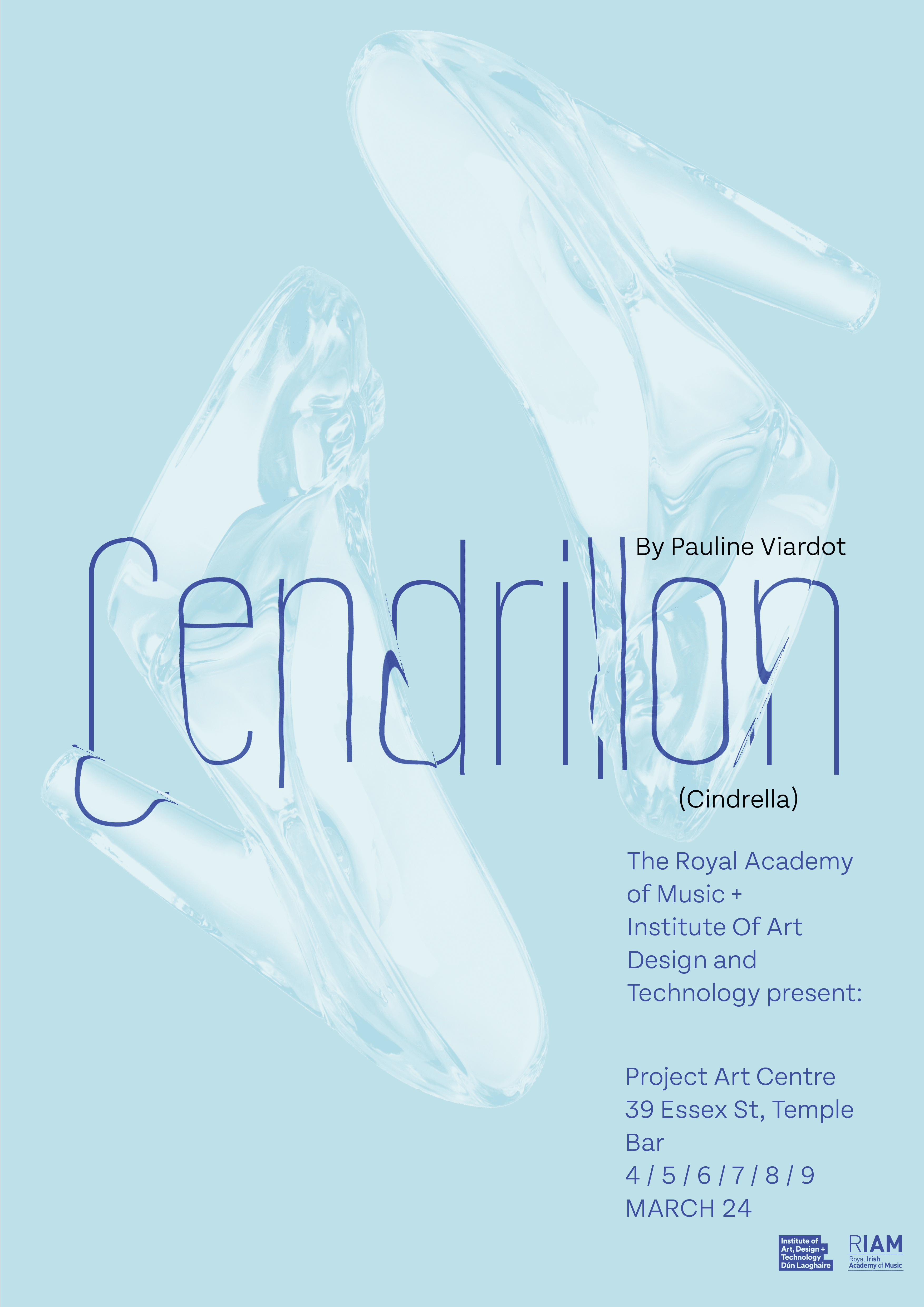
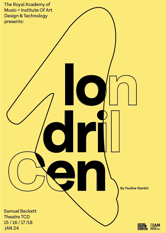
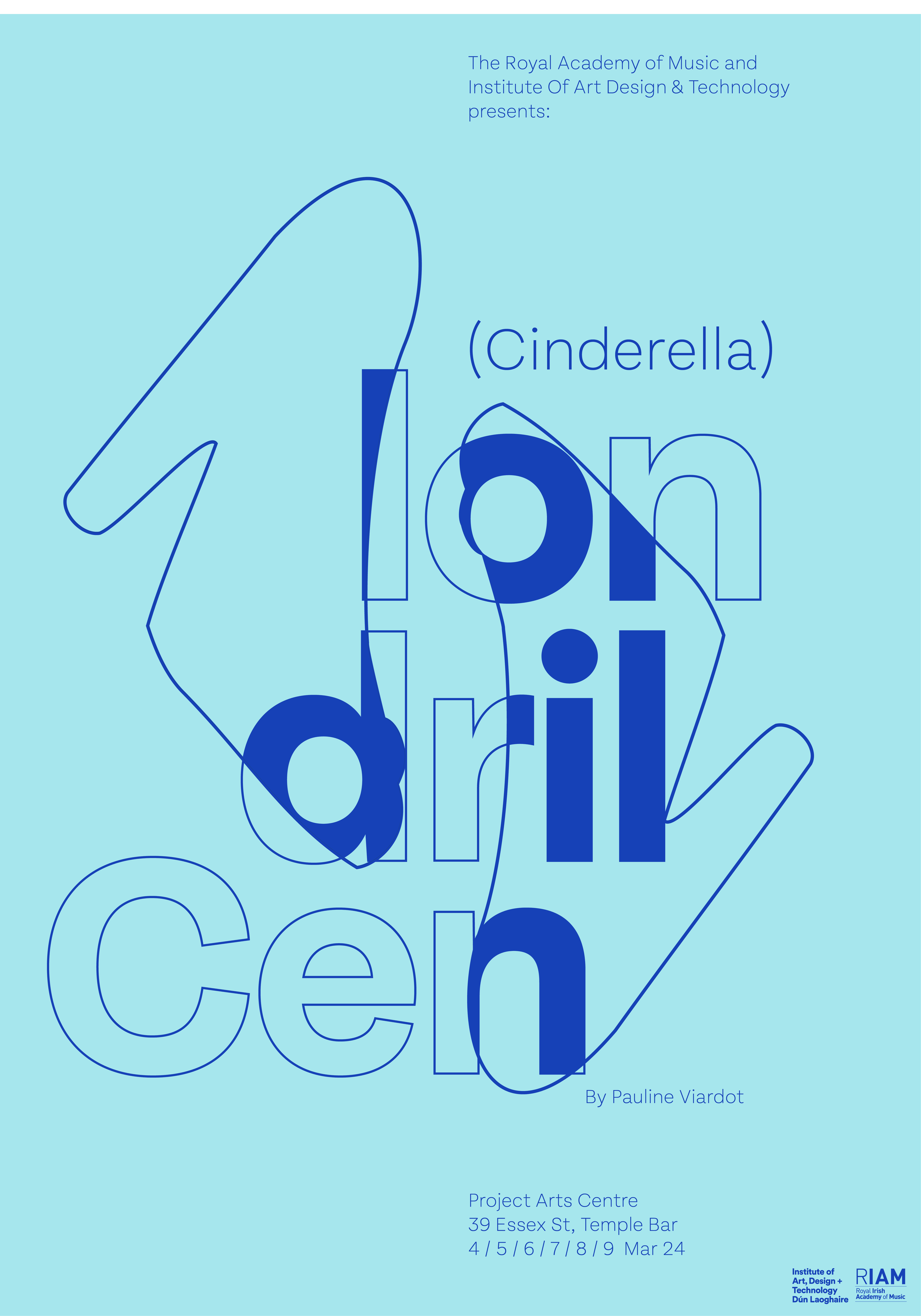
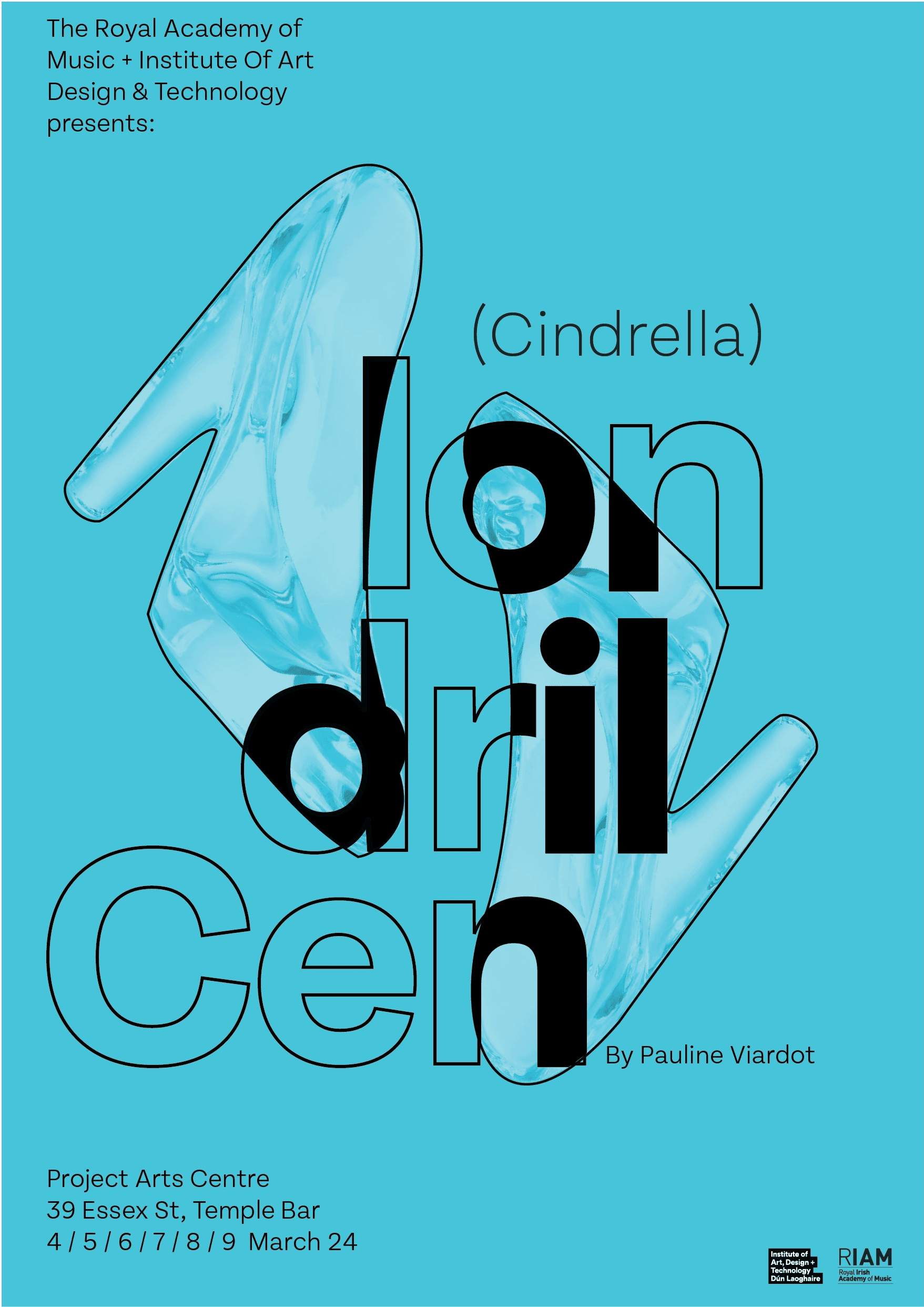
I created a collection of secondary imagery to inform my initial response and define the aesthetic, feel, and direction of the visual identity of this brief. Themes I identified and I wanted to visually represent such as shoes, flowers, and whimsical and ornate elements in juxtaposition with bold modern type. This was to reflect that this was a modern twist on a classic story.

Initial responses
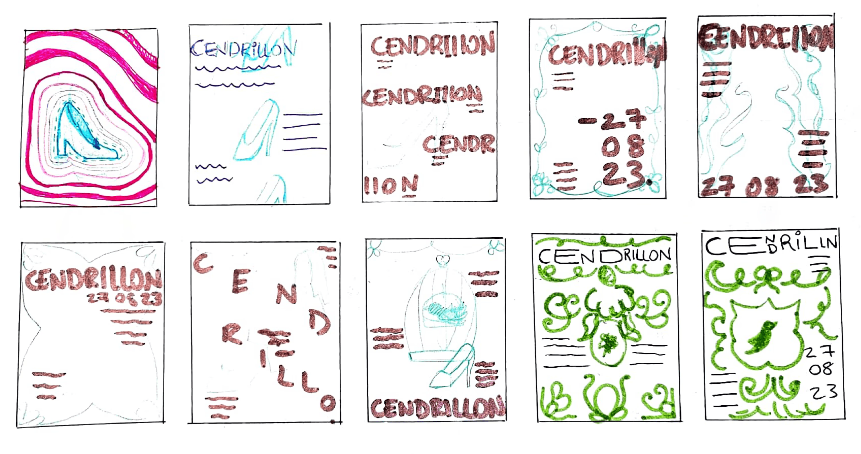
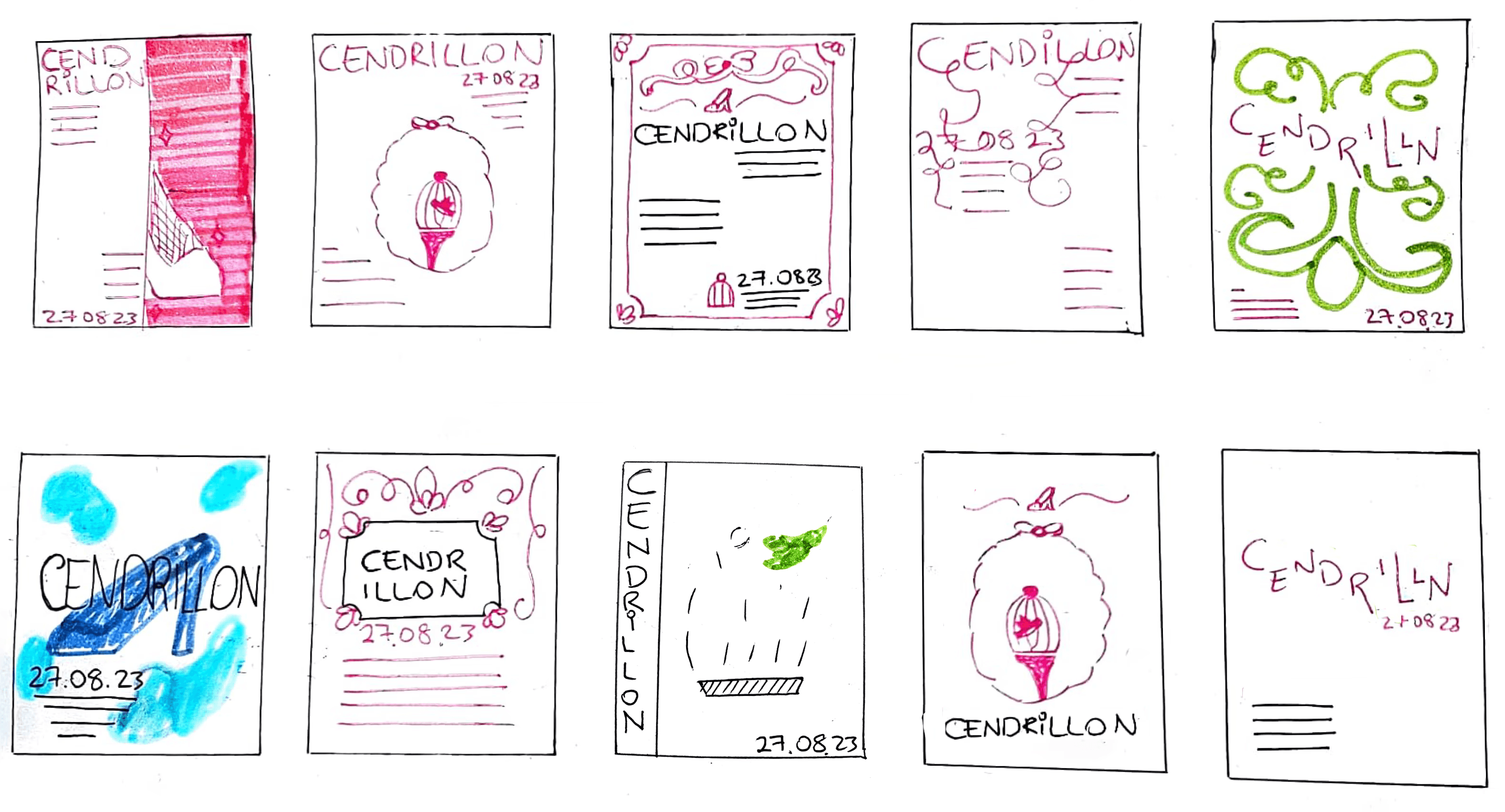
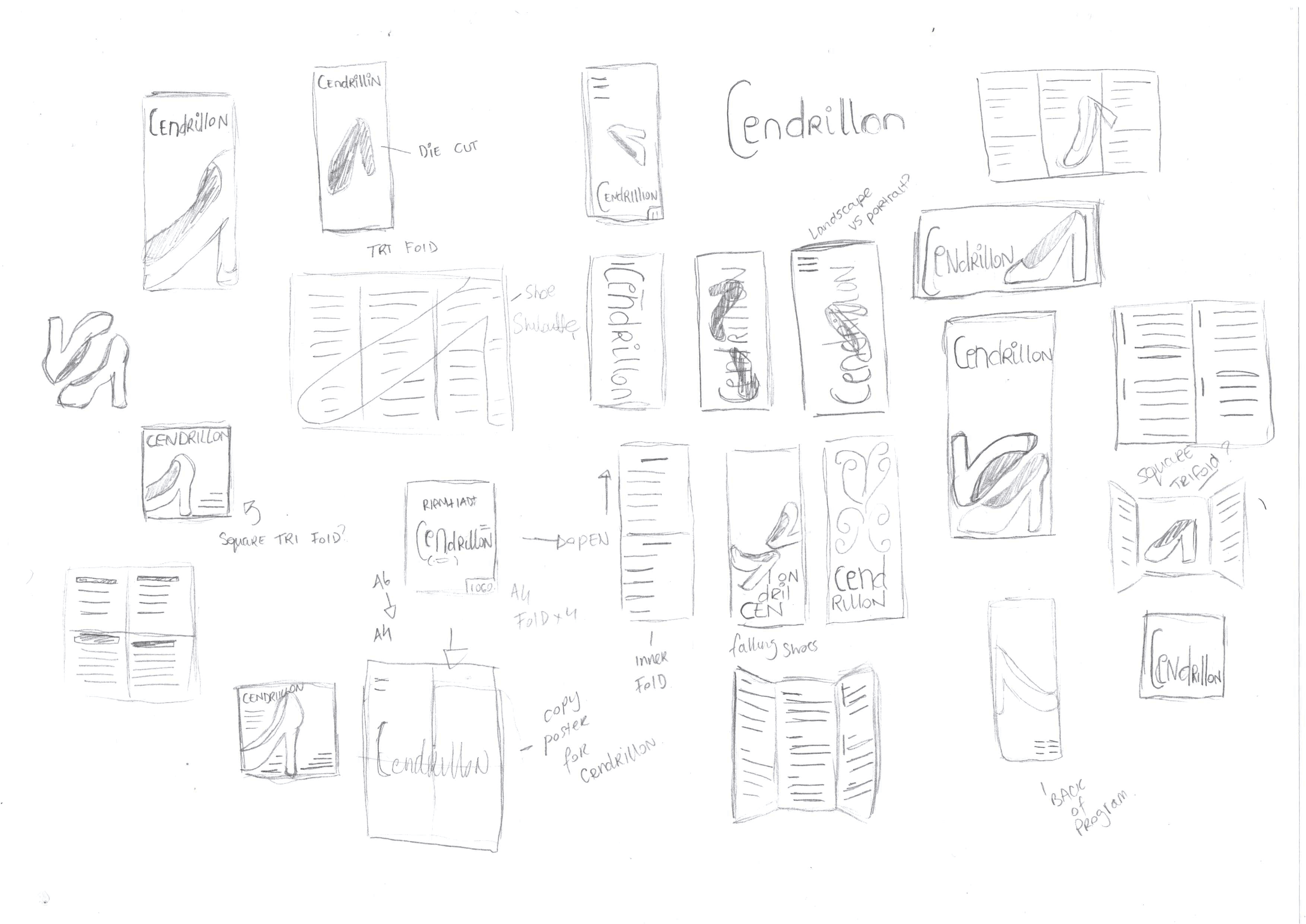
I started developing my ideas by making rough sketches in quick sprints t0 many variations and multiple directions for my concept using different elements of the story and moodboard. Making a considered choice of bold strong type being a consistent element in the visual identity.
04 / Iteration & Feedback
Iteration
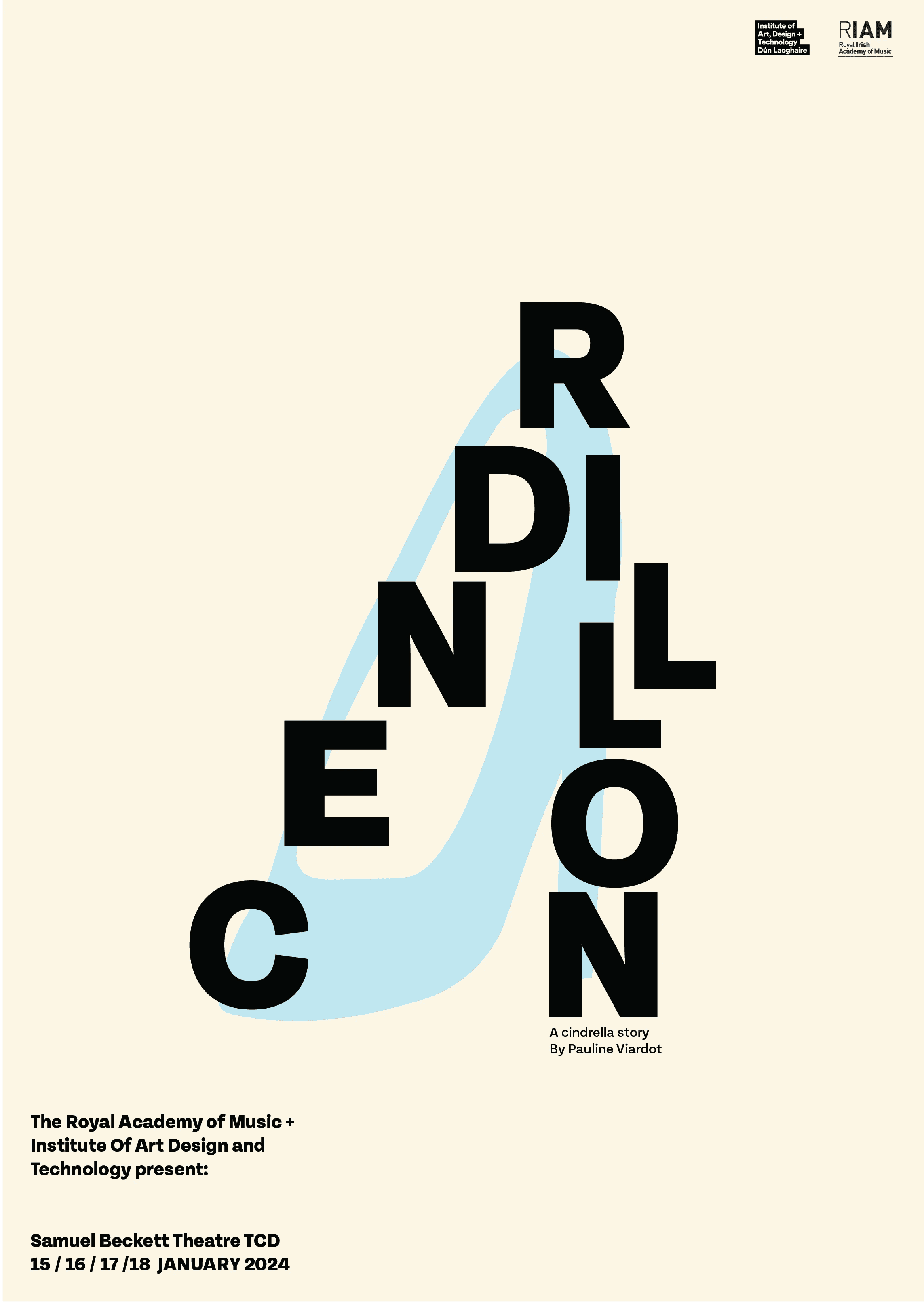
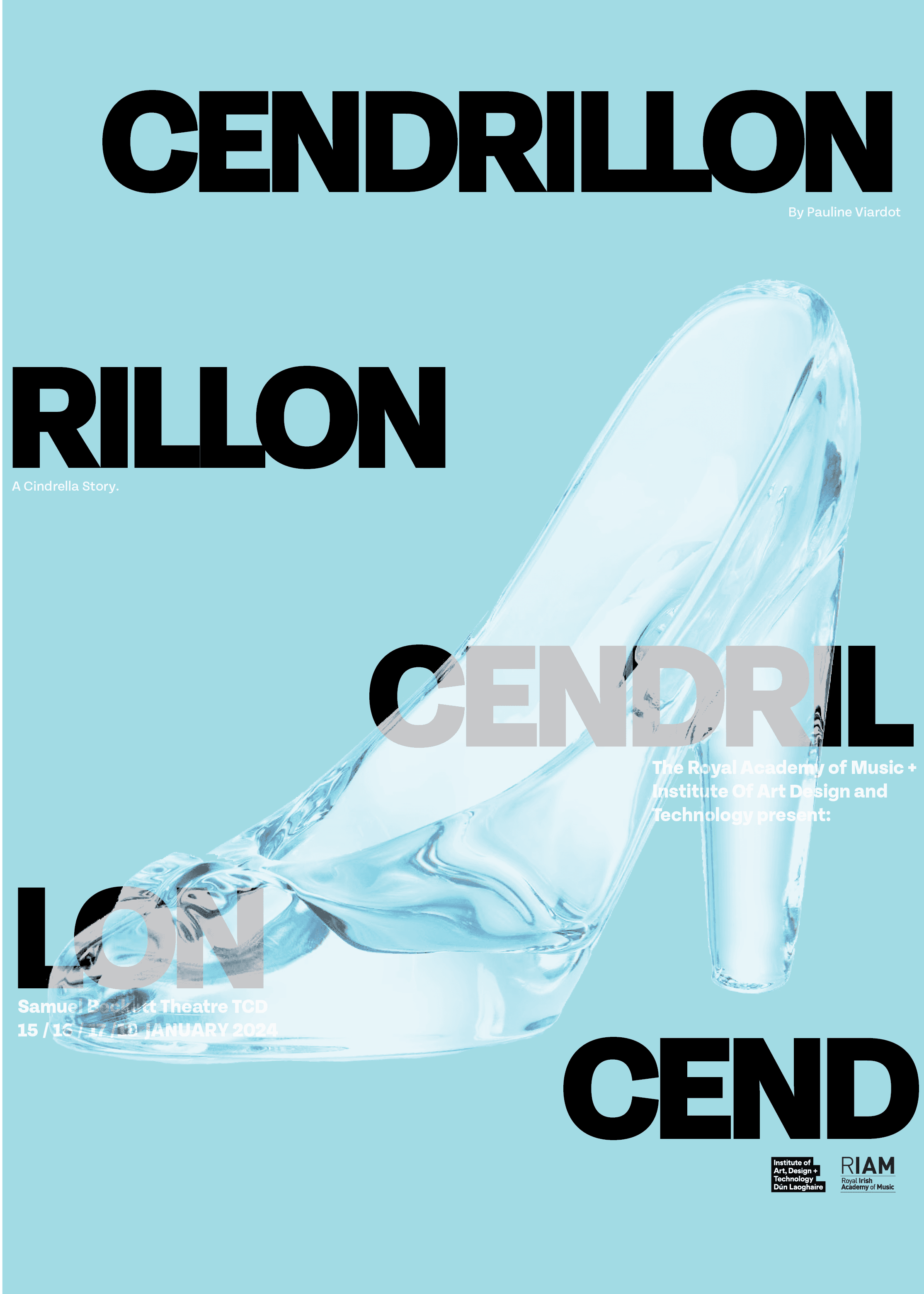
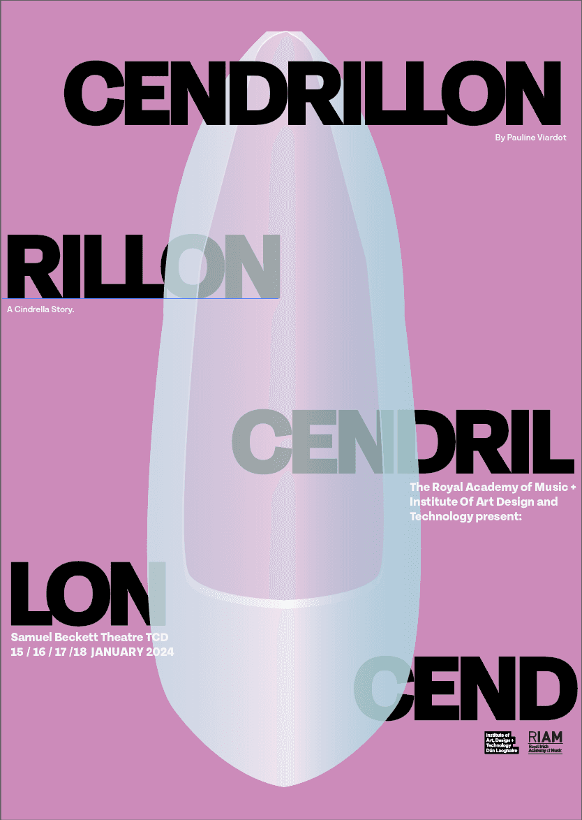
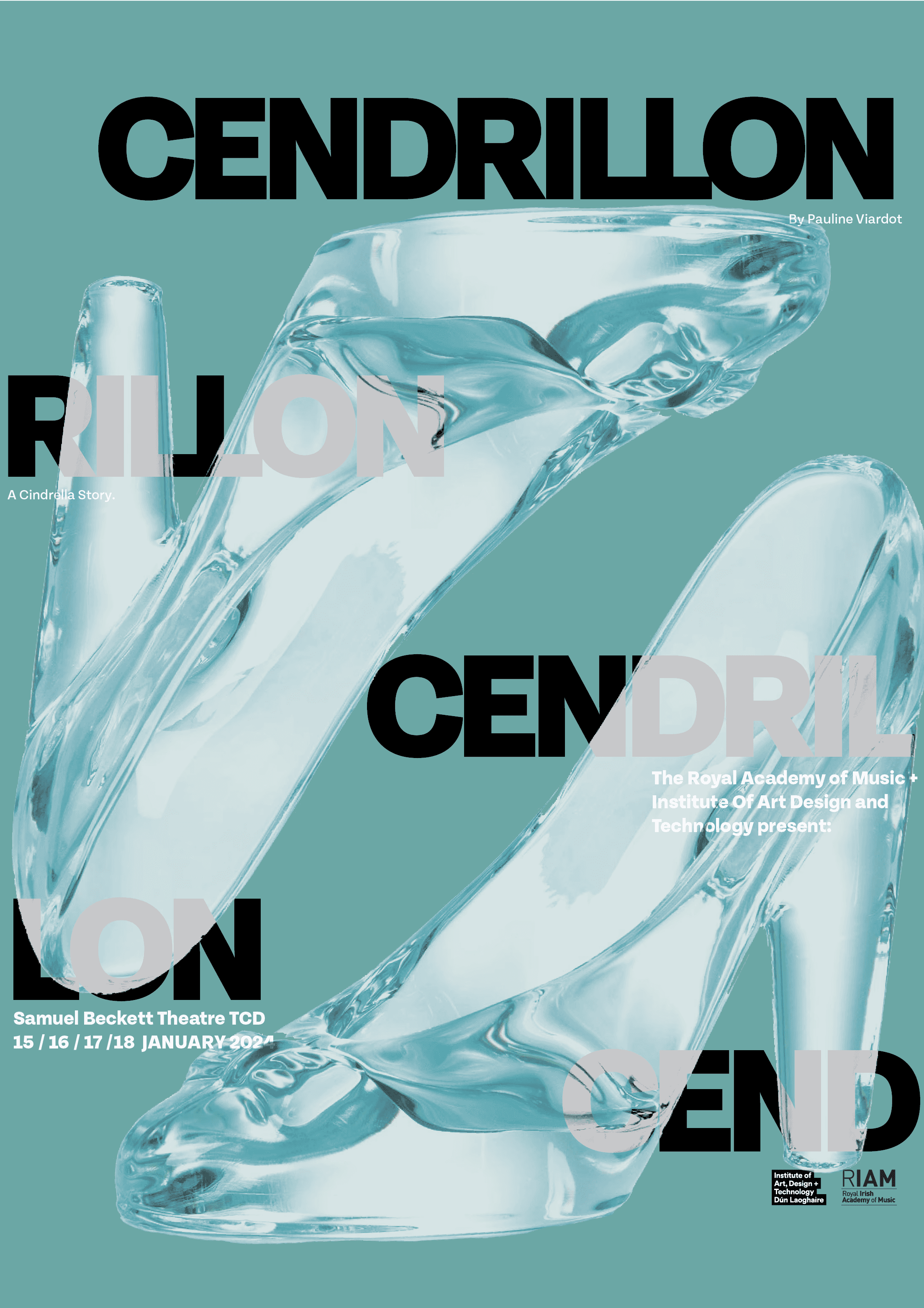
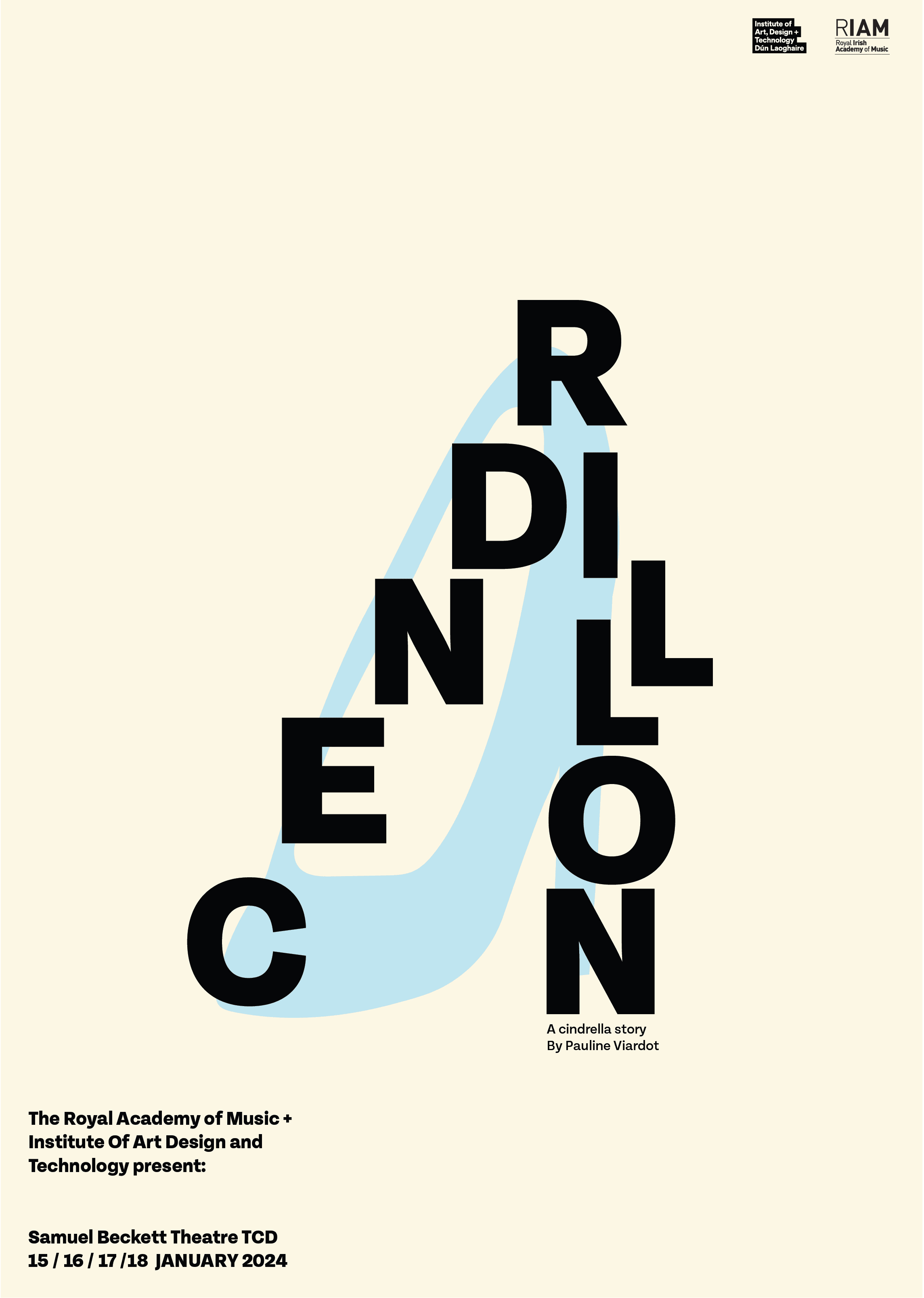
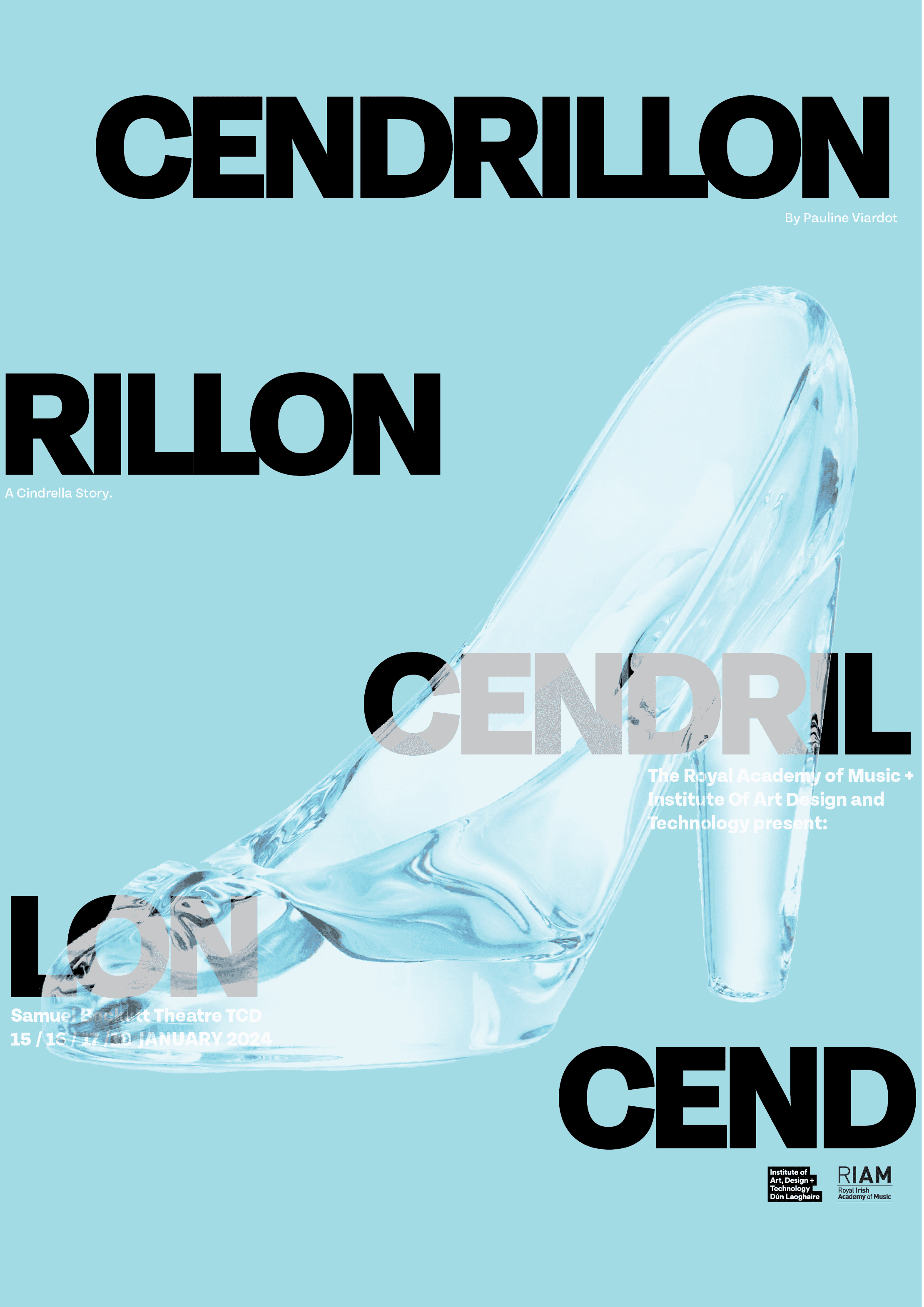
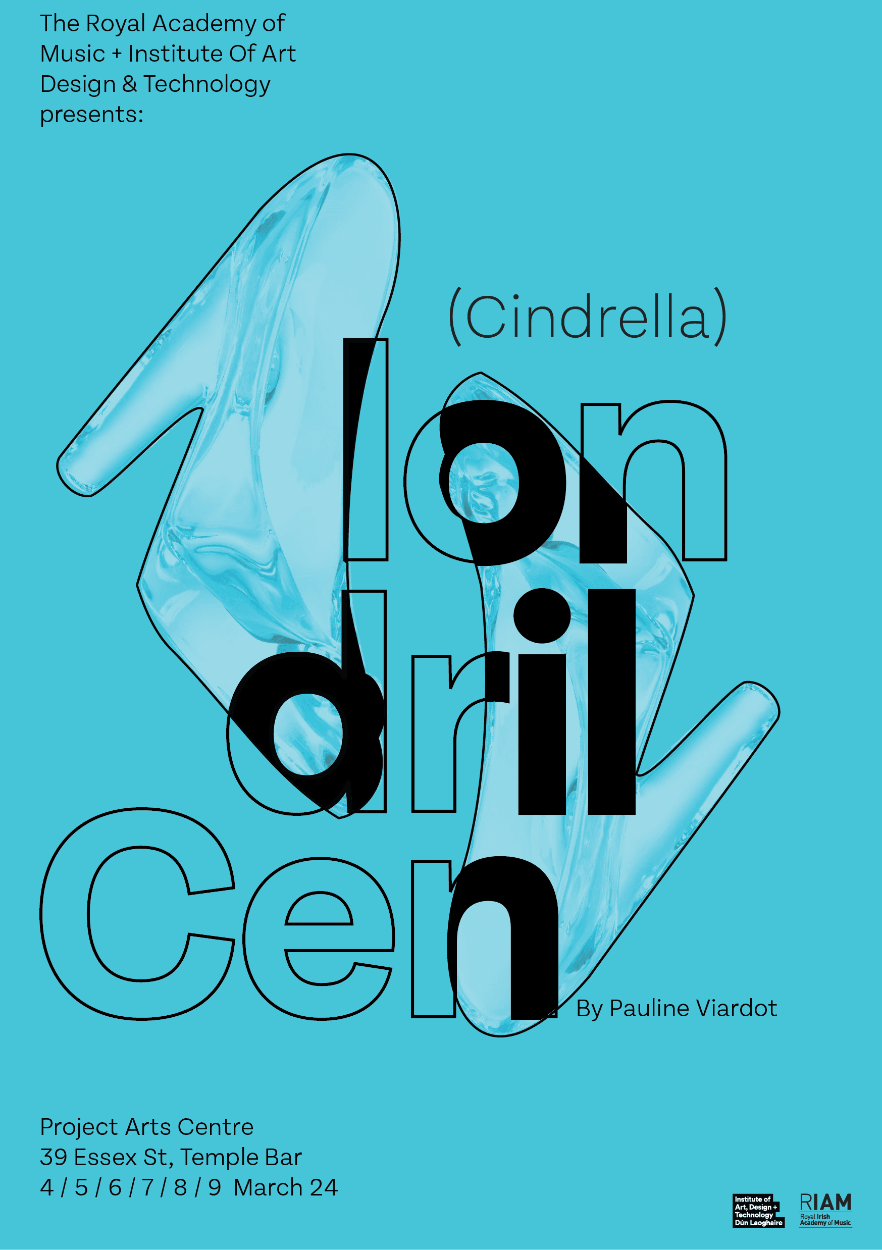
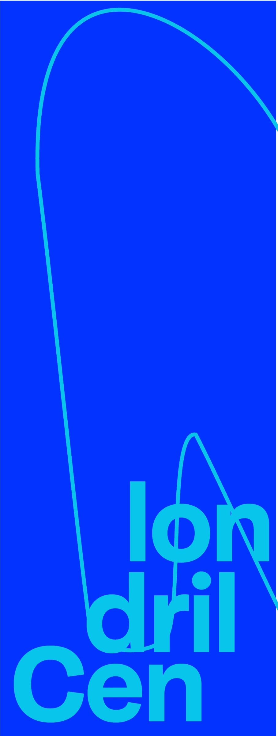
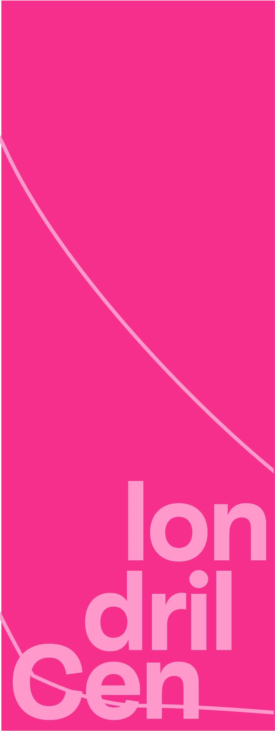
Taking the sprint sketches I rendered the layouts and responses into a higher fidelity visual response using assets such a glass shoe prop and vintage wall paper scans. Through this process and iteration the glass shoe became a visual focal point. This focal point then evolved into a viewing lens for the user and the glass shoe interacting with the type to create a distinct Identity.


Further iteration
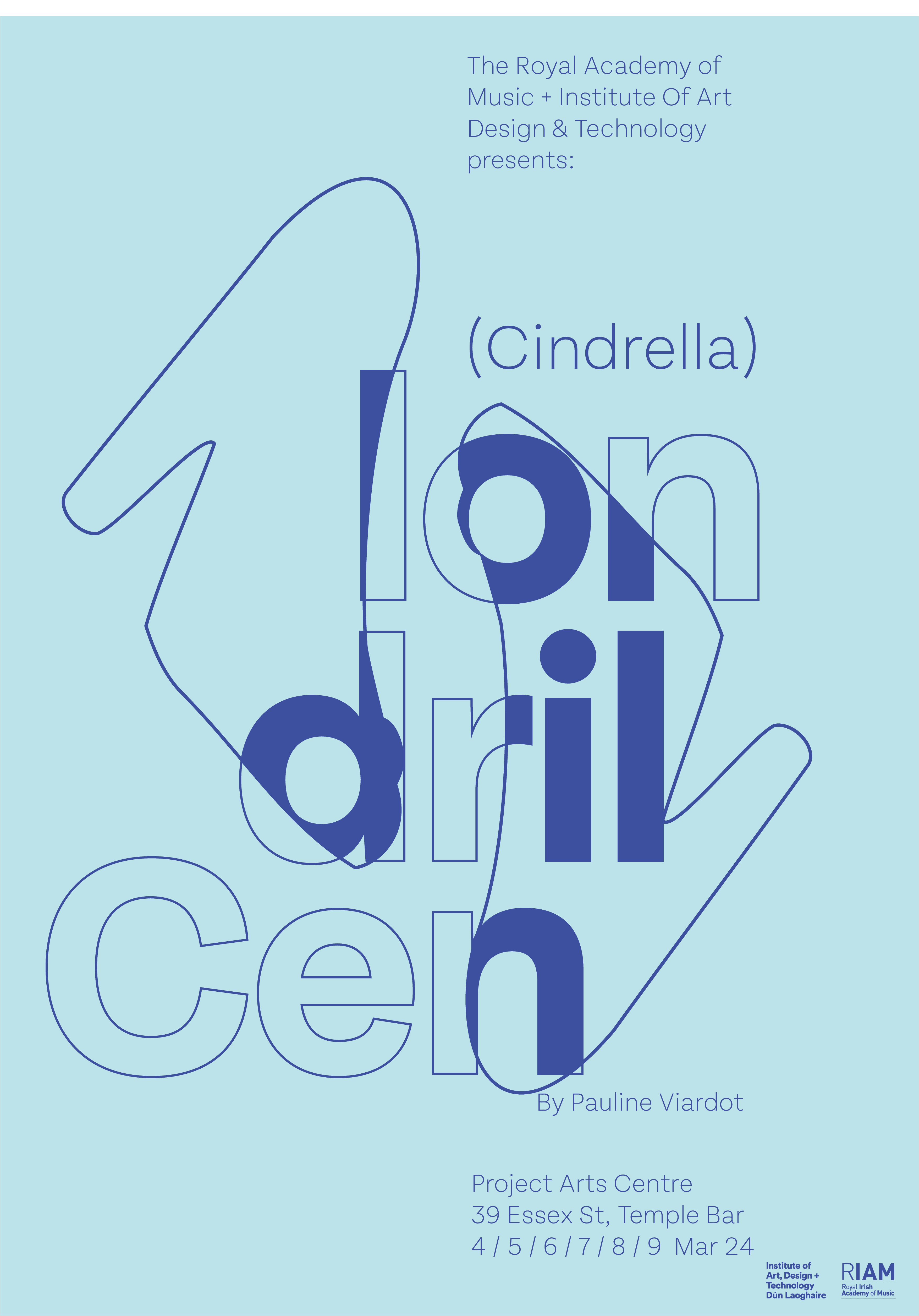
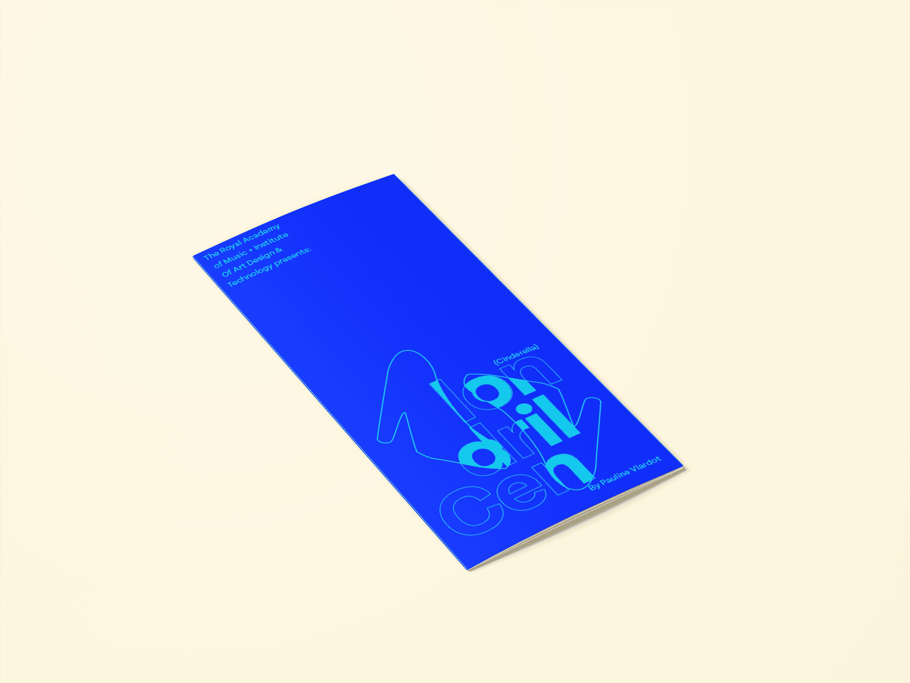
Bouncing off the use of the glass shoe as a viewing lens I developed this concept into the main visual treatment for the visual identity due to its distinct and unique visual presence. The use of the refraction/colour block on the type also created a visual motif that was distinct and was attention grabbing potential for users.
Client Feedback
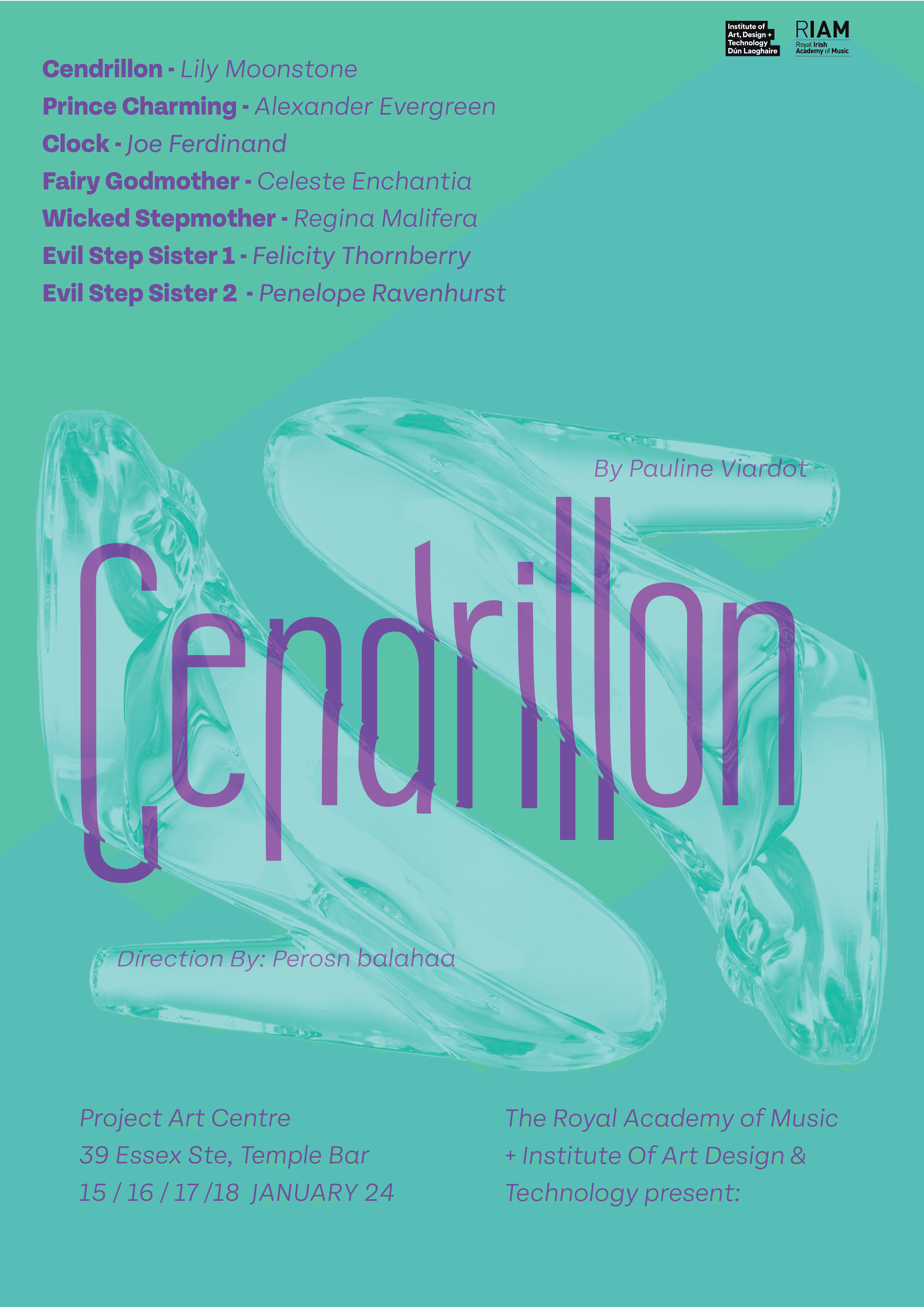
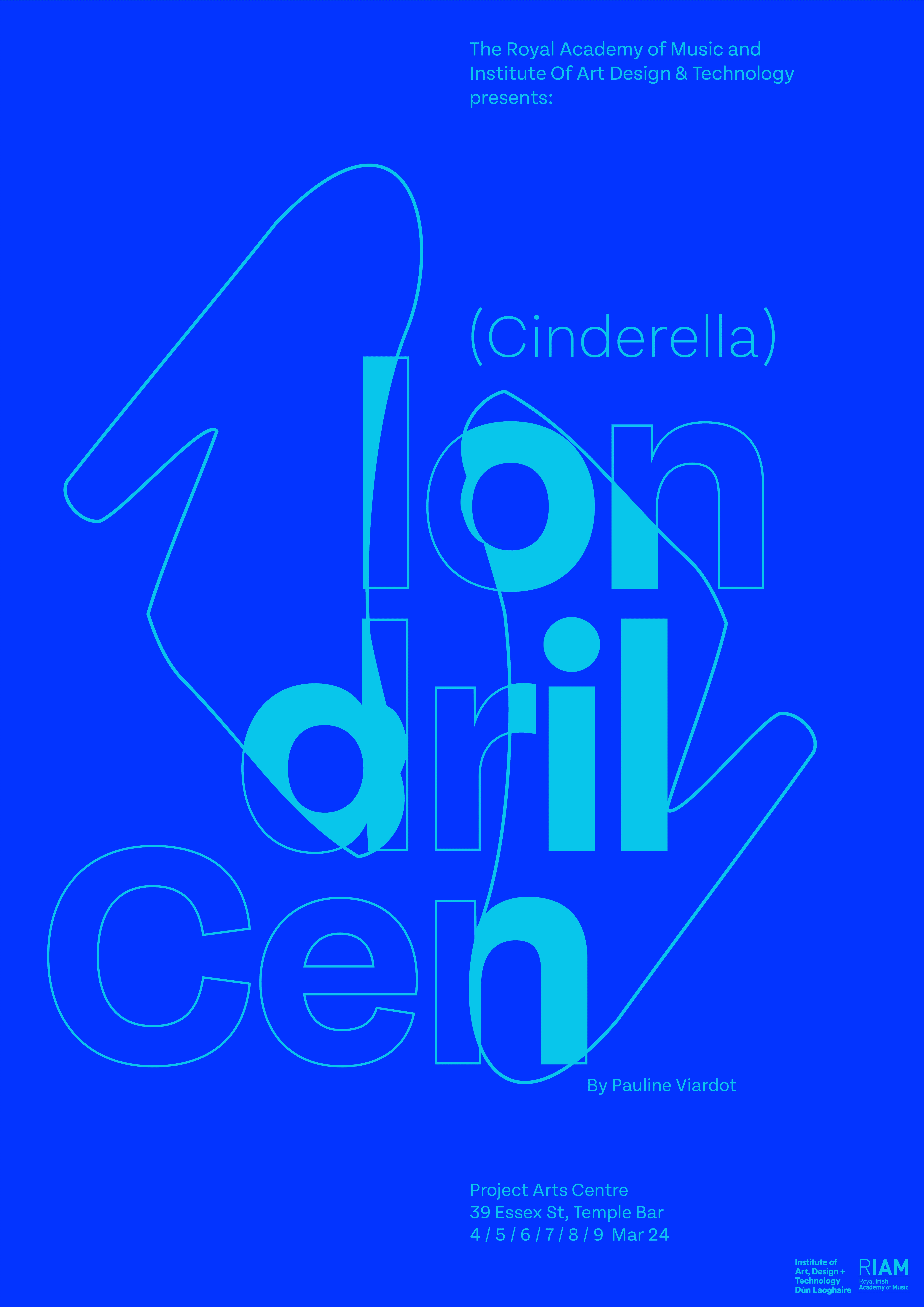
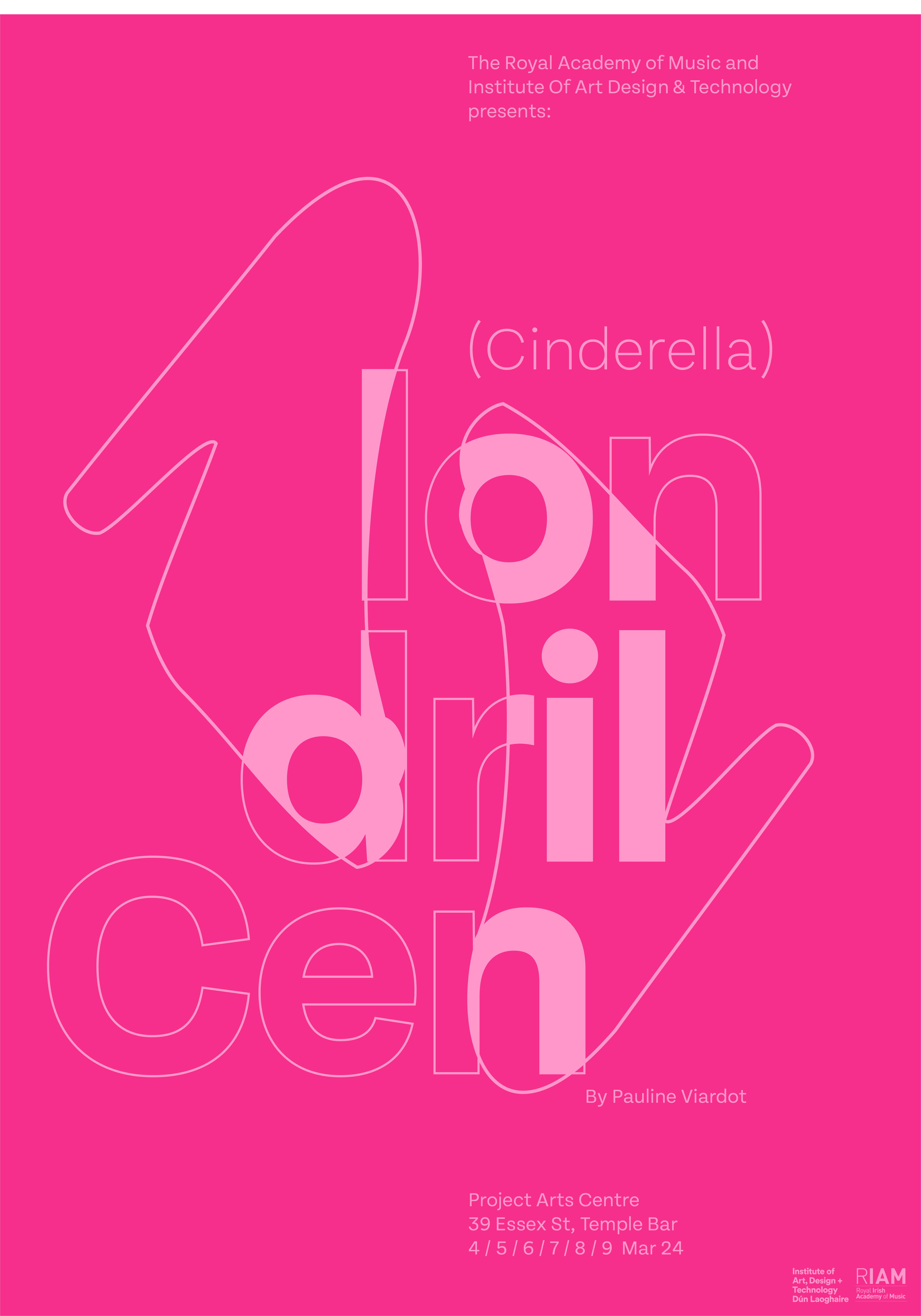
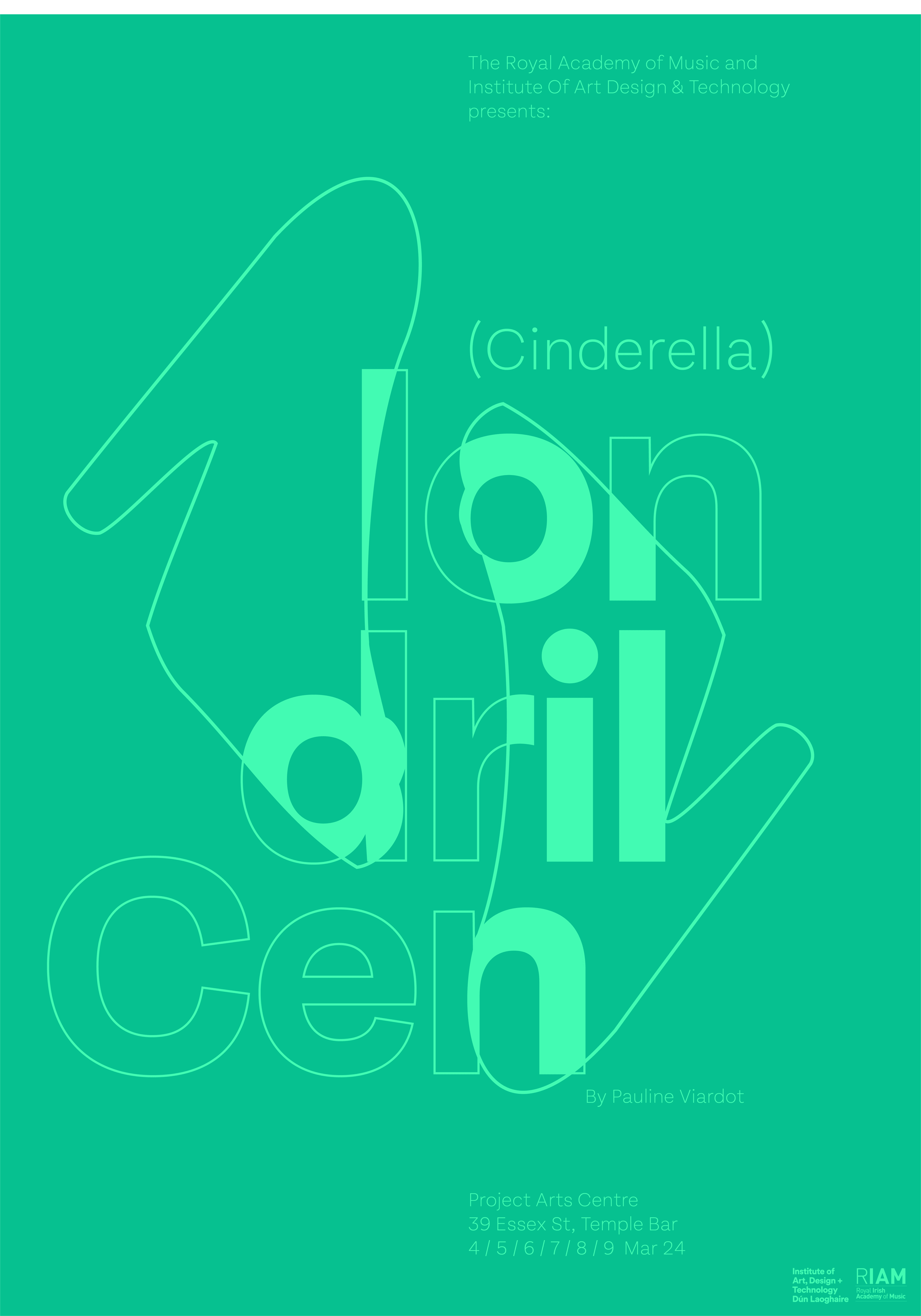
Presenting these iterations to the client RIAM, the client immediately was drawn the blue silhouette with two shoes that blocked in the text. The client felt this aligned with the production as it was a modern twist on a classic opera/fairy tale.
05 / Final
Final Iteration
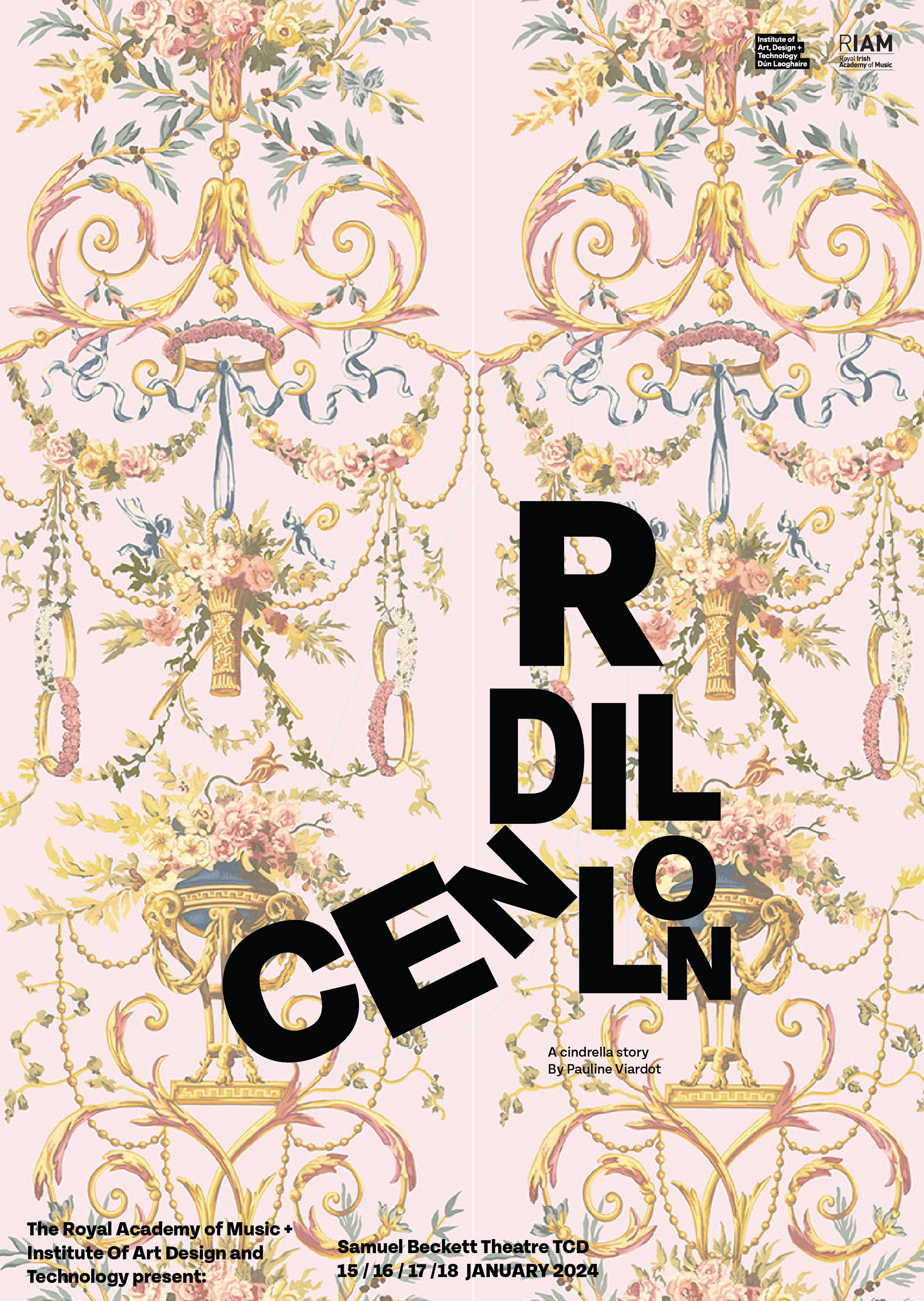
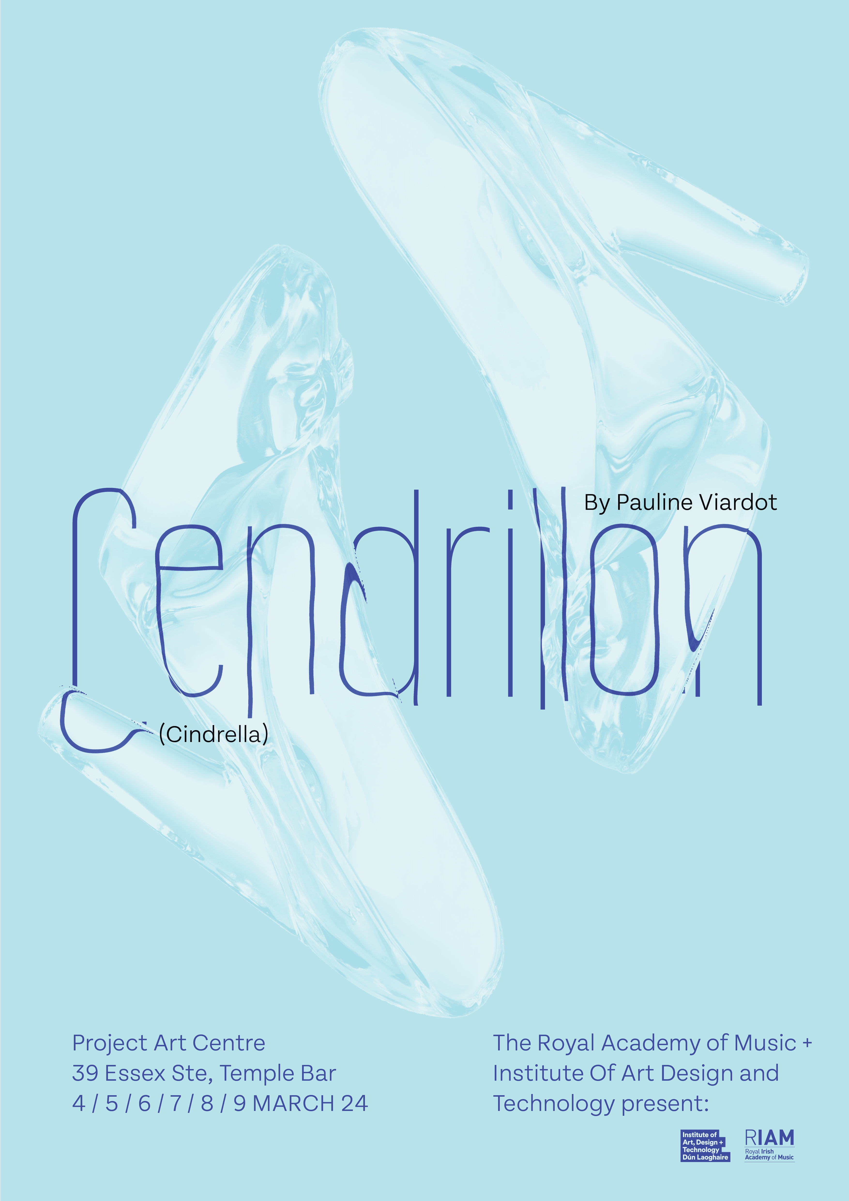
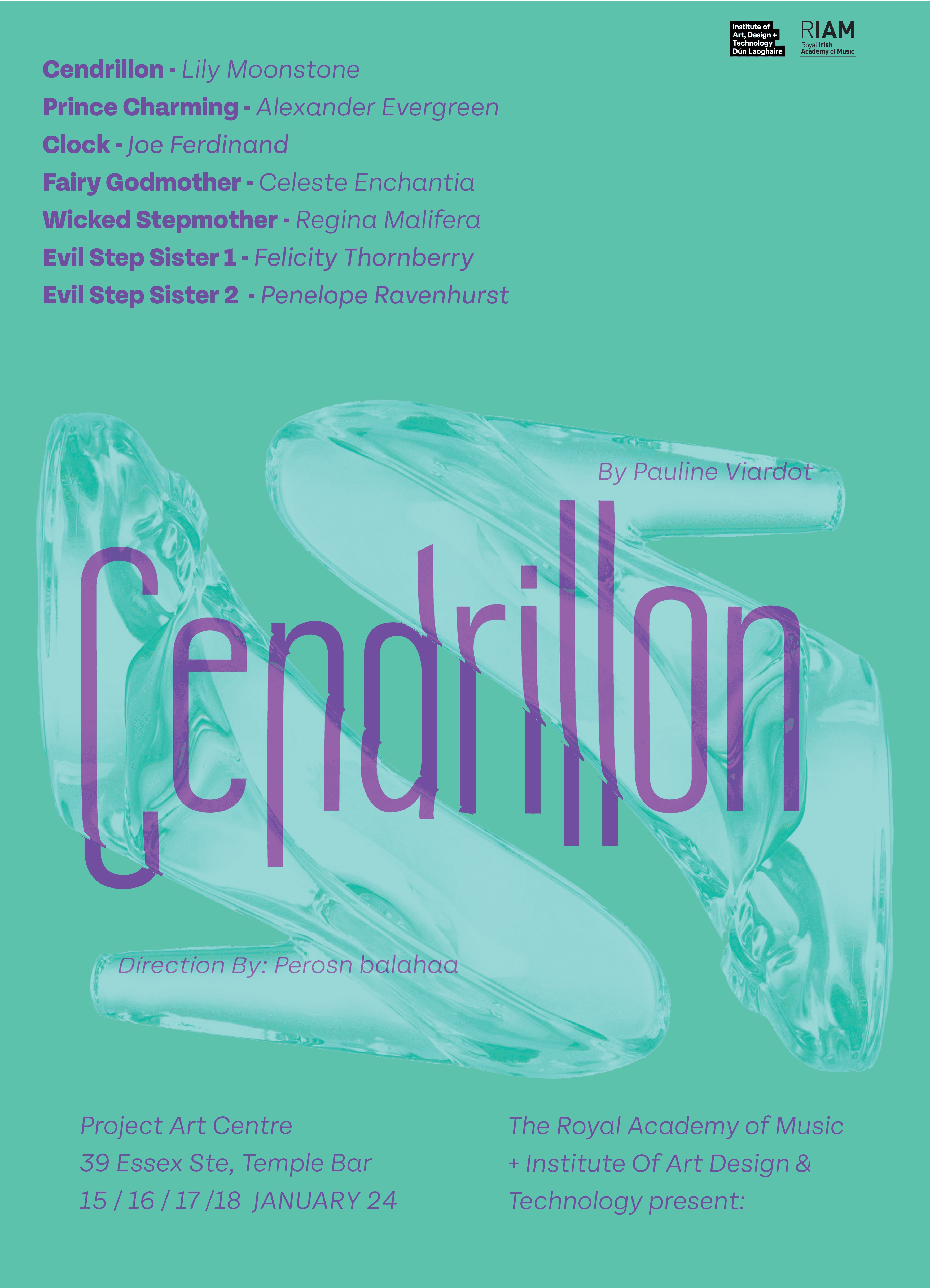
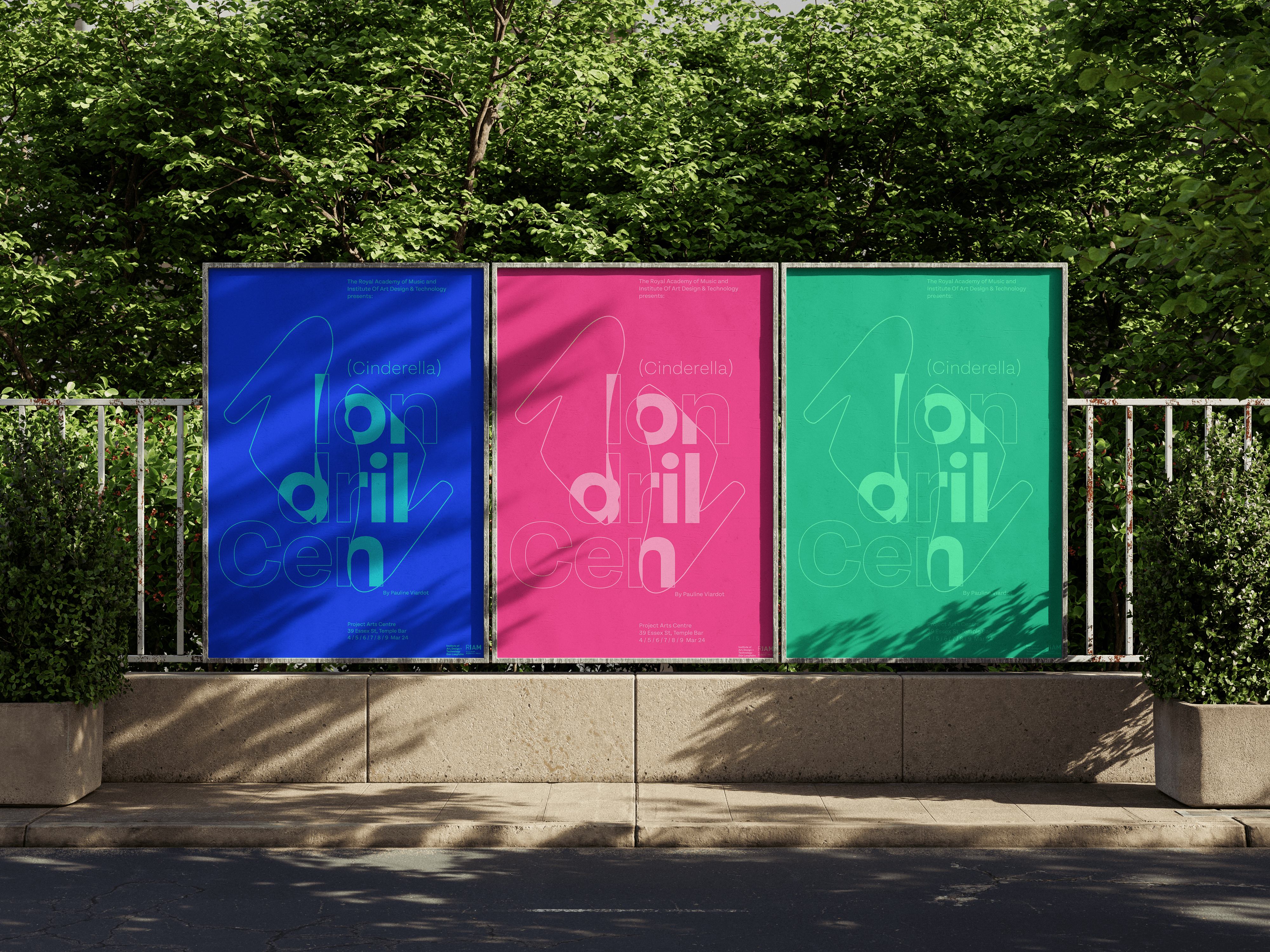
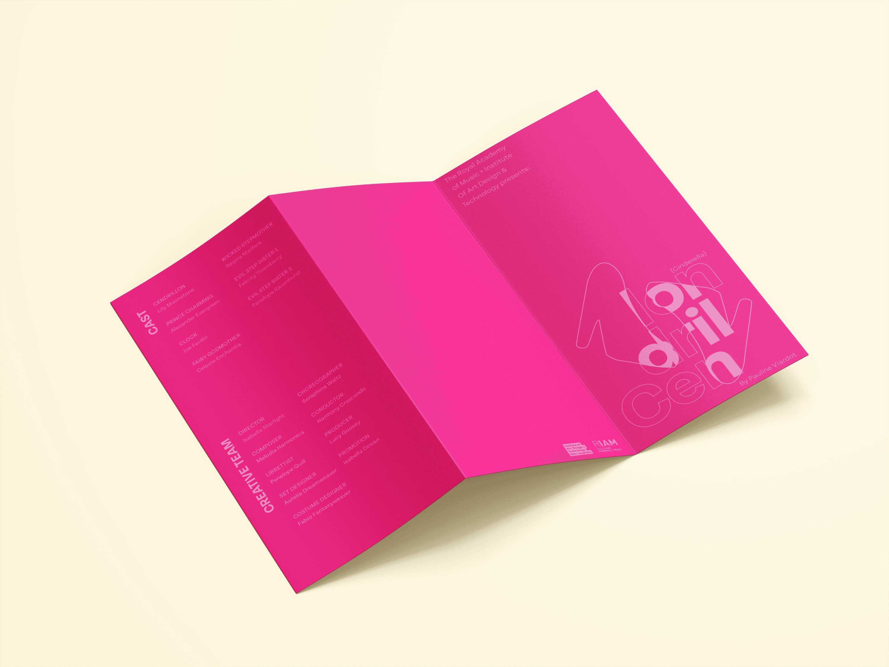
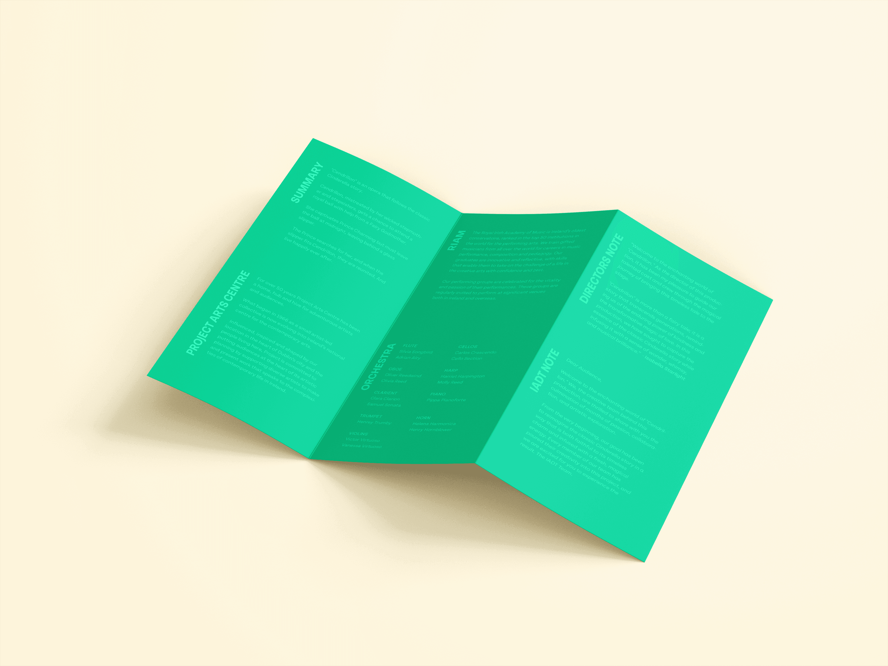
Based on further feedback from the client I took the iteration the client was drawn to and iterated the colour palette based on client feedback as they were looking for a modern/contemporary colour palette to reflect the RIAM production. Based on client feedback I elected to choose a highly saturated coloured palette with three distinct colourways for visual variety but also to reflect the three factions of characters in the Opera story Blue (Cendrillon) Pink (The prince) and Green (The Evil Step Mother) to highlight the silhouetted style of the identity.
06 / Print Artifact
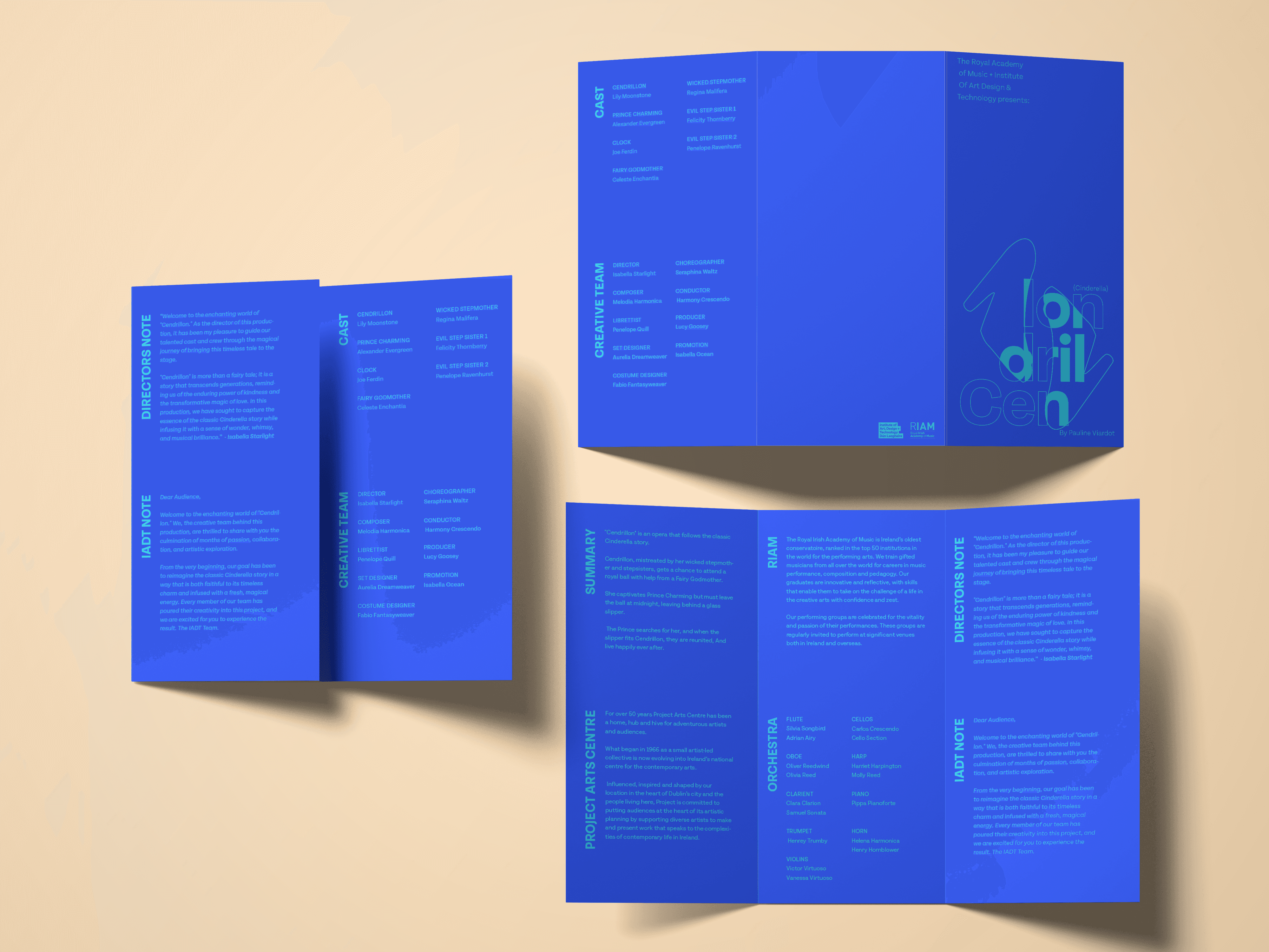
Artifact Planning
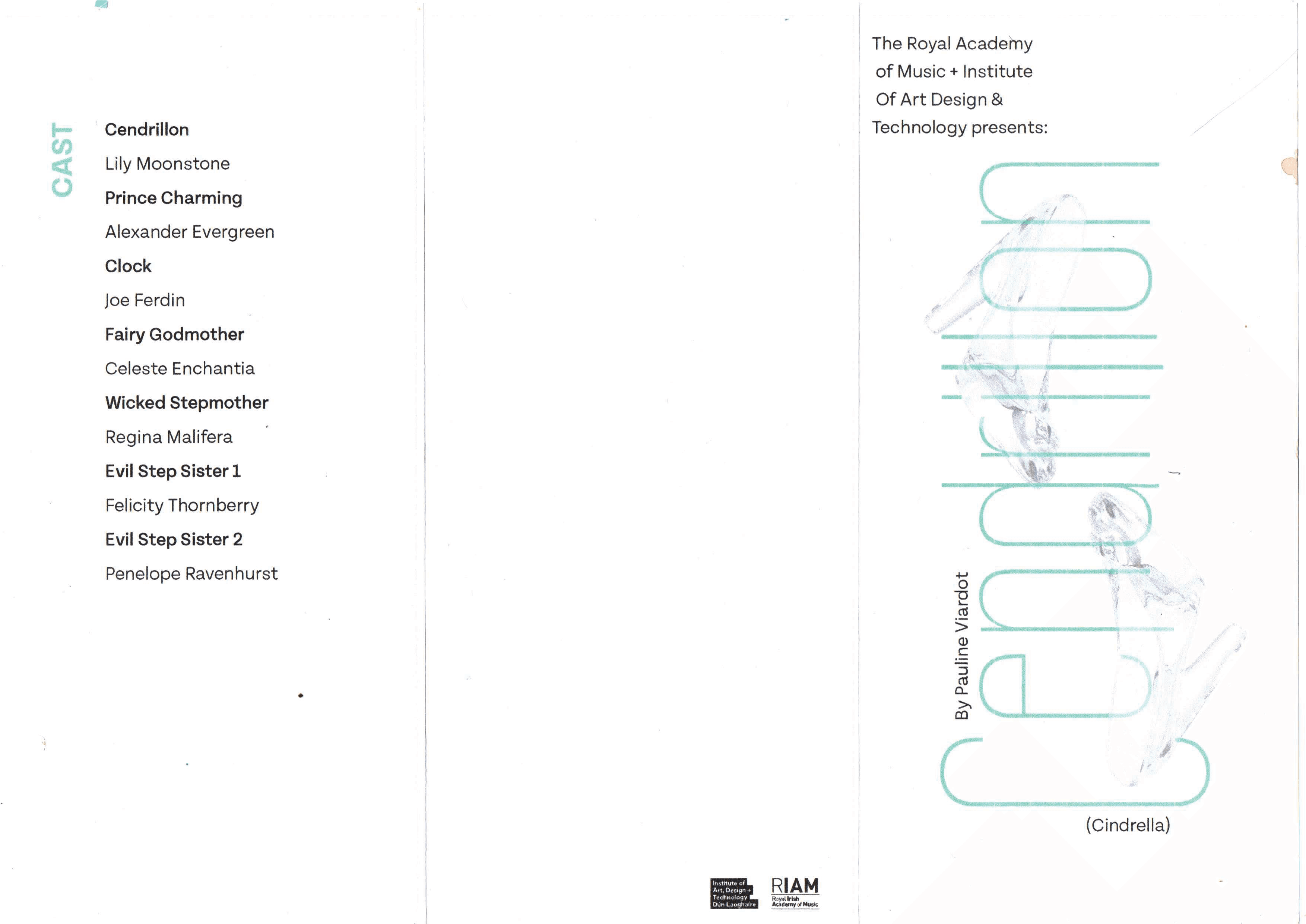
Part of the brief from the client was to develop and design a print opera program along side the posters. The Program needs to highlight key information and credits for the actors and production of the RIAM production.
Artifact Ideation
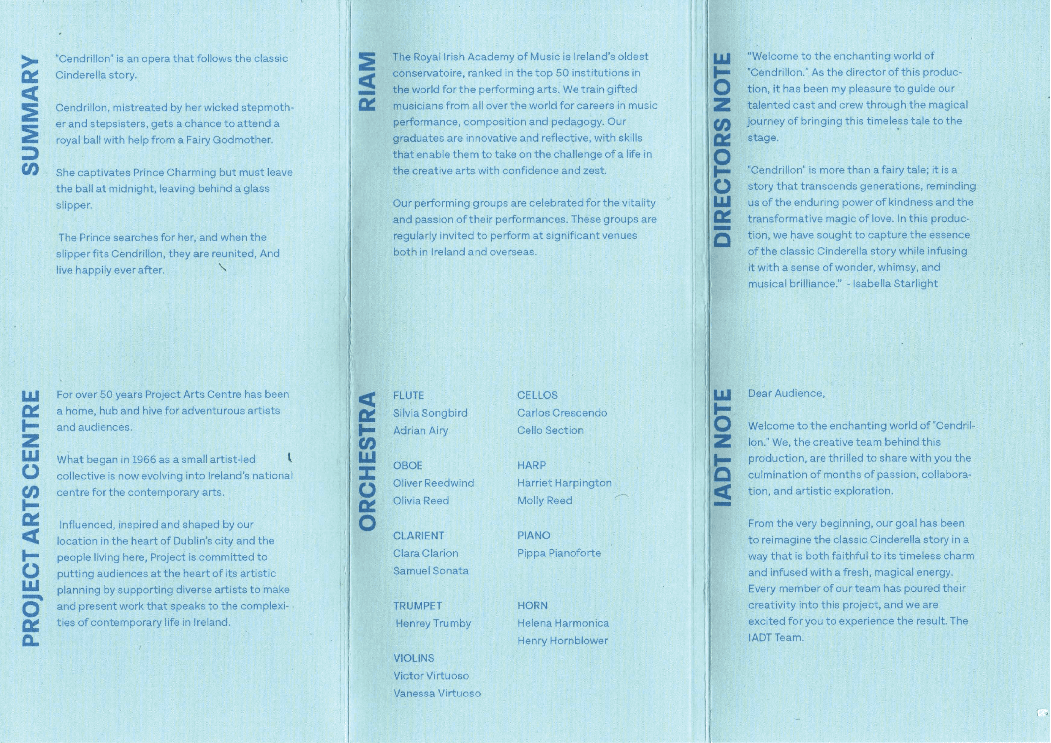
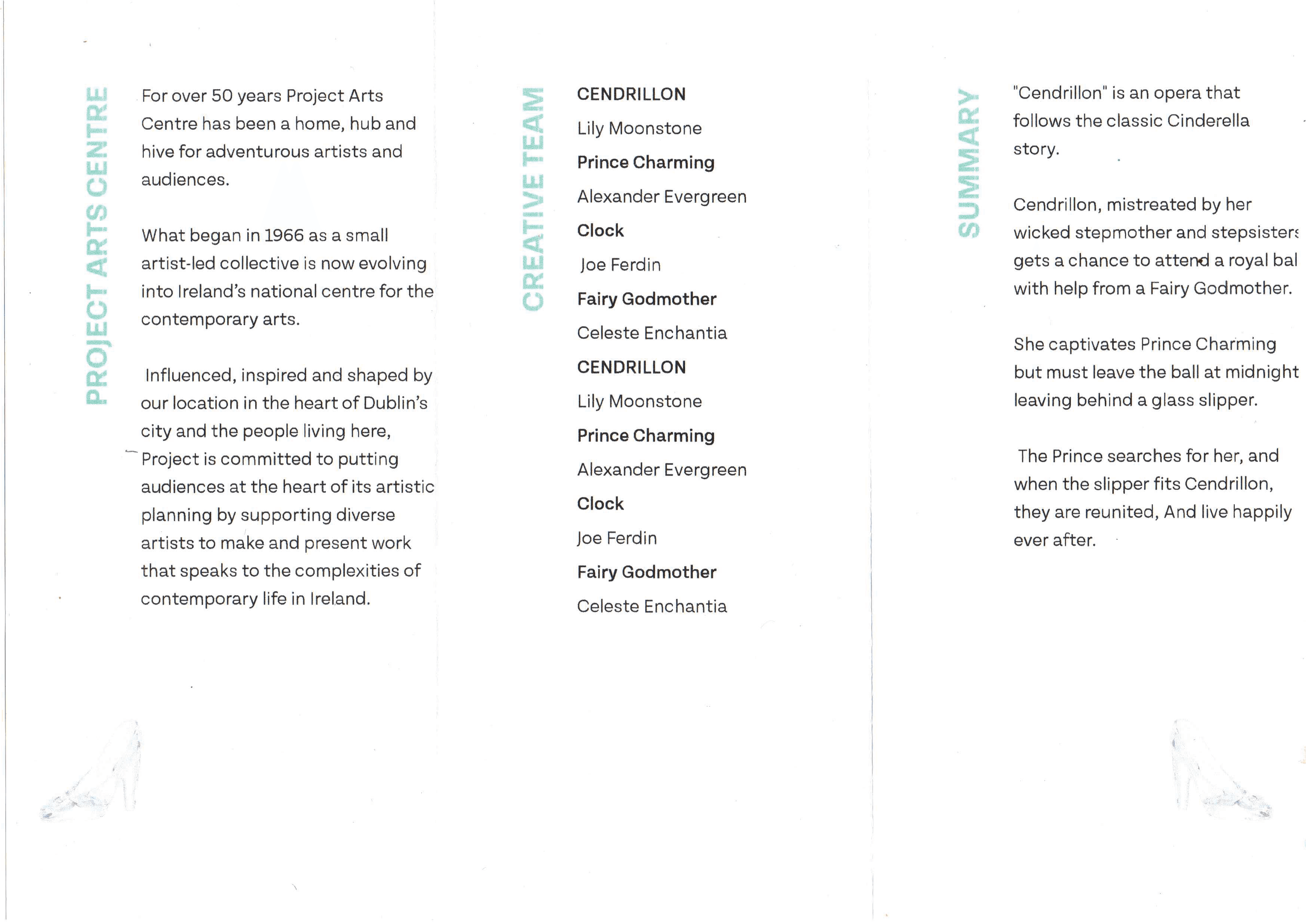
In terms of the program design my focus was on creating a clear visual connection between the poster and print materials that matched the visual identity created in the poster designs.
Program Iteration
In terms of the program design my focus was on creating a clear visual connection between the poster and print materials that matched the visual identity created in the poster designs. In terms of the information that needed to be in the program I wanted to design to keep the design minimal
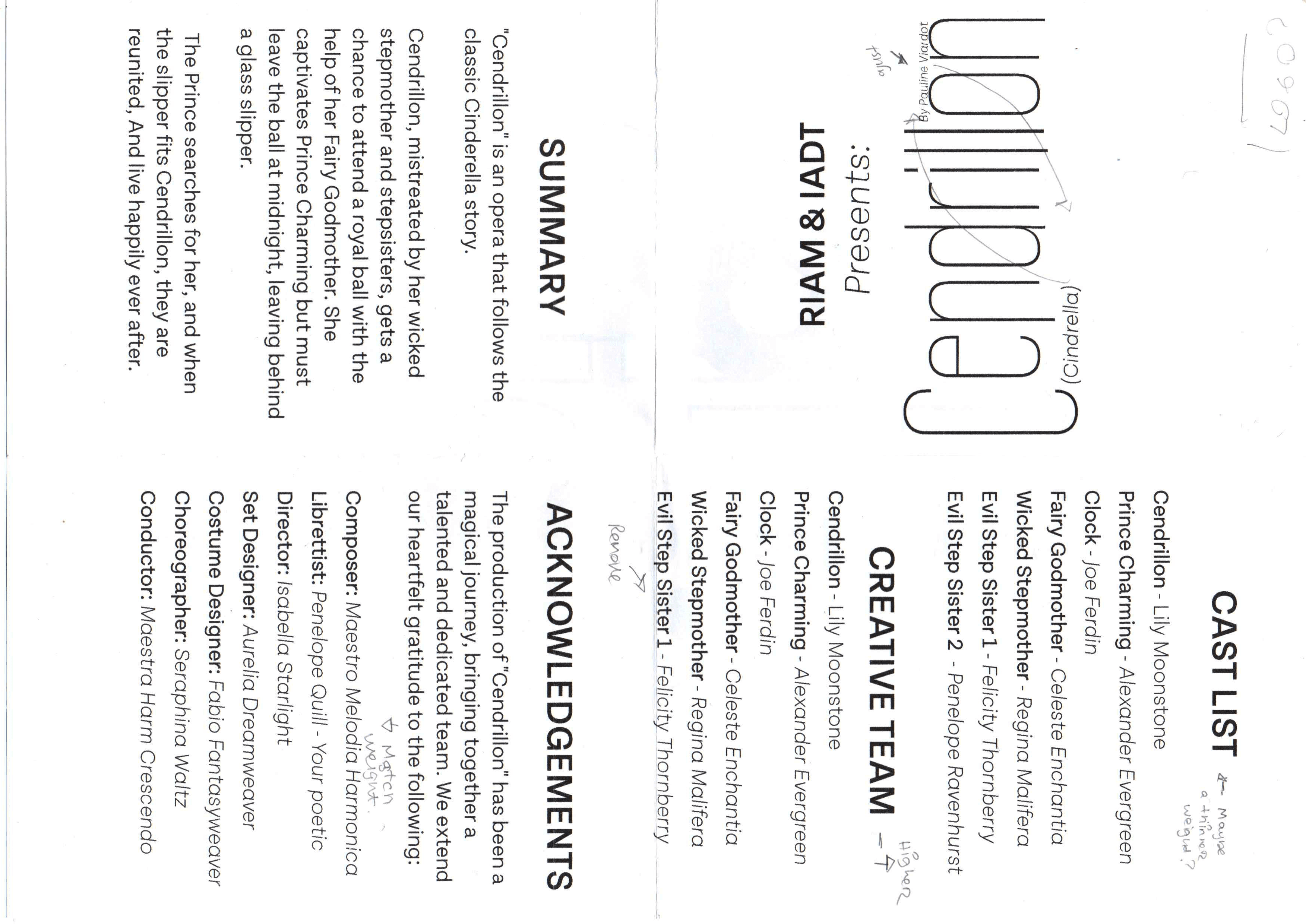
Final Program
The final program design incorporates the visual identity of the poster suite with the tricolour palette with three variants of the program for each colour. I wanted to keep the clean and bold identity when it came to the information in the program to keep consistency with the visual treatment of the inside of the program.
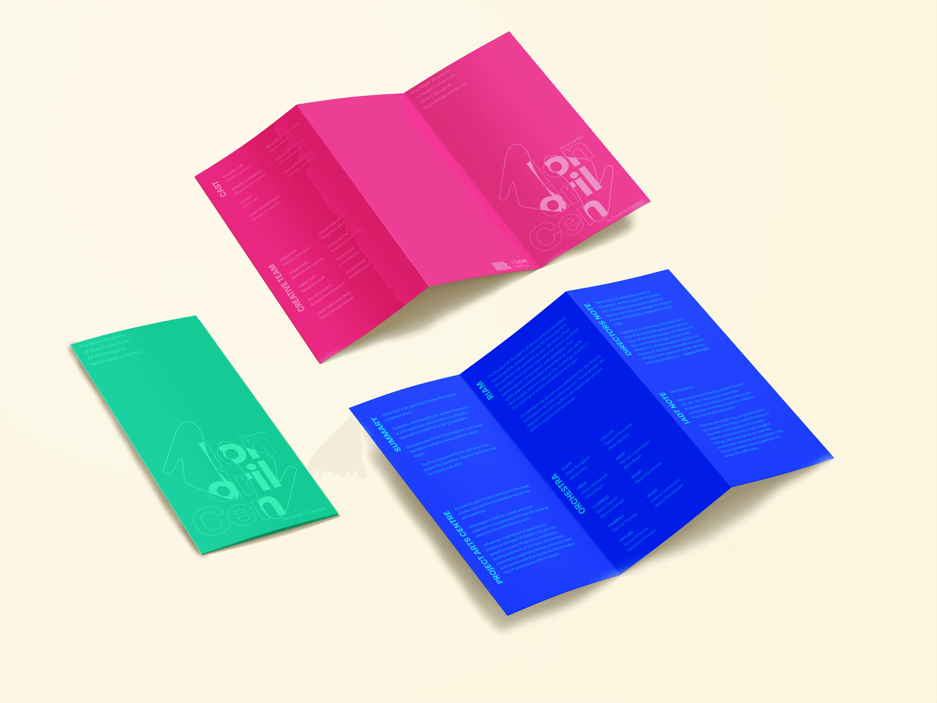
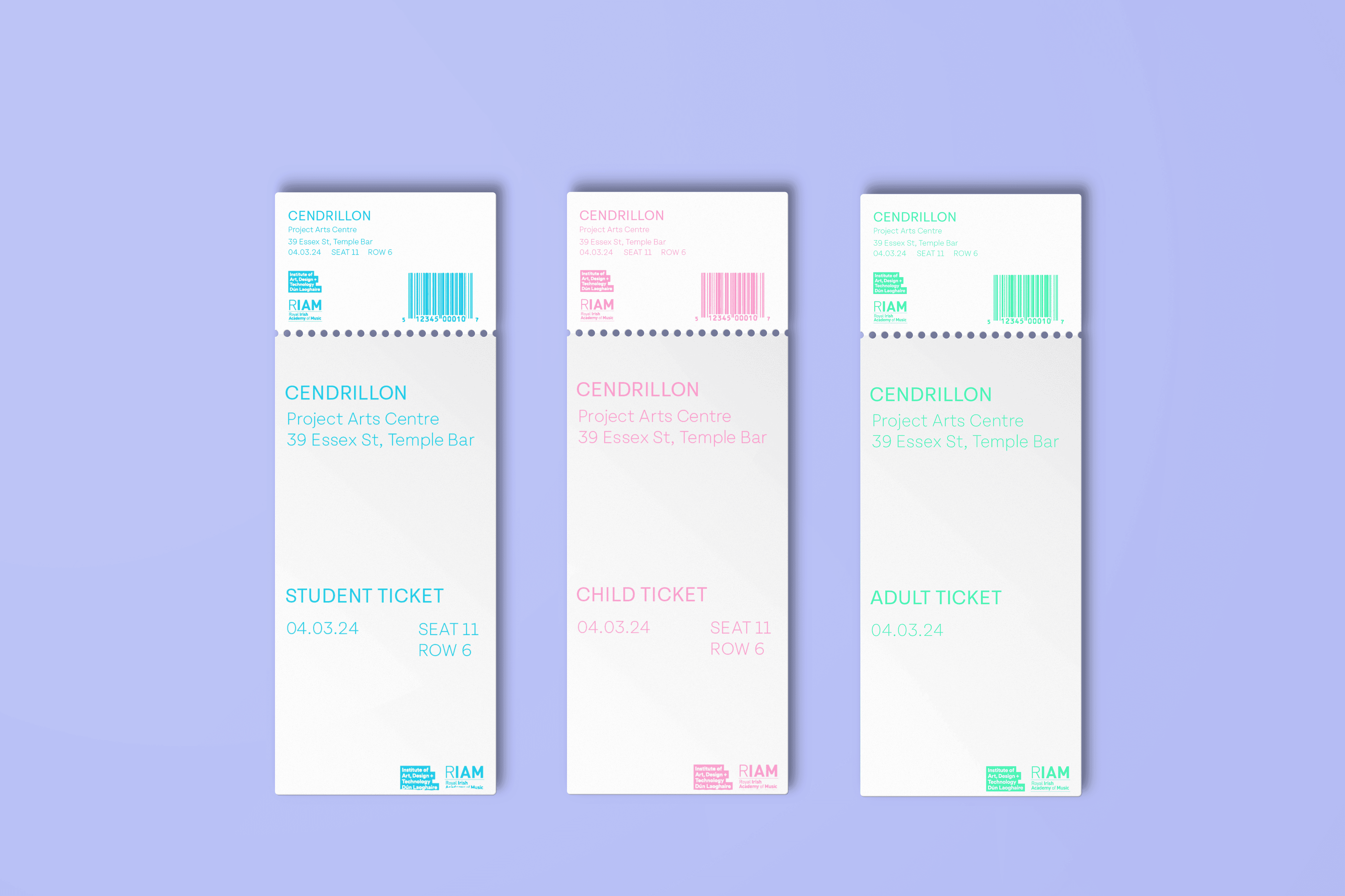
Ticket Design
As part of the print materials I also incorporated the visual identity for use in the ticket design as a tie in the RIAM production as an additional feature of the branding suite. I focused on keeping a cohesive visual identity keeping the three colourway palette and the type treatment with bold clean type and the shoe silhouette as the main focal image.

Results
Final Results
Designed a bold, modern and attention grabbing brand identity that answered the clients brief for their Opera production of Cendrillon.
Designed a poster suite with a unique and distinct visual treatment with a point of difference to catch new users attention.
Designed an Opera program with cohesive branding to the poster suite to create a die in brand system.
Designed an additional ticket design cohesive to the existing brand visual identity.
Designed a strong, clean, modern cohesive brand and visual identity suite for the client needs for their Opera production to attract new users and increase ticket sales.
Next Steps & Reflections
Next Steps
For the next steps of this case study, I would expand and focus on creating a social media campaign that utilizes the visual language developed for the Cendrillon branding. This would include a range of motion pieces that incorporate the design elements established in the poster series, using the iconic slippers in creative and intriguing ways to spark interest in RIAM’s production of Cendrillon these would be used to promote the production on platforms like instagram and tik tok.
I would also develop merchandise for the RIAM production, which could be sold or distributed during intermission as a way to further promote the show and increase audience engagement and support.
Reflections
Reflecting on this brief, I believe the programs are lacking and could use additional iterations in how the information is presented and laid out. I received feedback to the same effect. This brief was on a short deadline only being three weeks. The program didn’t get this extra iteration time due to this time constraint.
Having extra time I would also have liked to create more motion promotional visuals for the production campaign as this feels missing from the promotion suite. The tickets designed for the production also need refinement as they didn't go through enough iteration.