CASE STUDY 02
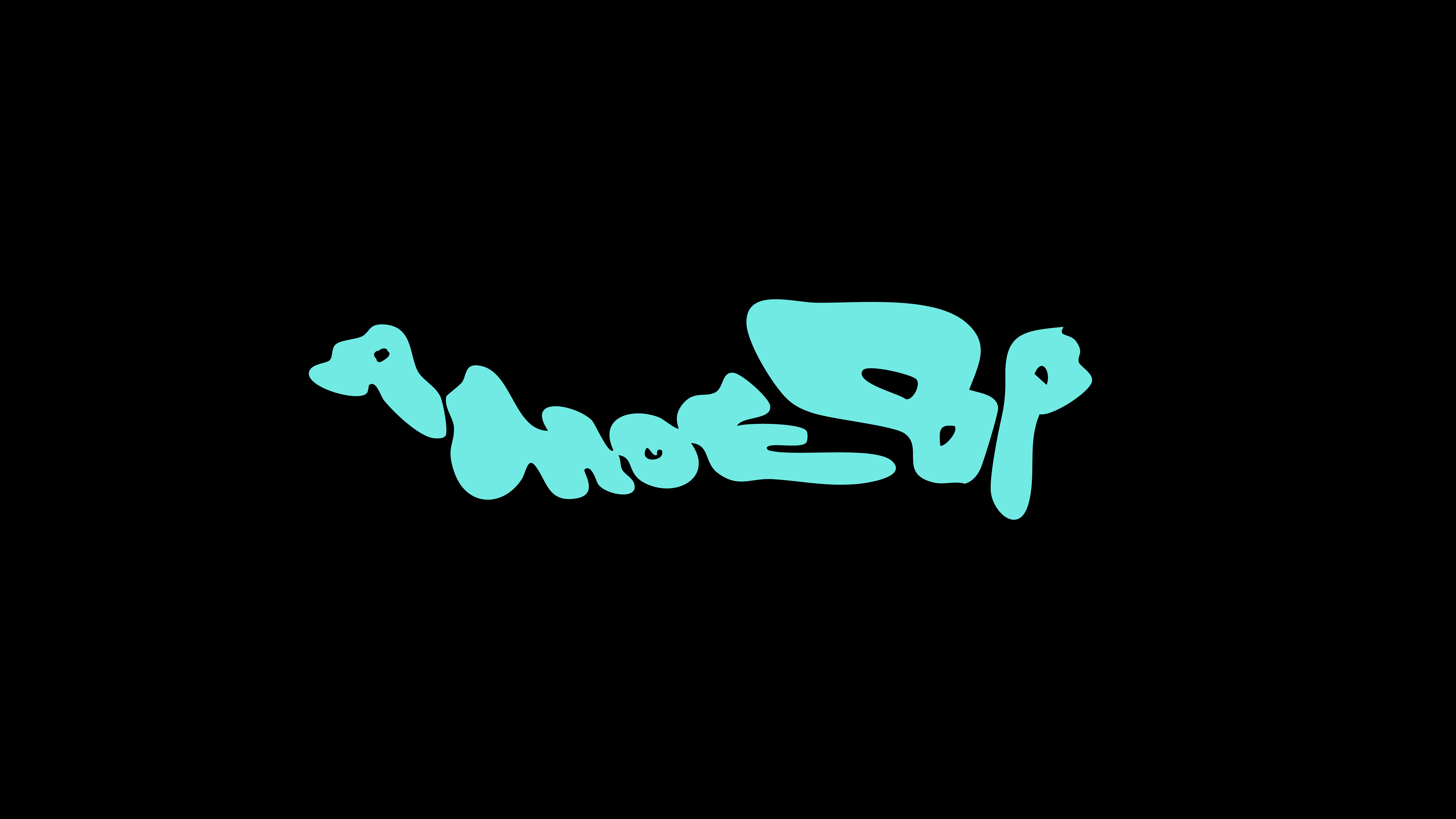
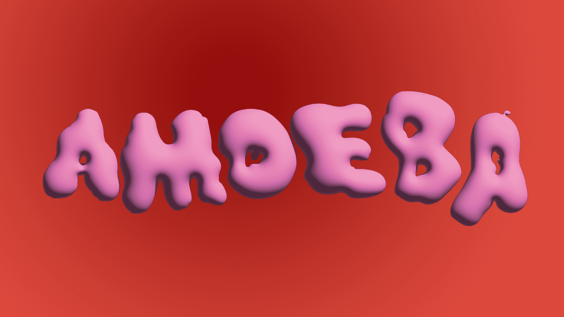
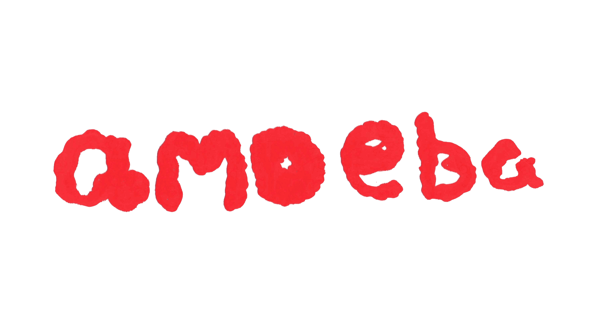
Amoeba
Project Overview:
Amoeba was a client-led promotional project for a psychological short film, focused on translating the film’s narrative and emotional tone into a cohesive visual system. The brief required the creation of a title sequence alongside supporting print and digital assets that aligned closely with the director’s vision.
Working to defined requirements and feedback, I designed a title sequence, poster, print artifact, and microsite, ensuring consistency across motion, print, and digital touchpoints. This case study demonstrates my ability to work from a client brief, interpret abstract themes into clear visual outcomes, and iterate based on stakeholder input.
01 / Setting the scene
Task
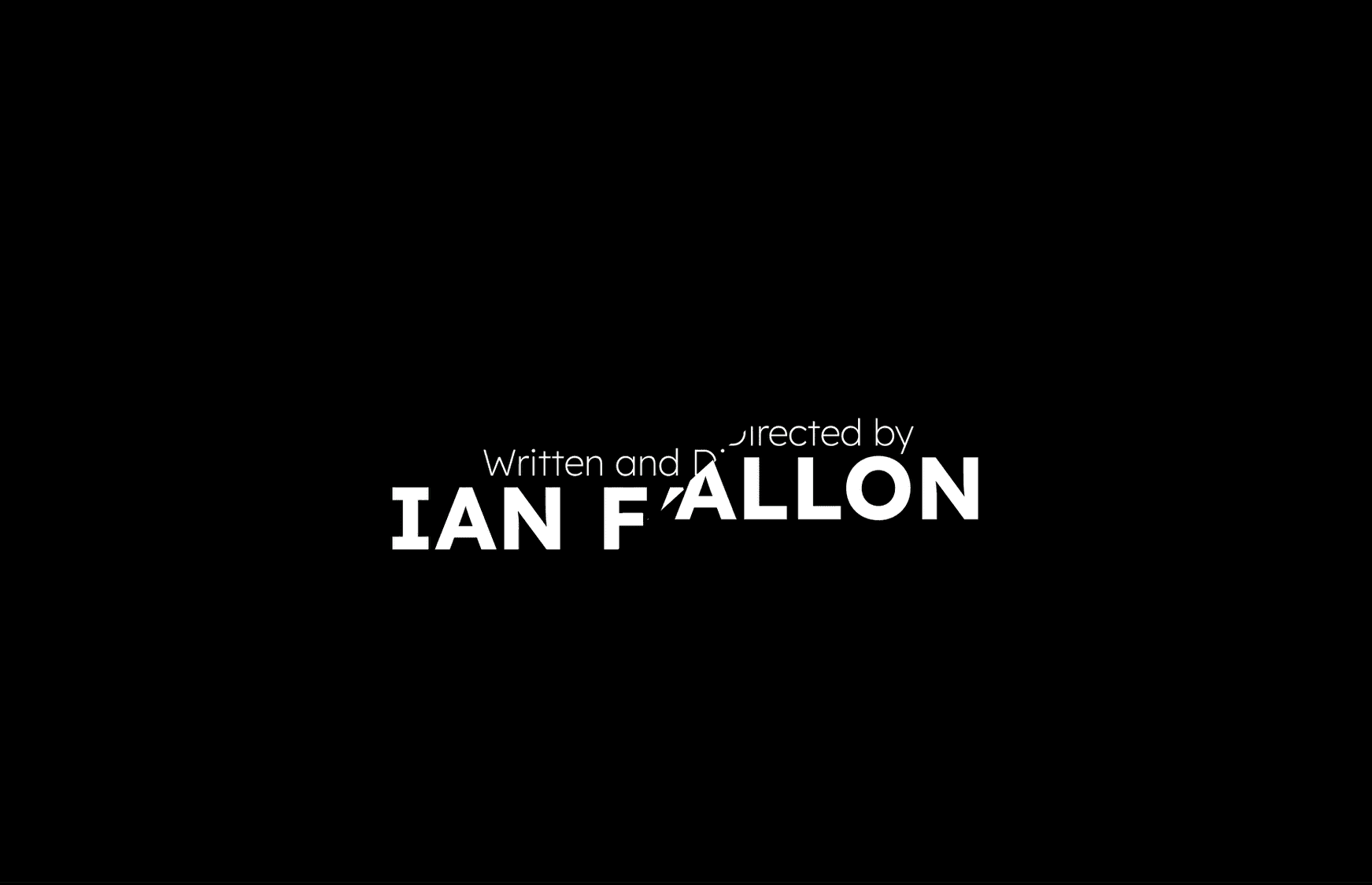
Design an opening title sequence and promotional campaign for the short student film Amoeba by Ian Fallon graduate of The National Film School (NFS) Ireland IADT.
Background
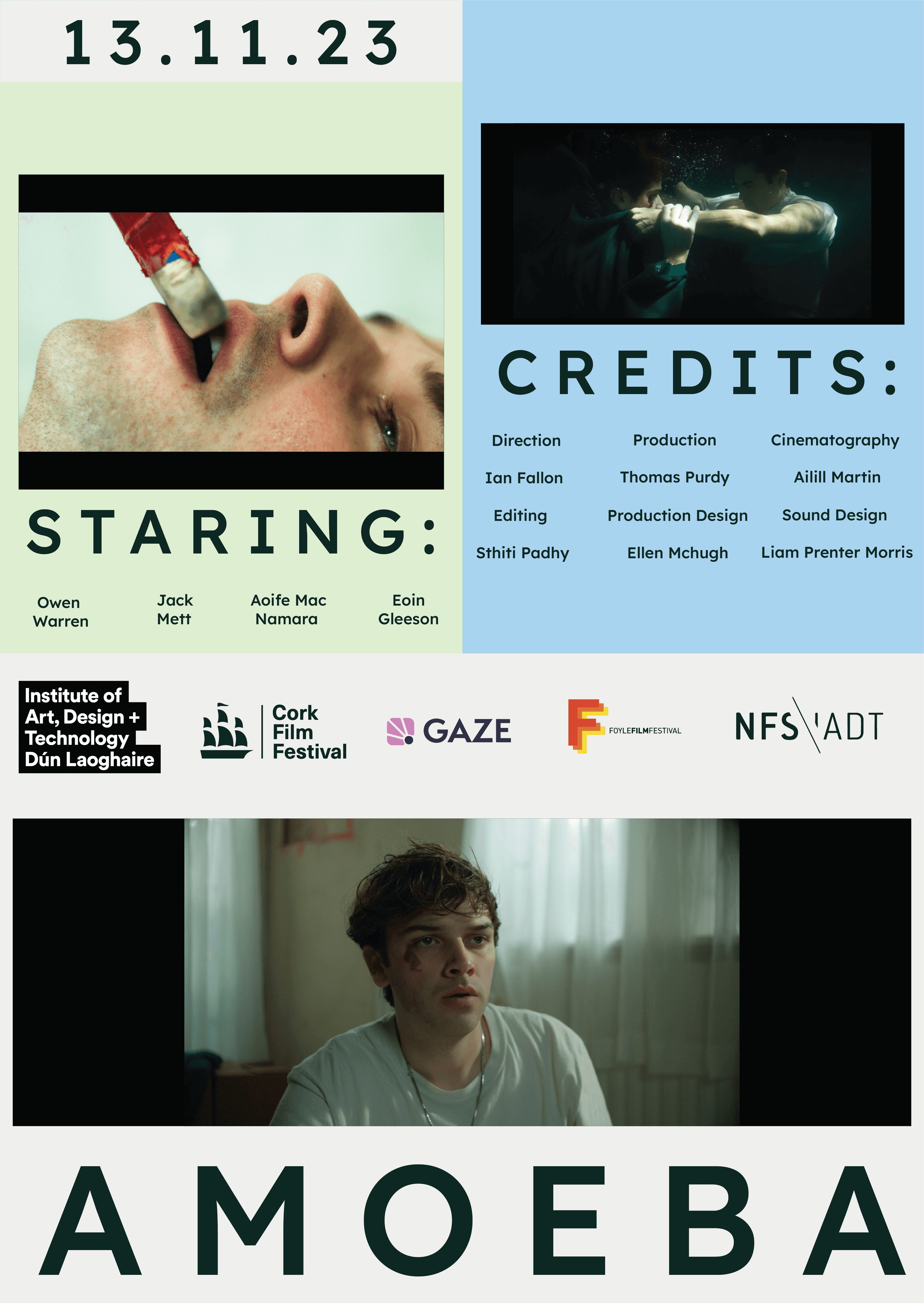
Amoeba is a romantic turned horror film about a young queer man Levi, After he survived a brain eating parasite, Levi is invited to his secondary school crush Roan’s house for the weekend. Waking from an intoxicated night of reconnecting, Levi becomes convinced Roan kissed him. As Levi seeks the truth of what happened that night, his grip on reality loosens. The film is a manifestation of Levi’s reality as it falls apart and is taken over by the brain eating Amoeba and his obsession and feelings for his school crush become overwhelmingly dangerous.
Timeline
From the initial briefing with the client, to a midway client critique and feedback to final outcomes this project had a time line of 6 weeks.
02 / Research & Brainstorming
Research & Planning
I began by reading and analysing the script of Amoeba, identifying themes and the plot including the crucial plot points as well as the characters’ themes and motivations. I also did this to identify key metaphors and props on the film as elements I could incorporate into the title sequence.
03 / Ideation
Secondary Research
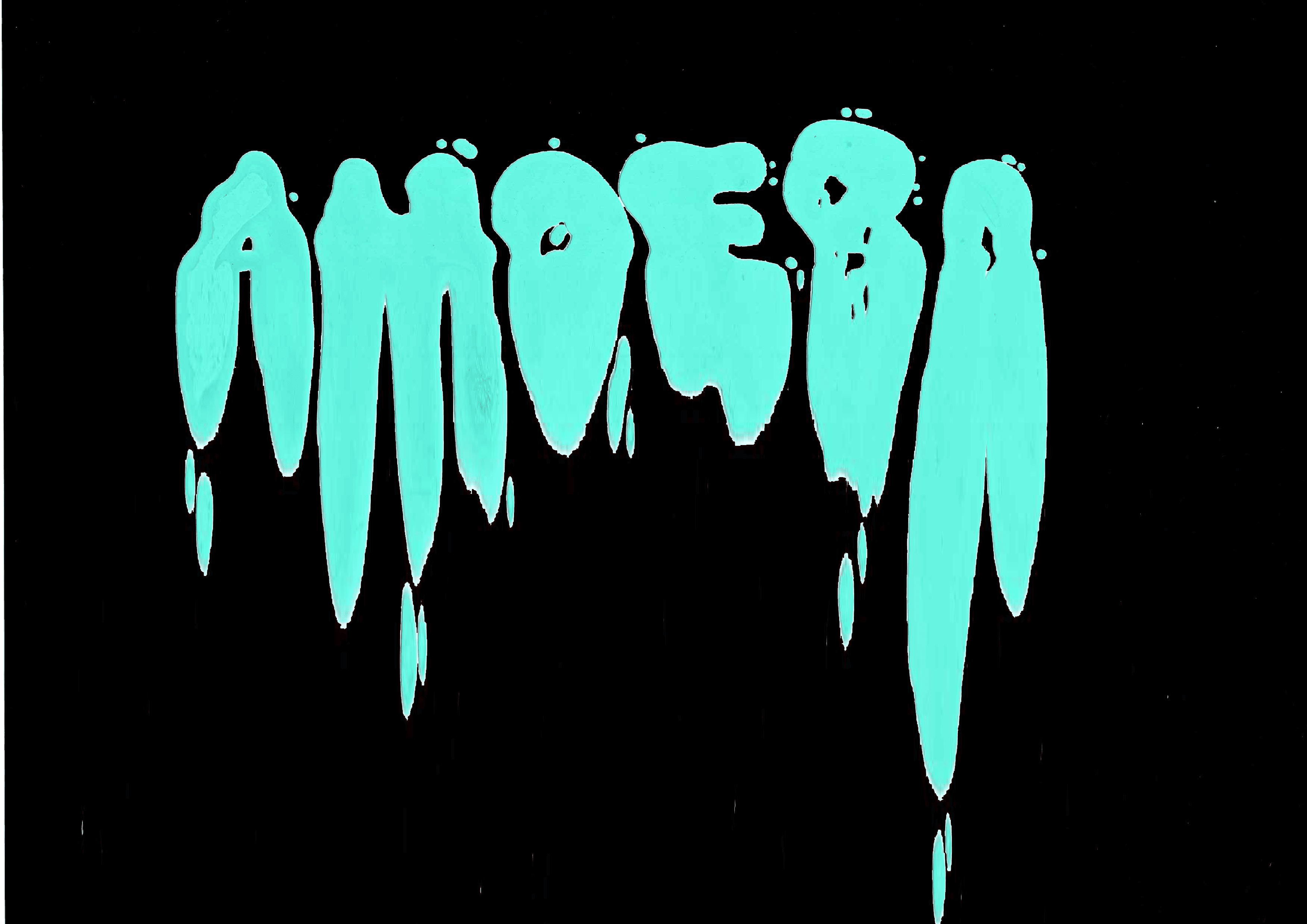
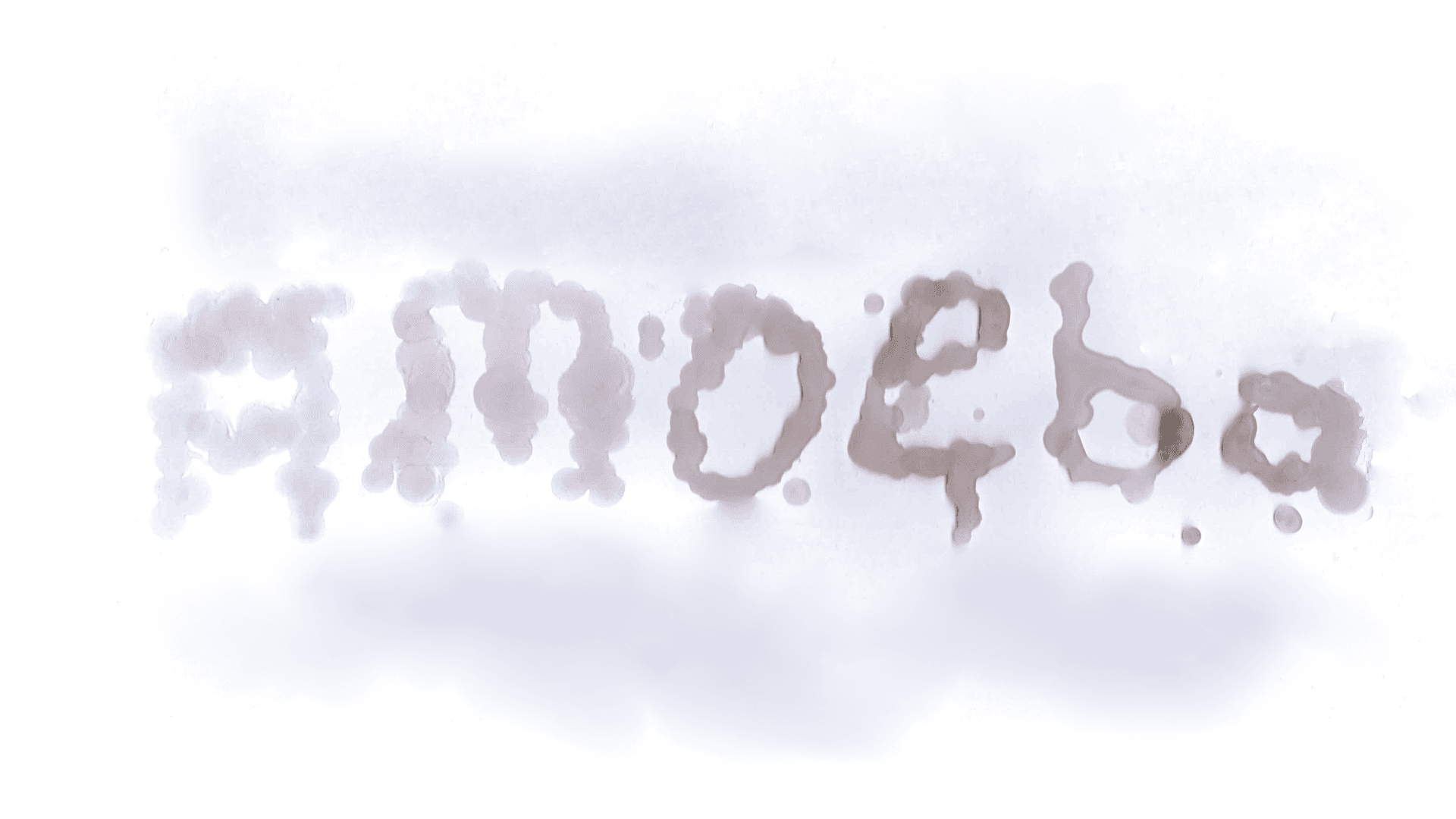
Using this analysis and themes Identified from the script, I gathered imagery and secondary sources that would convey the tone and visual style from this examination. I aimed to convey insanity and mental deterioration with a darker tone and the feeling of being consumed like an Amoeba.

Initial responses
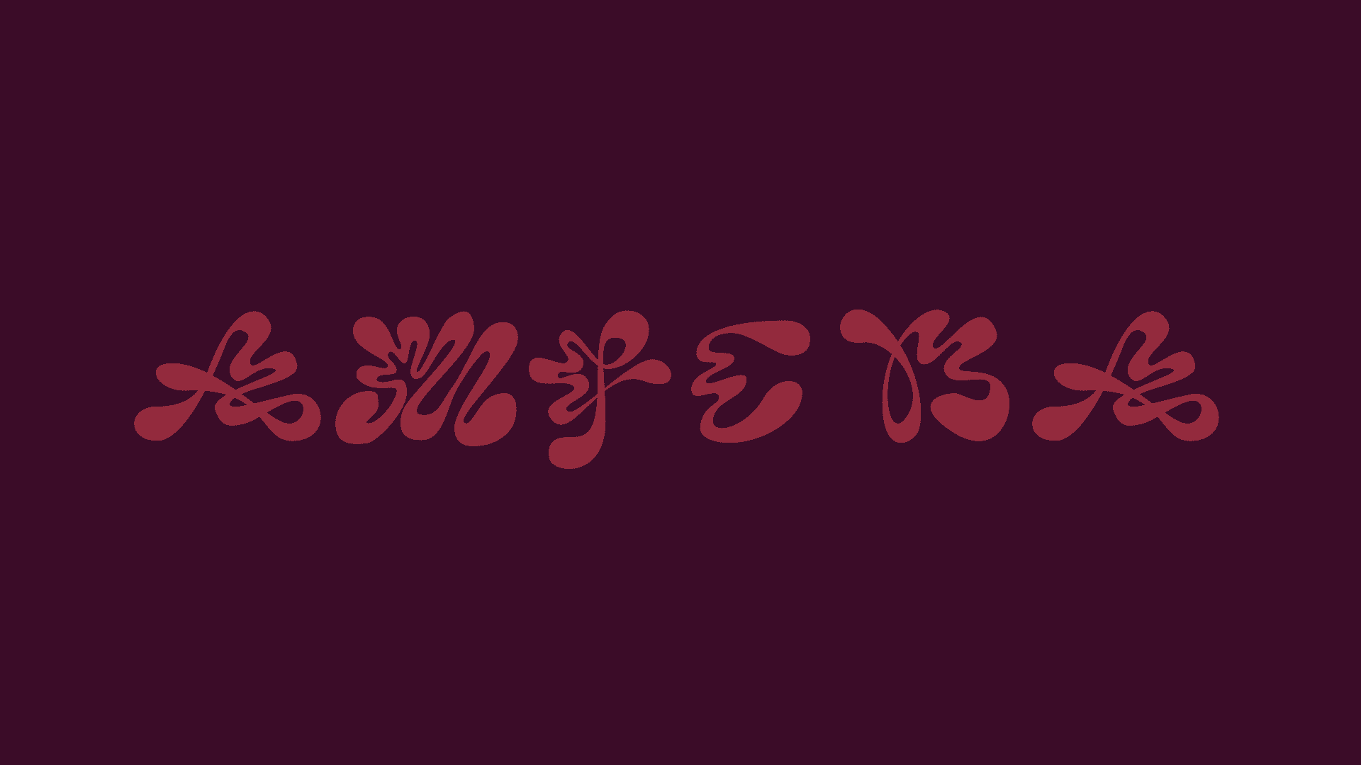
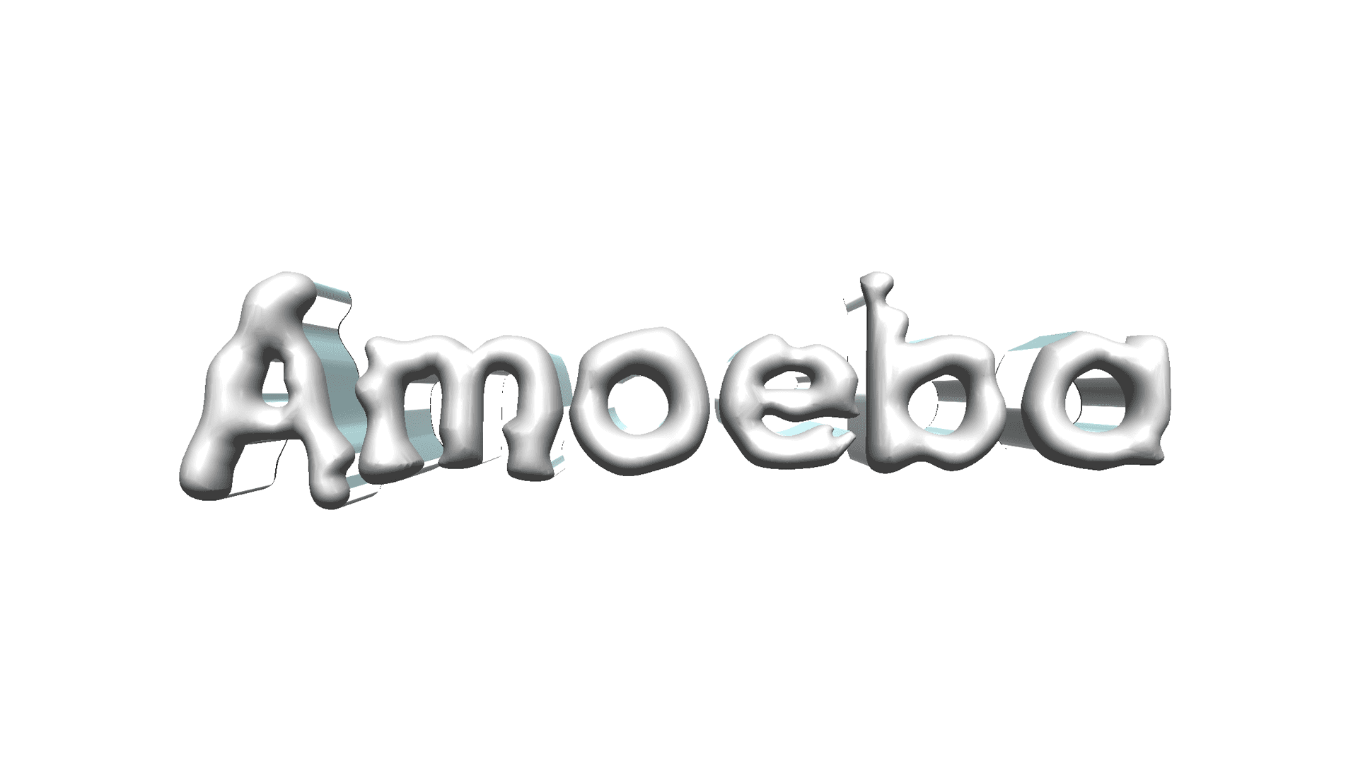
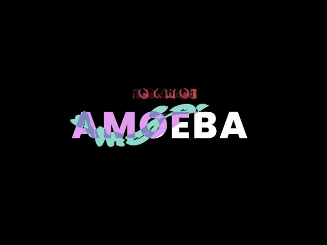
Inspired from the script analysis and mood board I made responses that used unconventional shapes and letter forms to create a visual language that was out of the ordinary to convey madness or losing touch with reality. My aim was to make visuals that had a sinister tone of voice and visually
04 / Iteration
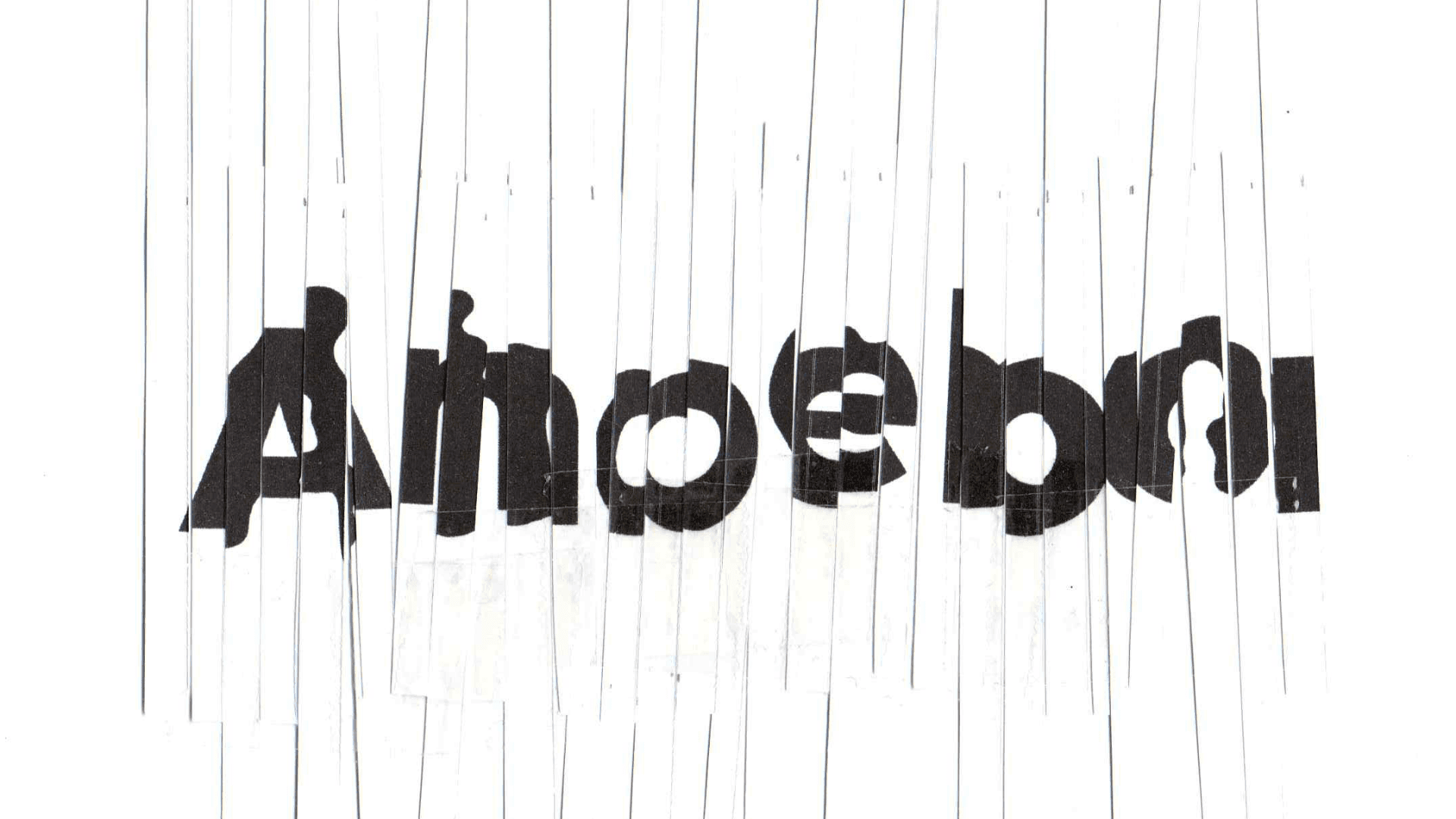
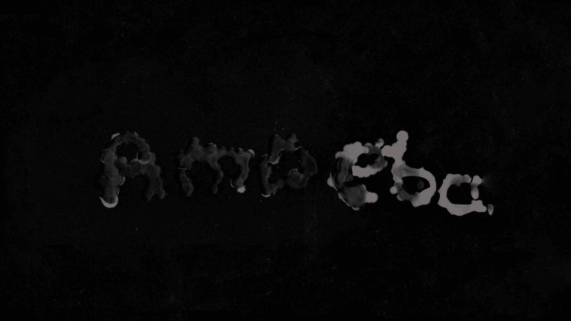
Iteration
I experimented with different mediums such as candle wax and slicing and cutting up paper as a method to create organic and disturbed visual responses. I wanted to create organic shapes and random cuts and slashes to give a tone of unease or something being off as part of the visual language to echo the losing touch with reality themes that had been established from the script analysis.
Further iteration
Taking the initial handmade responses that I had created, I iterated these elements and brought them into a digital space to expand on the visual variety of the elements using many typefaces and forms as a point of view to create many realities or tones of voice to communicate the concept of being unsure of reality. My aim was to convey this through a wide variety of visual treatments.
Motion Development
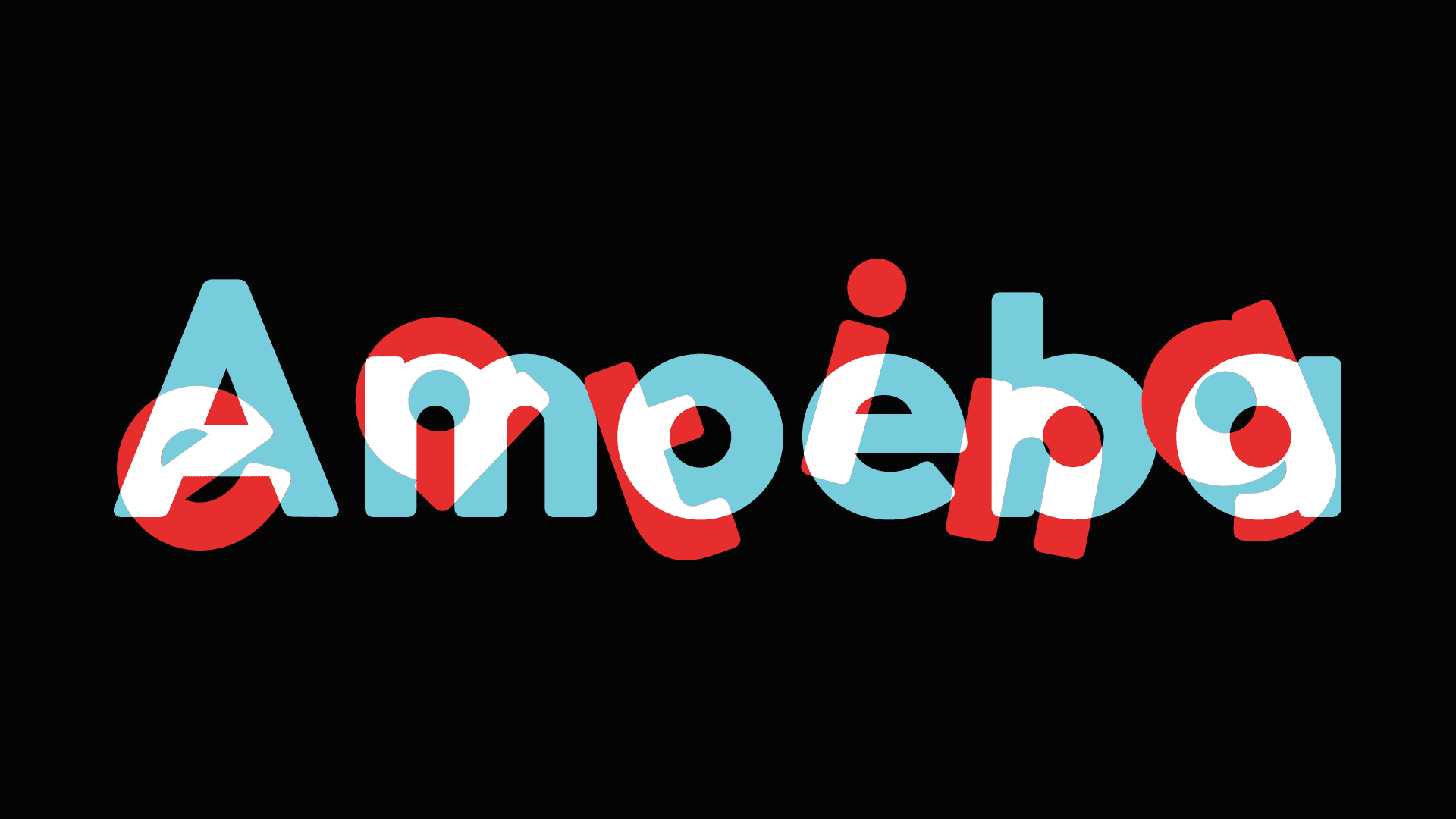
I experimented with layering these visual elements and flashing them one after another and weaving them together using organic and rigid shapes to create an unstructured strobe effect that would leave the use r with a sense of uneasiness to convey a distorted reality.
Client feedback
Feedback from the client while they like the tone of voice and visual treatment alongside the sense of uneasiness. The client found the fast paced cuts with changing bright colours and shapes to be overstimulating and not in theme with the vision they had for the film. And thought the visuals could be paired back and lean towards a more consistent colour palette.
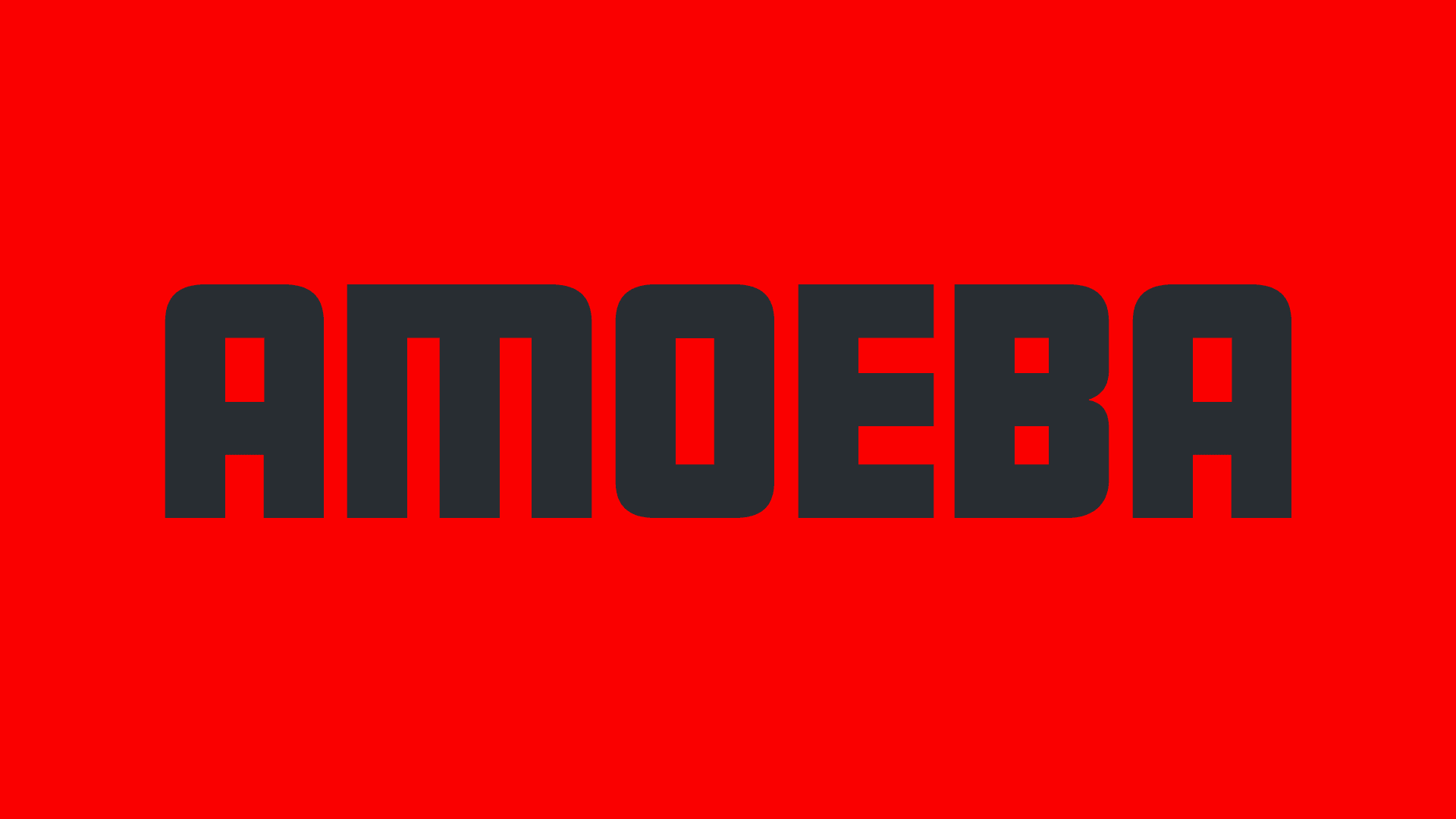
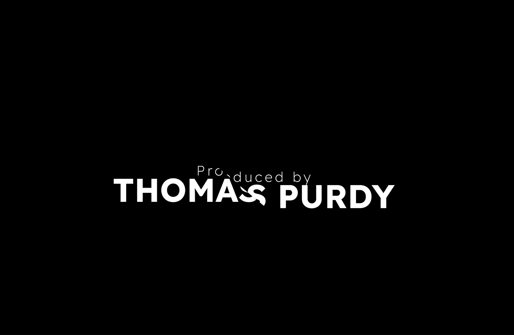
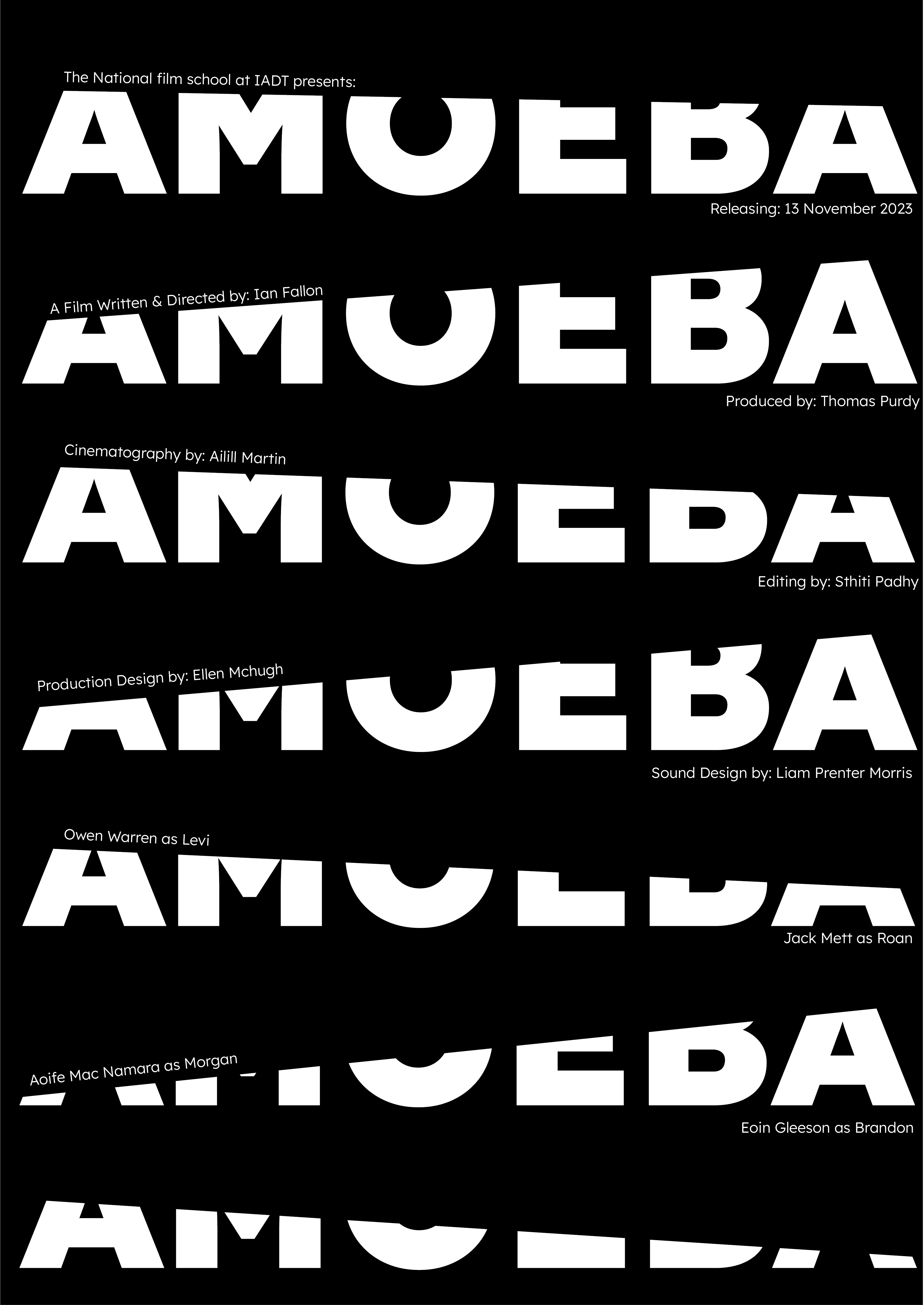
05 / Motion
Final Iteration
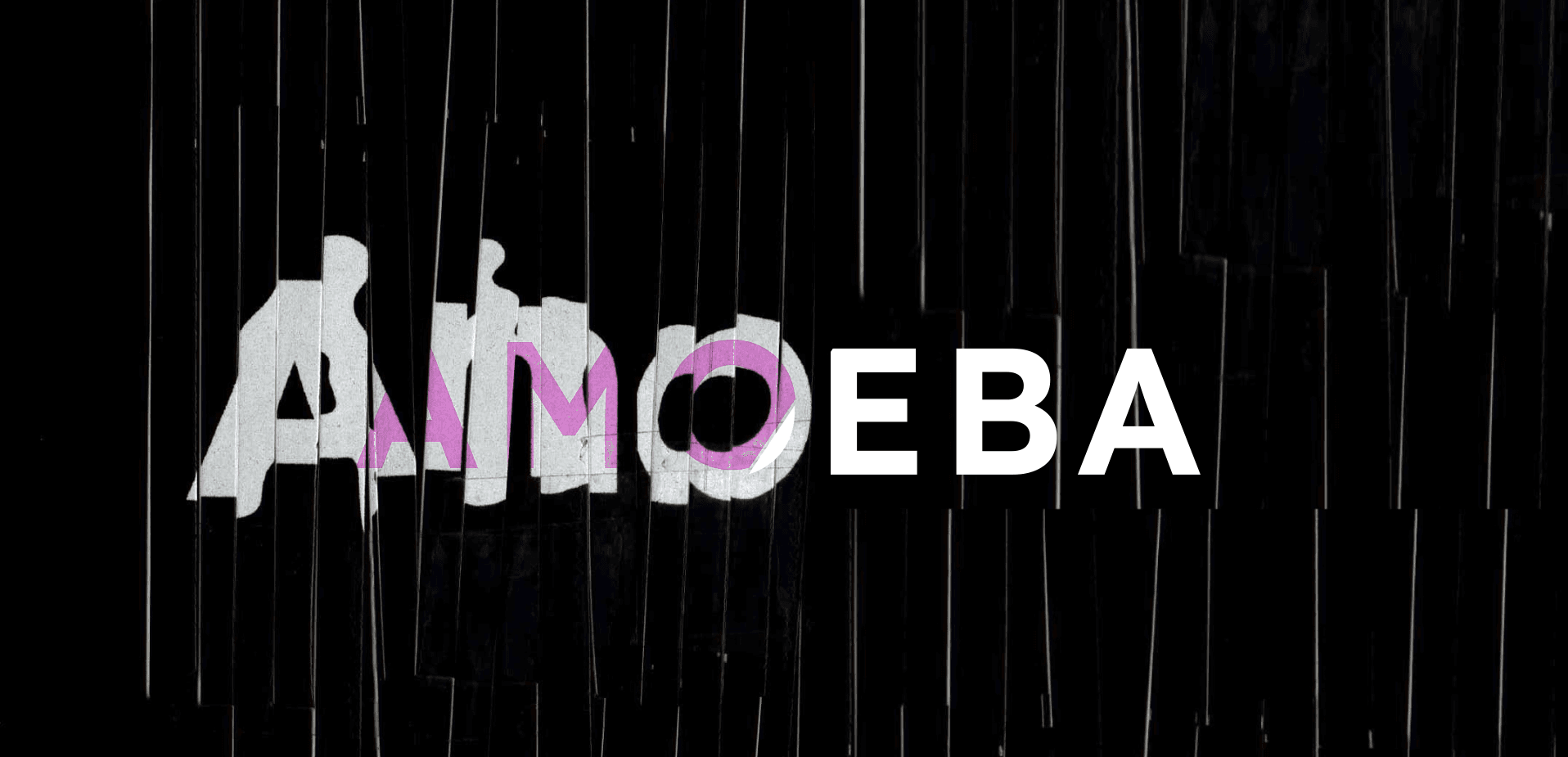
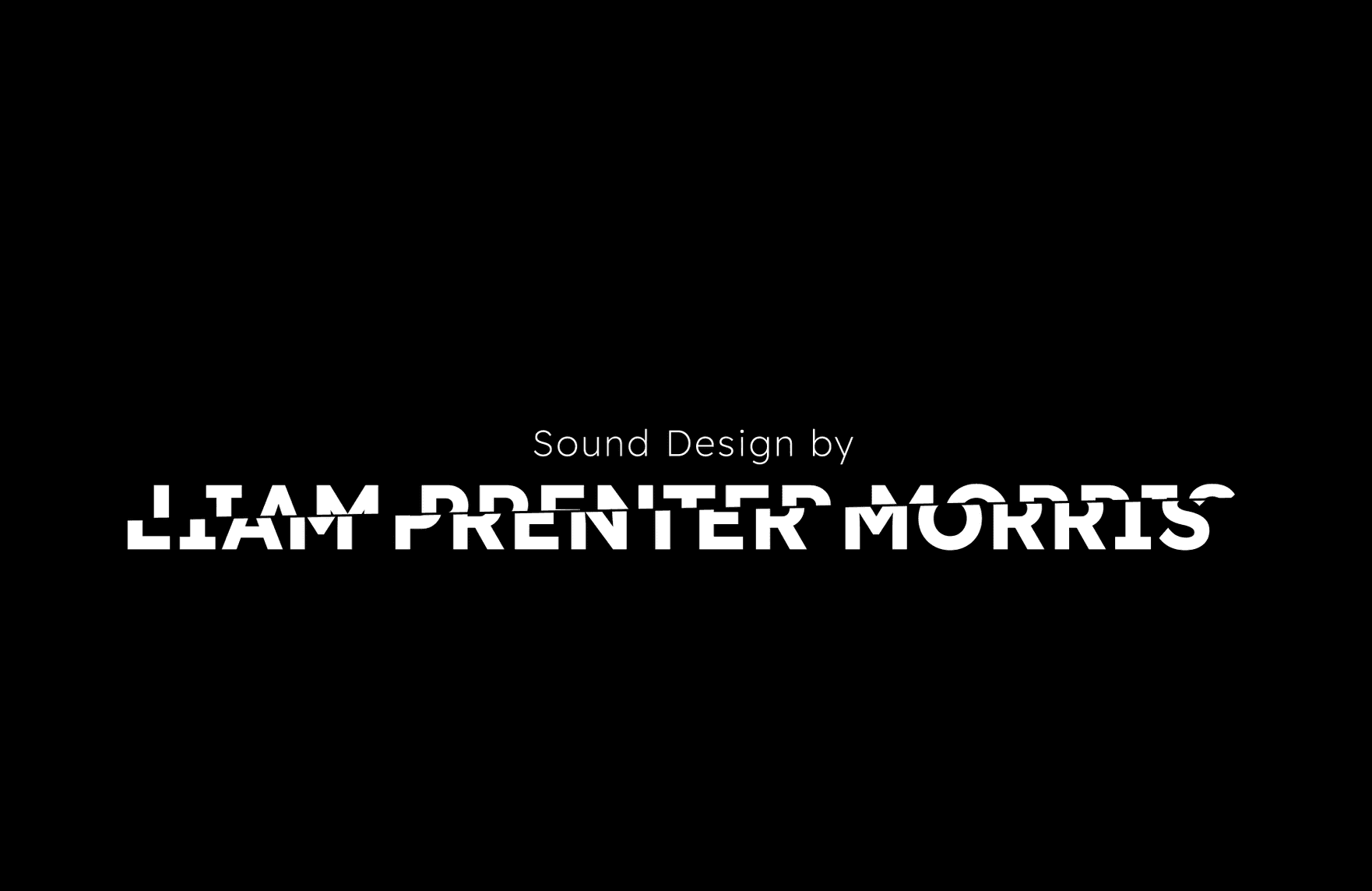
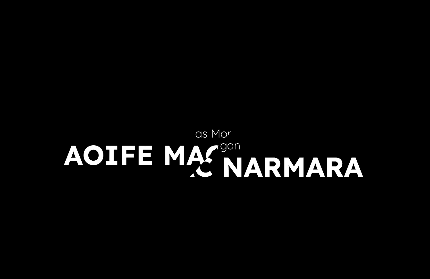
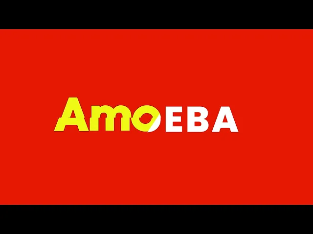
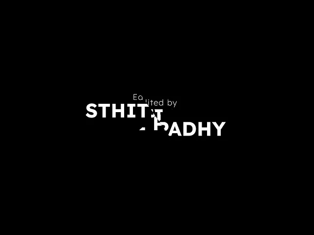
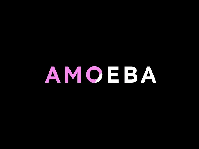
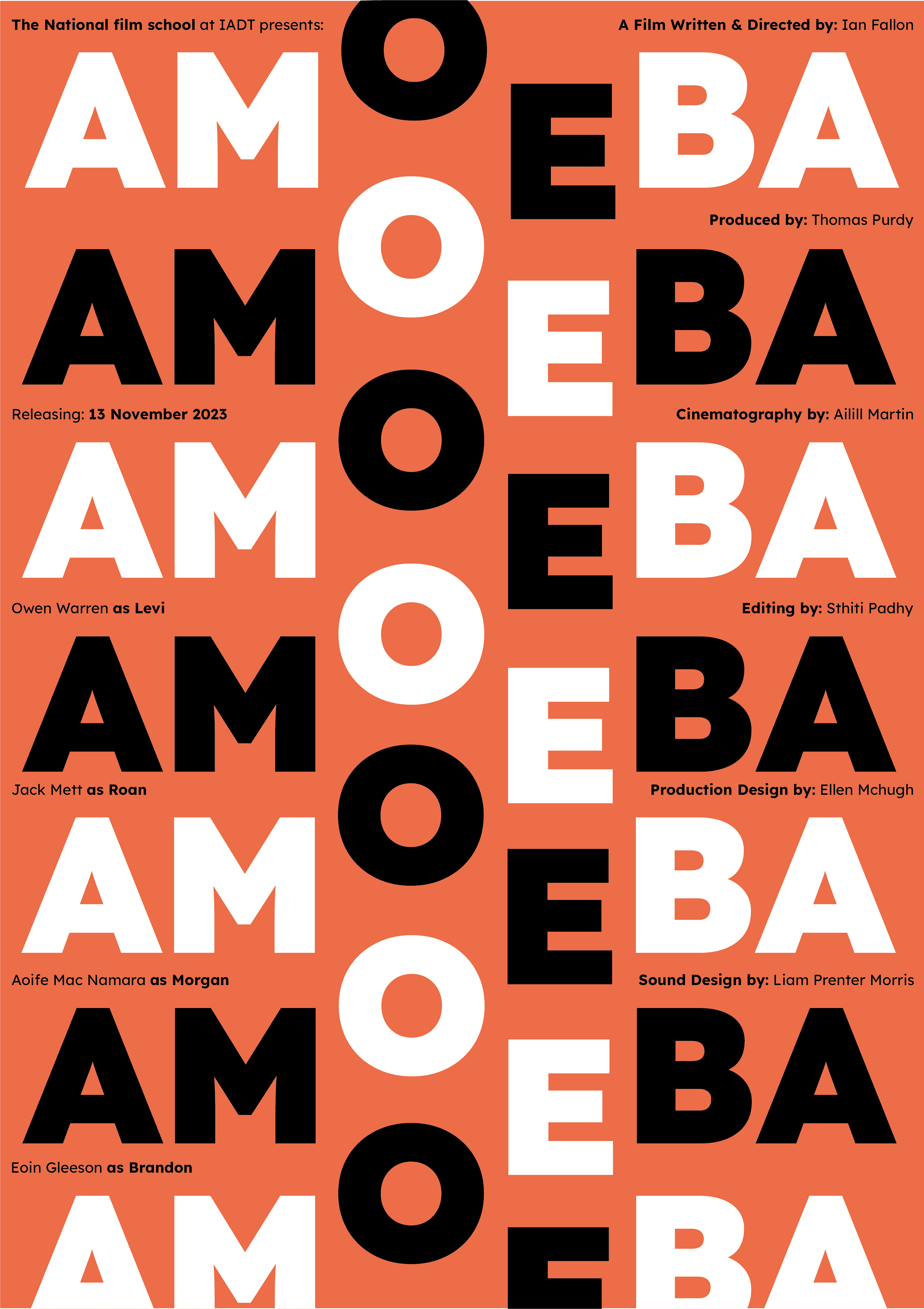
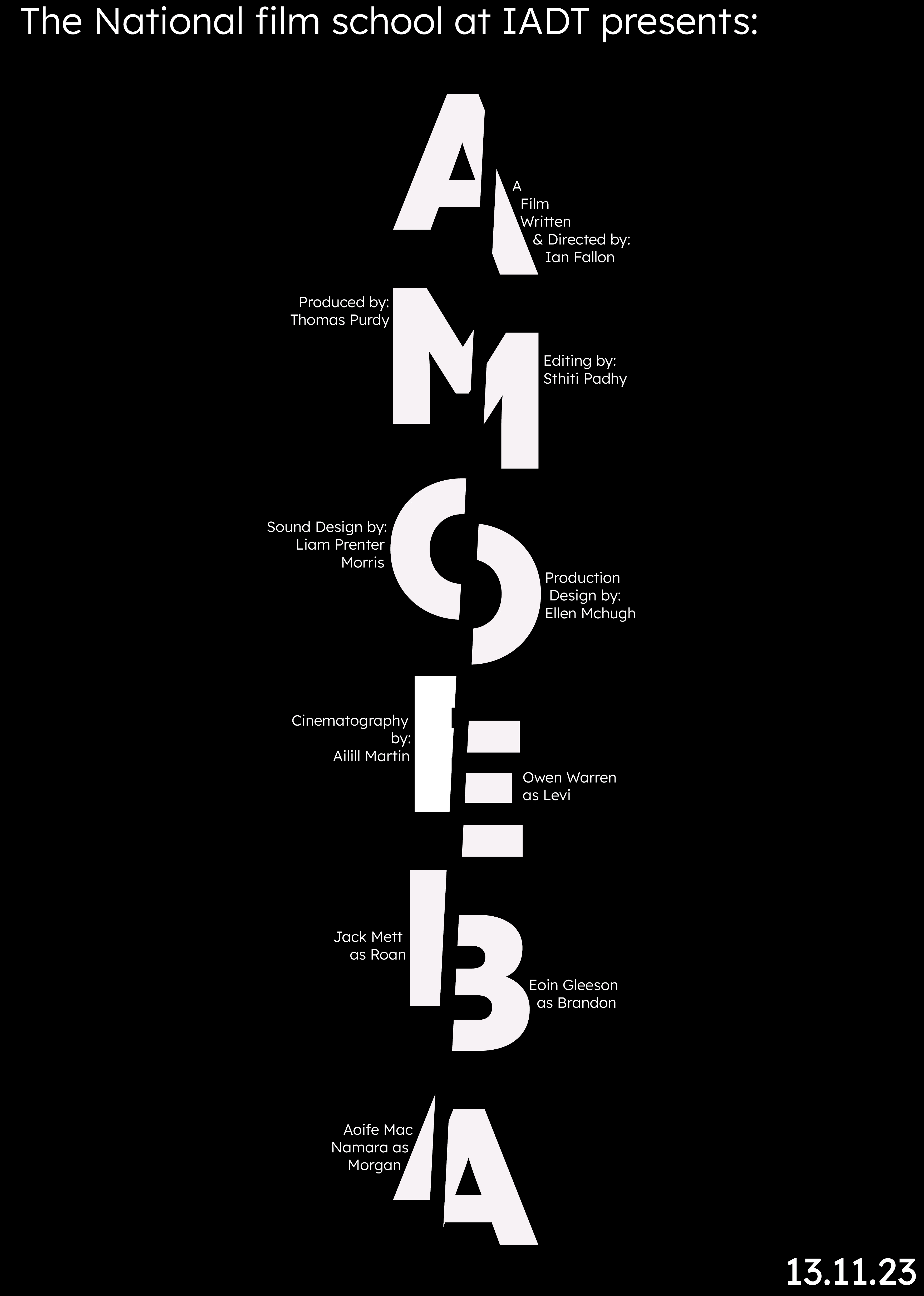
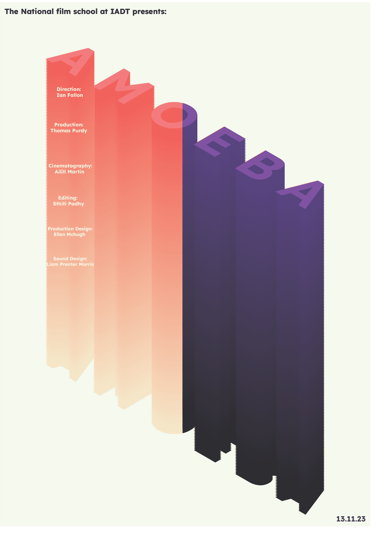
I paired back the many colours and visuals from the previous iterations to create a more streamlined visual language and finished the product in line with client feedback. Mainly using black, white and a strong accent colour and interesting type form I created a high contrast look for both readability and impact
The final sequence incorporates glitching like jump cuts, and interweaves slashing and shifting pieces of type and credits of the credits to echo the changing perspectives and perceived truths of Amoeba. The high contrast colours and tone also mirror these elements used in the film.
06 / Print Materials
Program Planning
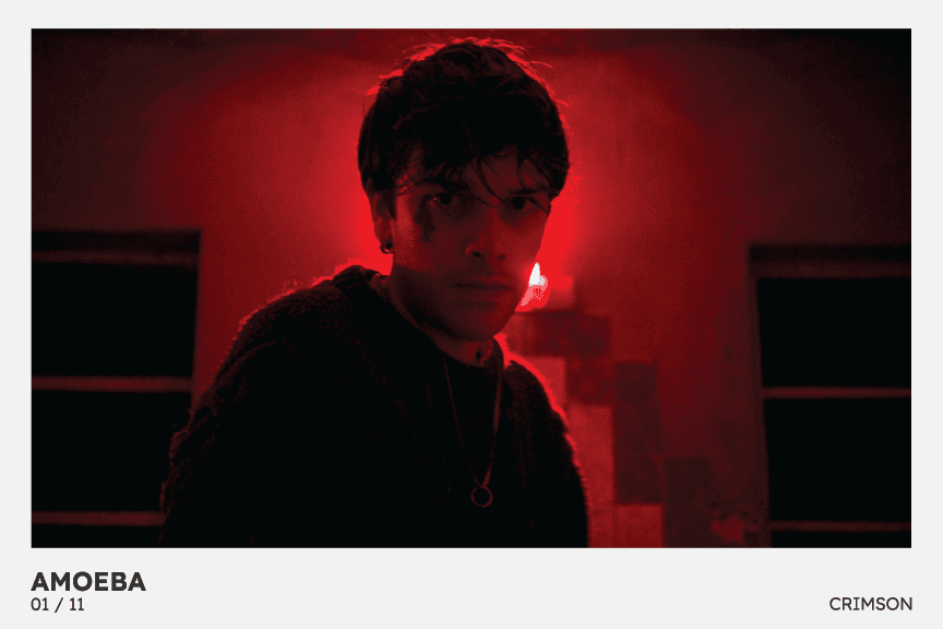
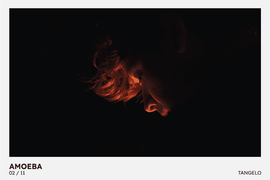
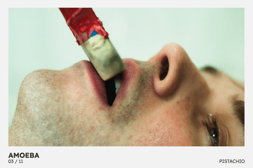
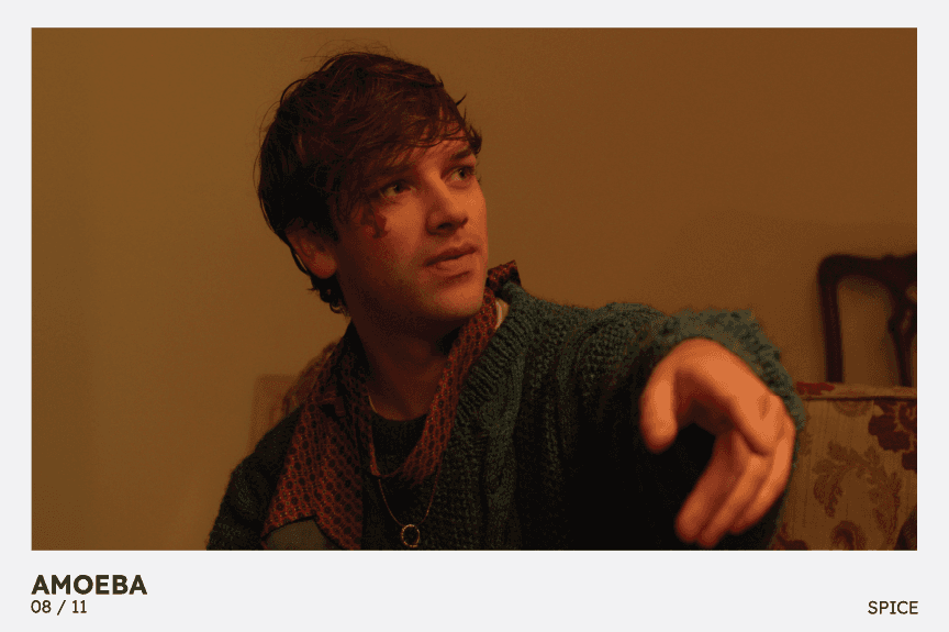
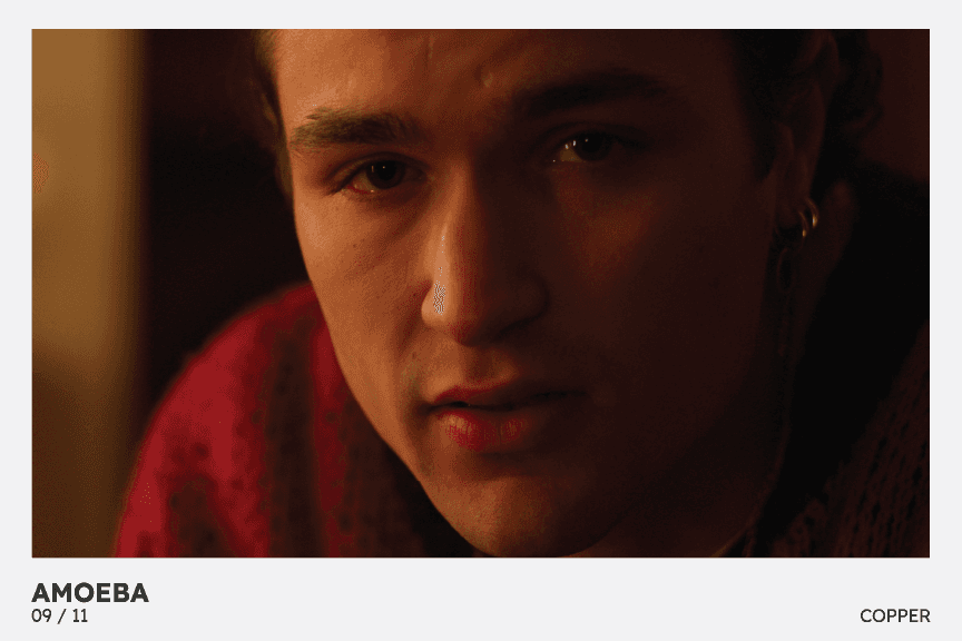
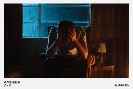
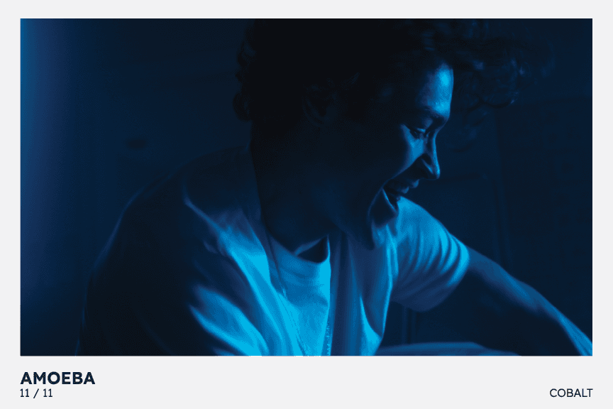
Part of the brief from the client was to create a print artifact as part of the promotion of the film as a souvenir or promotional object. The initial concepts I brainstormed were to use the existing stills of the film that use bright vibrant colours; this was a stylistic choice by the director to convey tone and emotion during these moments in the film and using them in the printed material was a way I could make a direct visual link between the film and the visual language of the branding for the promotional material.
Program Ideation
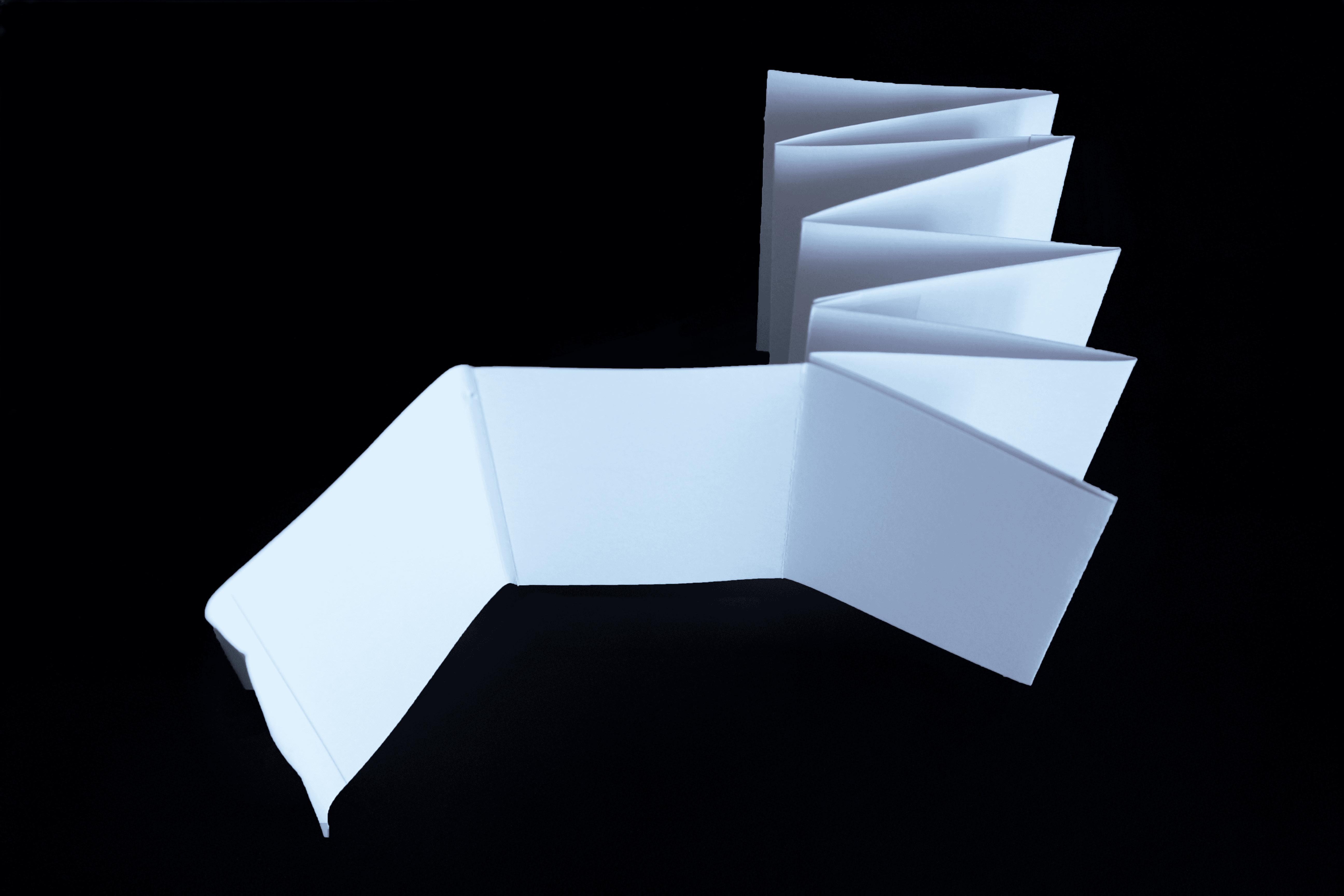
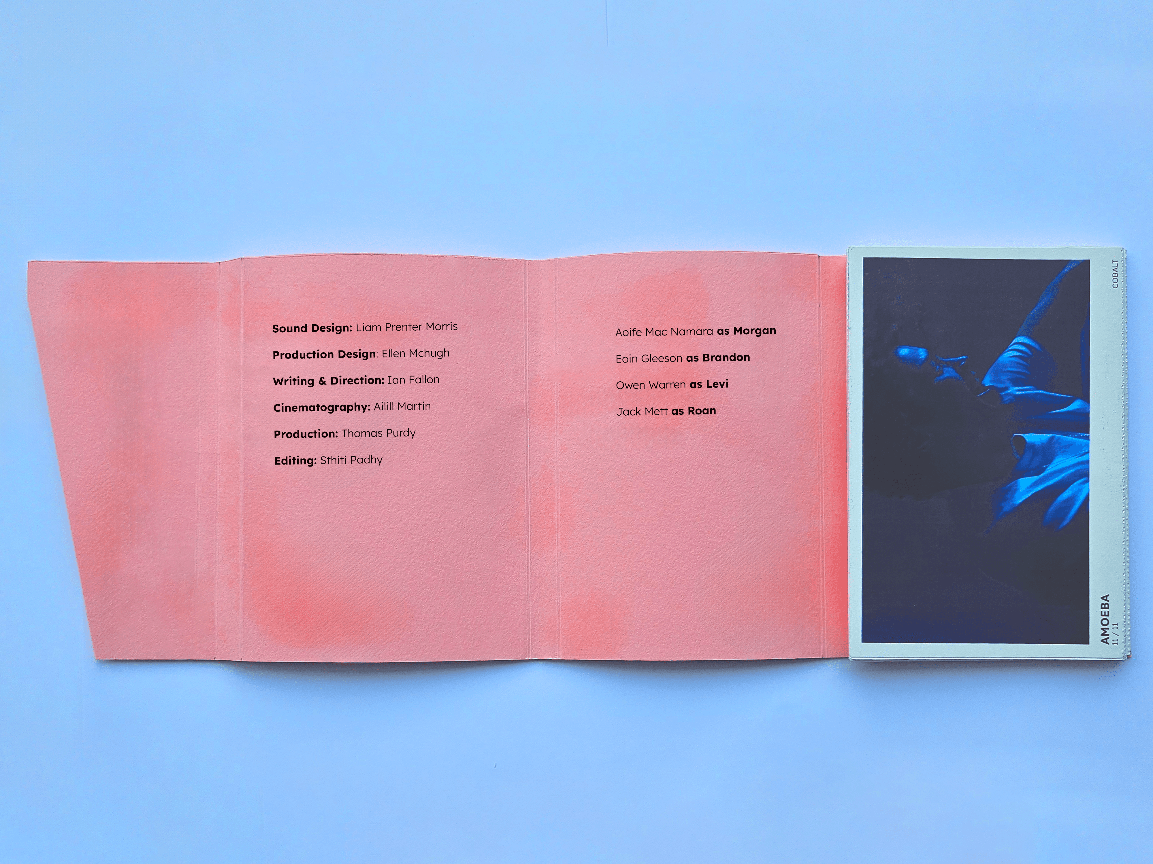
My first concept was to have a loose deck of these stills as postcards in a hardbox. Iterating on this postcard collection concept developed into the postcards being encased in an accordion style book block, the postcards which would have perforated joints so the cards could be torn apart and used individually each card showcases a still from the Amoeba film tied in more with the visuals of the Amoeba film itself which led me to make the choice.
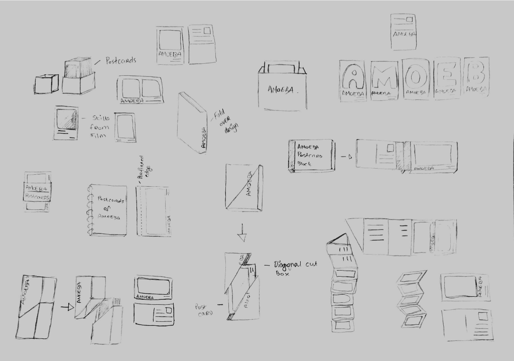
Artifact Iteration
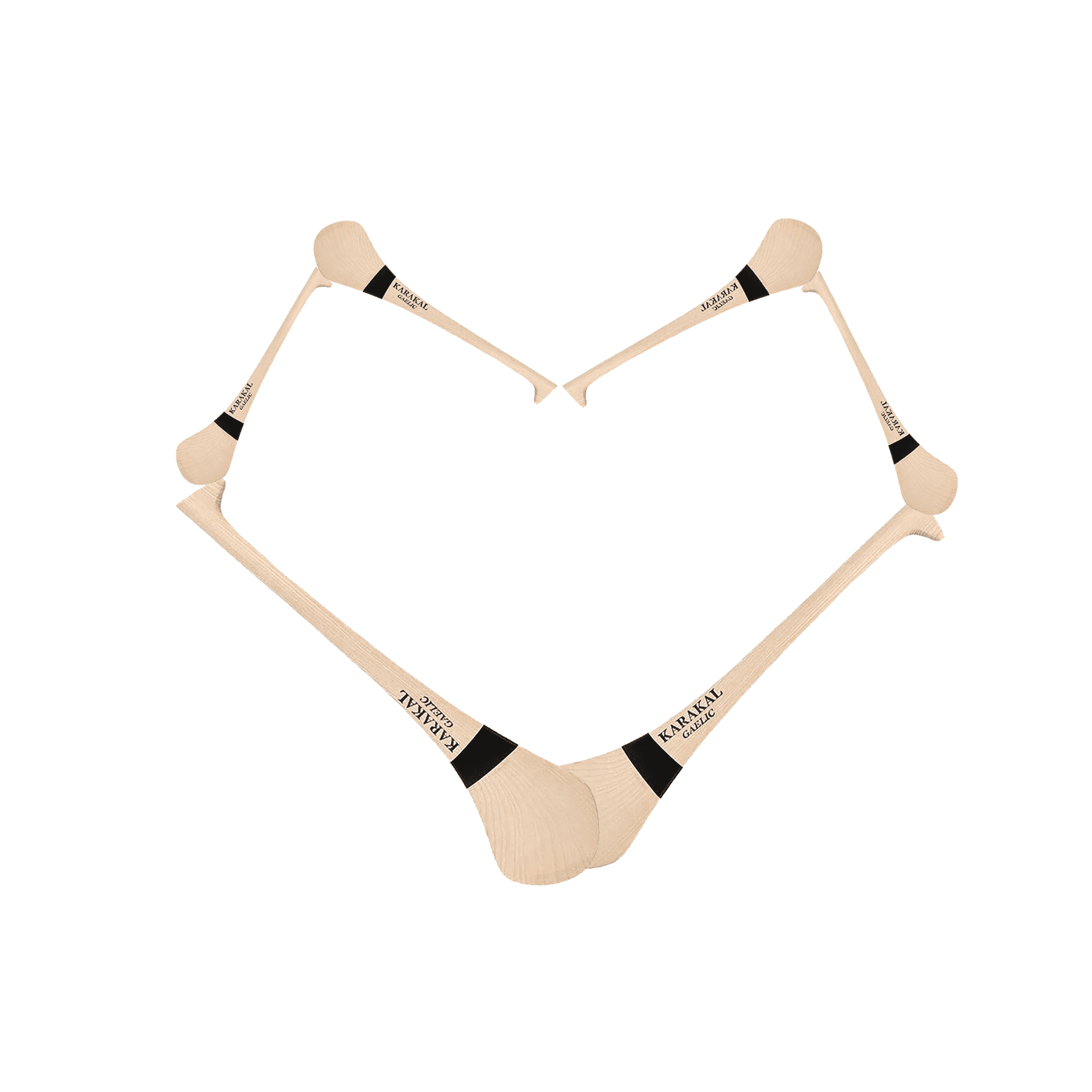
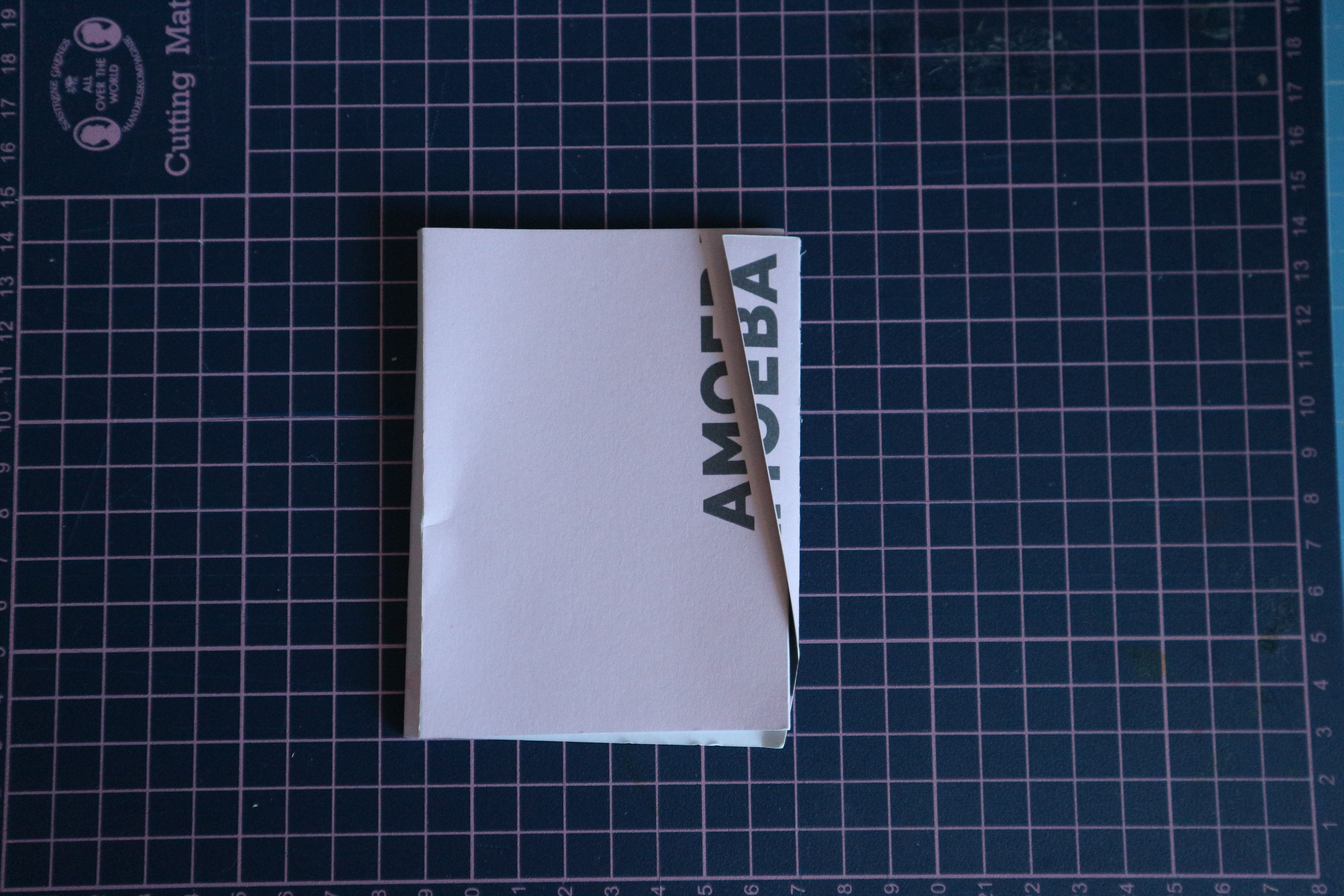
Making the artifact from sketch to a physical artifact was a process of trial and error. I made physical mockups using blank paper to work out sizing and dimensions that felt substantial and felt a good size for a postcard. This also allowed me to work out how I would construct the artifact and how it could most easily be printed for the client to print it for their promotion campaign. I also implemented an overhang with a diagonal cut as a method of bringing the visual language of the Amoeba identity into physical form.
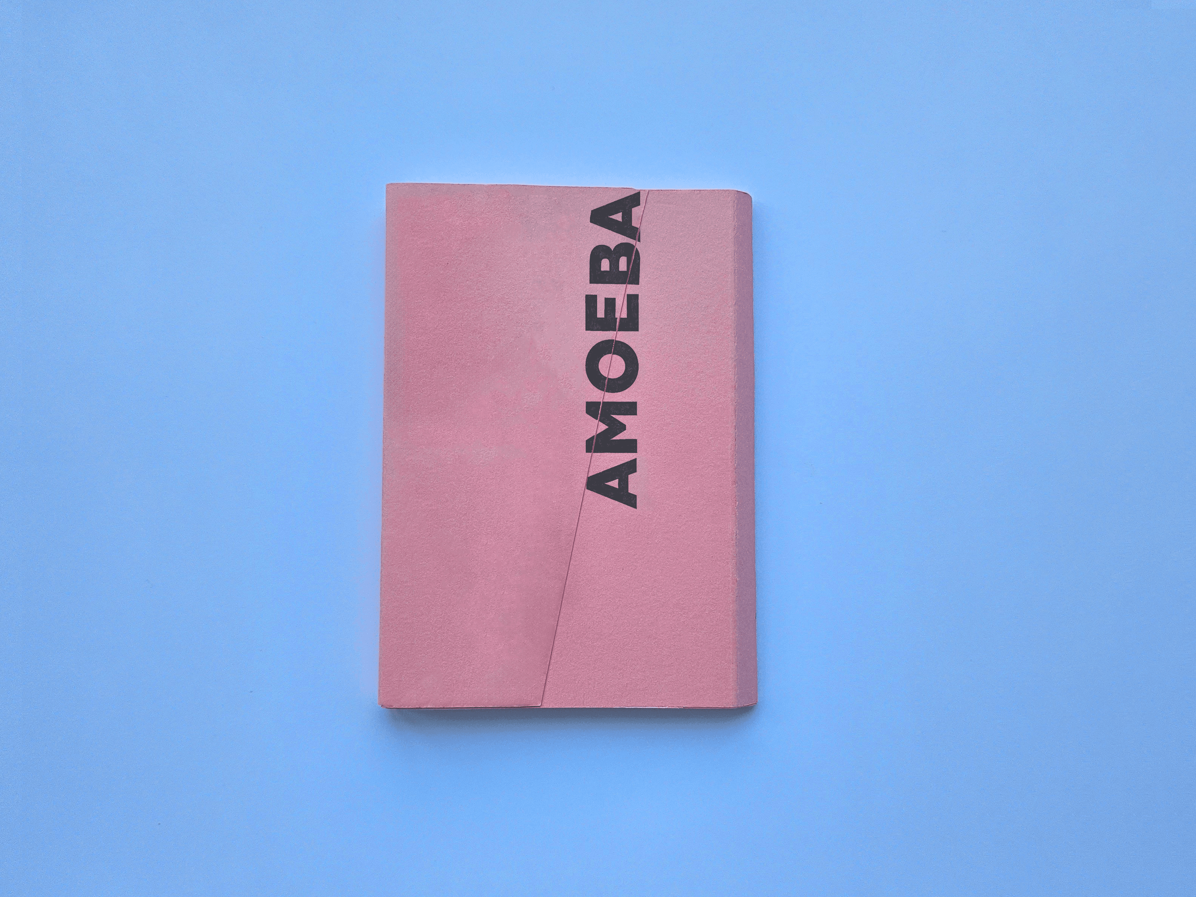
Final Artifact
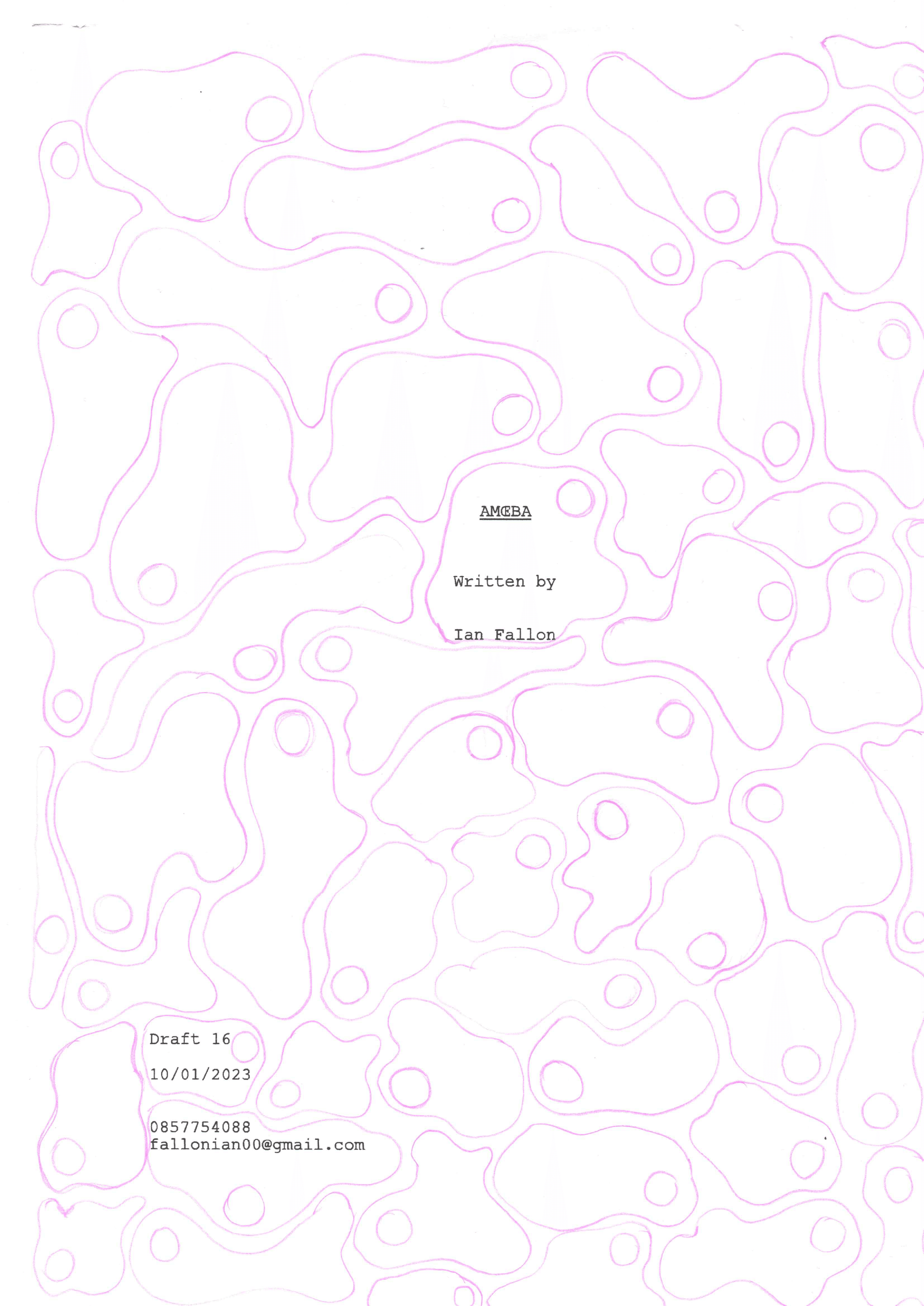
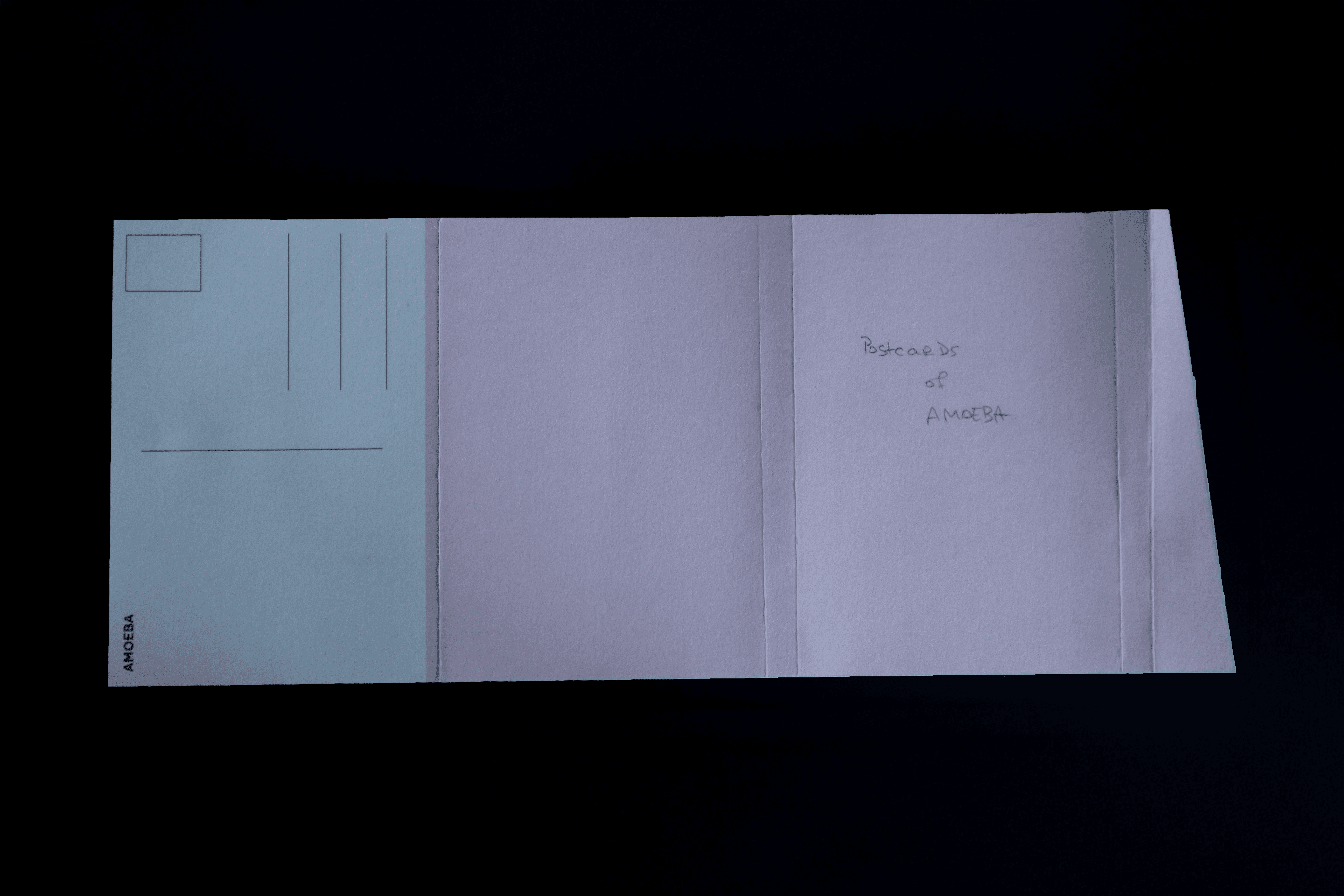
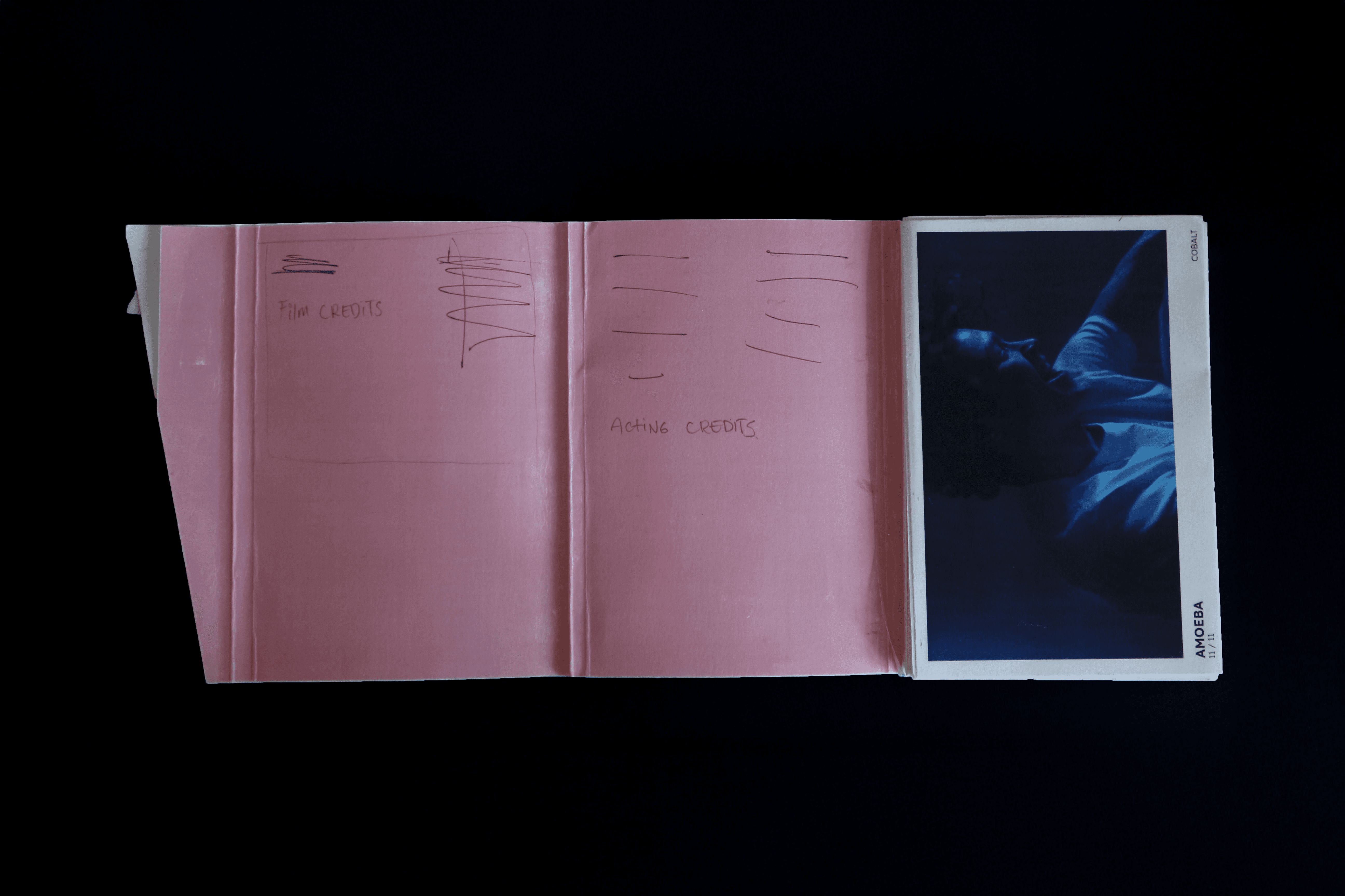
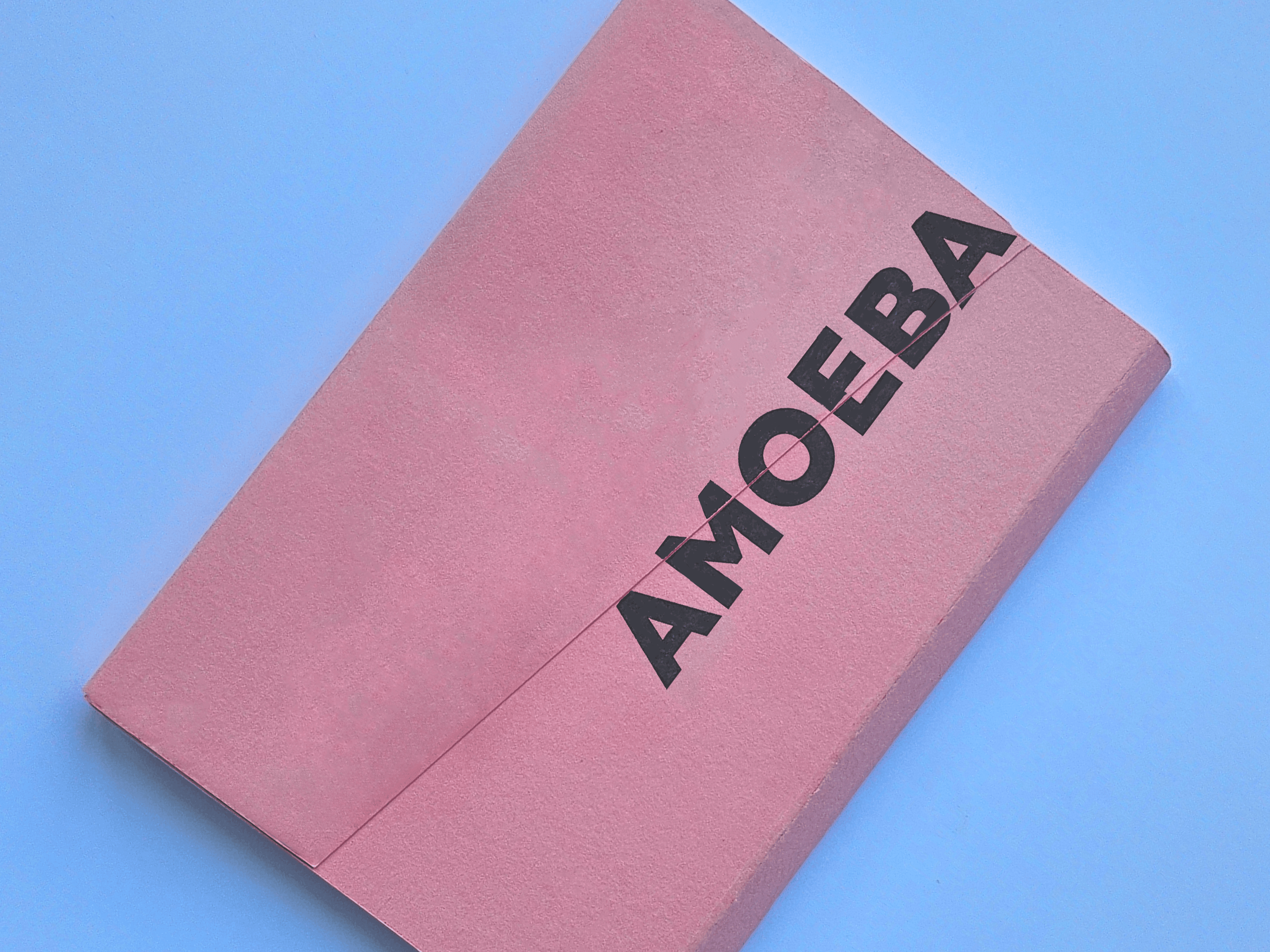
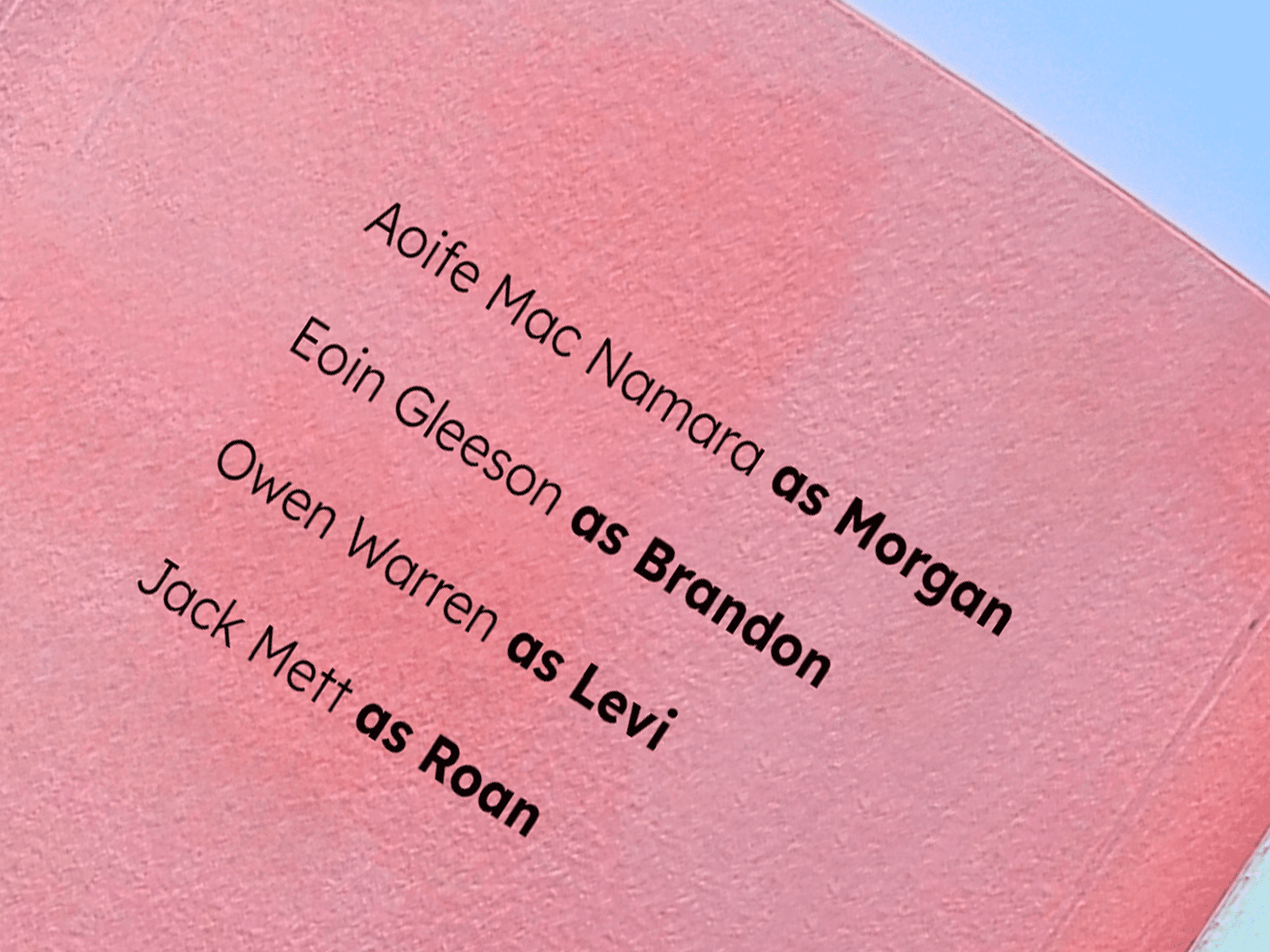
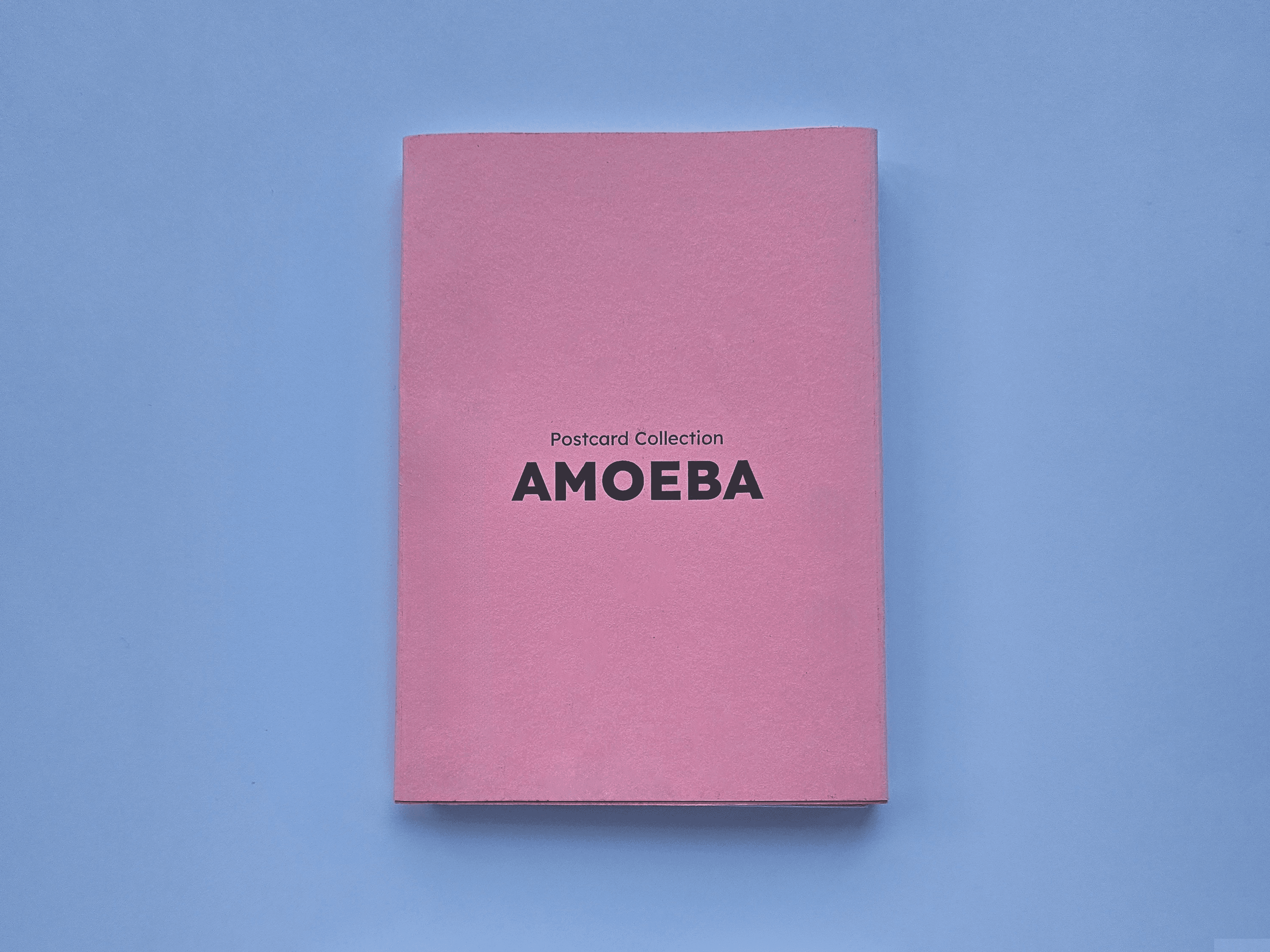
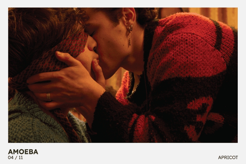
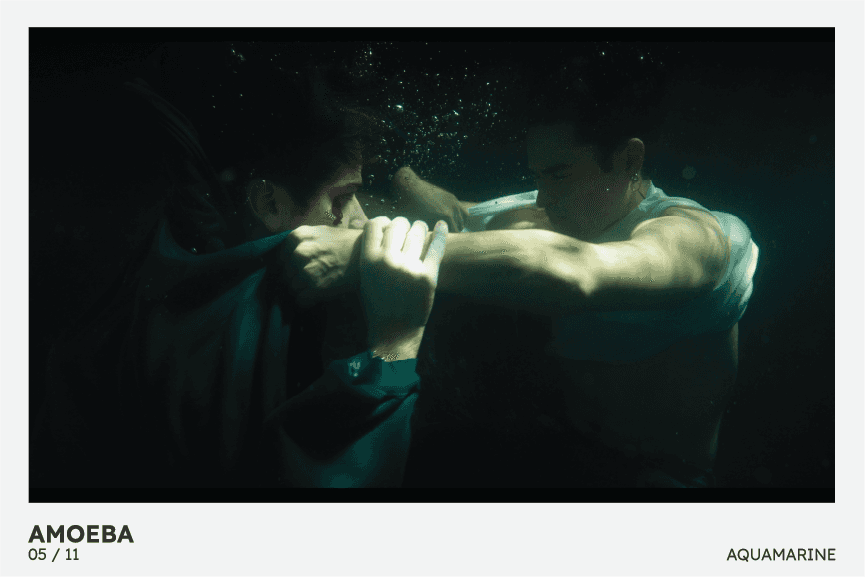
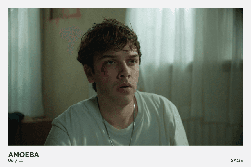
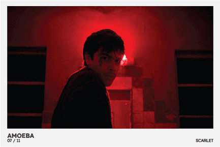
The final print artifact after iteration has an accordion style trail of postcards of 11 stills from the film. Encased in a pink softcover, Pink was chosen as a reference to the colour commonly chosen as the colour of a brain. This was also to reflect the romantic nature of the film. Credits for the cast and crew of the film were also included on the inside of the cover as an additional touch and spot like for the makers of the film.
07 / Posters & Promotion
Poster Planning
The client's brief also requested a poster as part of the promotion campaign. When planning out the poster my aim was to design the poster in a way that tied into the established visual identity and visual language of the title sequence and print artifact. The main focus of the poster was to naturally grab attention for potential users to see the poster and to spark interest in the film Amoeba and for these potential users to be turned into ticket buyers.
Poster Ideation
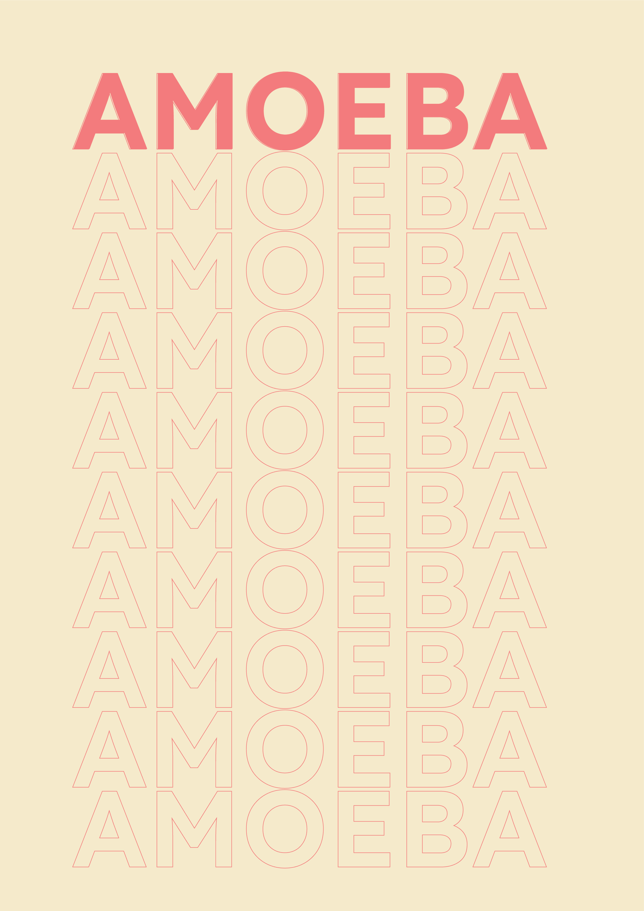
When brainstorming poster concepts recurring visuals where sliced up type similar to the visual treatment used in the title sequence. Another concept at this stage was to use more of the stills from the film to create a visual link between the print artifact and the poster. I wanted the posters design to have the style of an indie romantic film but also capture the sinister nature of the film using these visual elements as juxtaposition with each other.
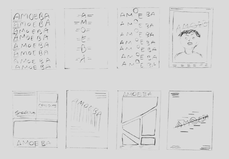
Poster Iteration
When bringing the poster concepts into a digital space and higher fidelity, I experimented with layout and tone in order to achieve a balance between the romantic themes of Amoeba but also bring in horror elements with the aim to achieve a juxtaposition between the romance and the horror. One thing I wanted to remain consistent for the sake of visual connection between the title sequence and the posters was the use of strong bold type so this featured in many of my iterations. This would include slicing and cutting up the type to tie in once again with the visual language of the title sequence.
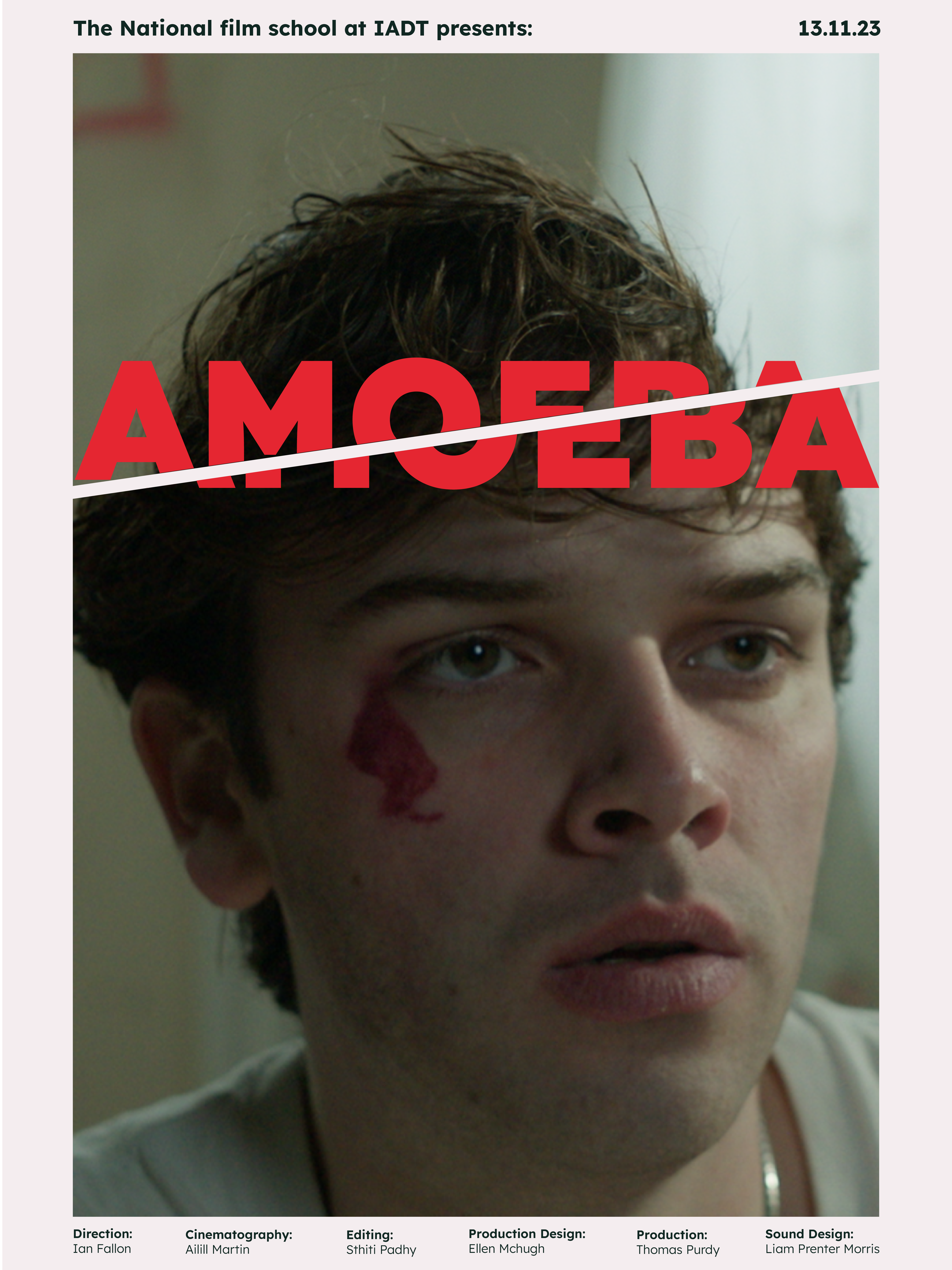
Final Poster
The final poster came from the combination of elements from multiple of the previous iterations. Further iteration of the poster developed introducing the main character Levi as the Hero image of the poster alongside the Amoeba logo text. Using a similar framing device as the postcards or polaroid to ensure a more consistent visual language throughout the film promotion package.
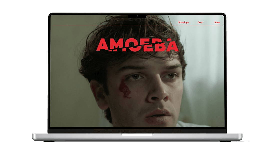
Microsite
I designed the microsite to be the central up for a user to see the Amoeba film. Users who would come across Amoeba promotion would be directed to the site in order to buy tickets or purchase promotional material of the film as well as see shows and festivals the film would be at. I designed the microsite to reflect the visual language in the title sequence as well as the poster and artifact to create a visual link brand identity between the film and promotional material.
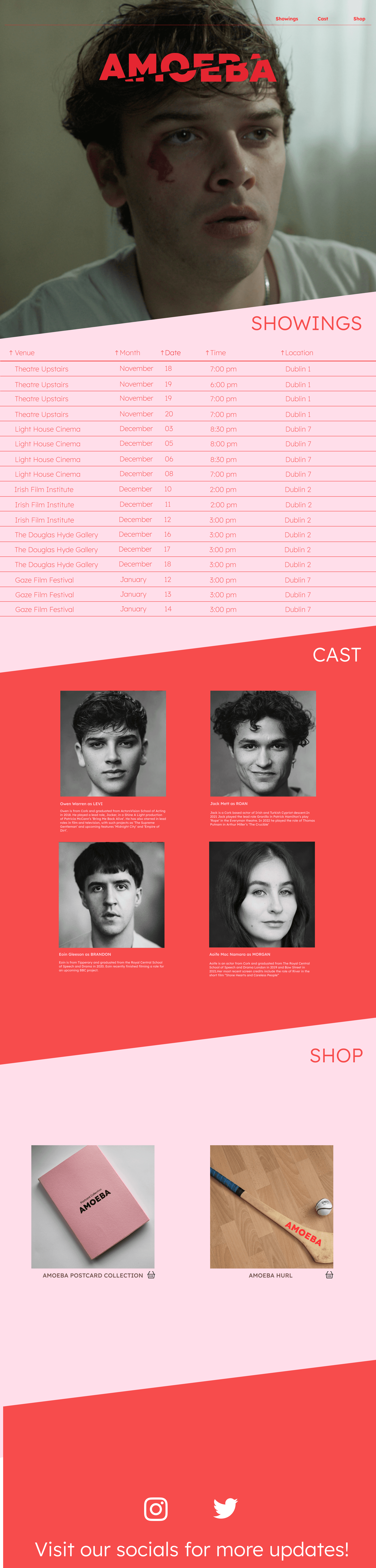
User Journey
The user has the possibility of coming across Amoeba promotion via social media, on posters or by the staged bloody scenes using blood stained hurls. Each promotion would carry a link or QR code directing the user to the microsite and calling them to view the film.